Leaderboard


Popular Content
Showing content with the highest reputation on 04/29/2022 in all areas
-
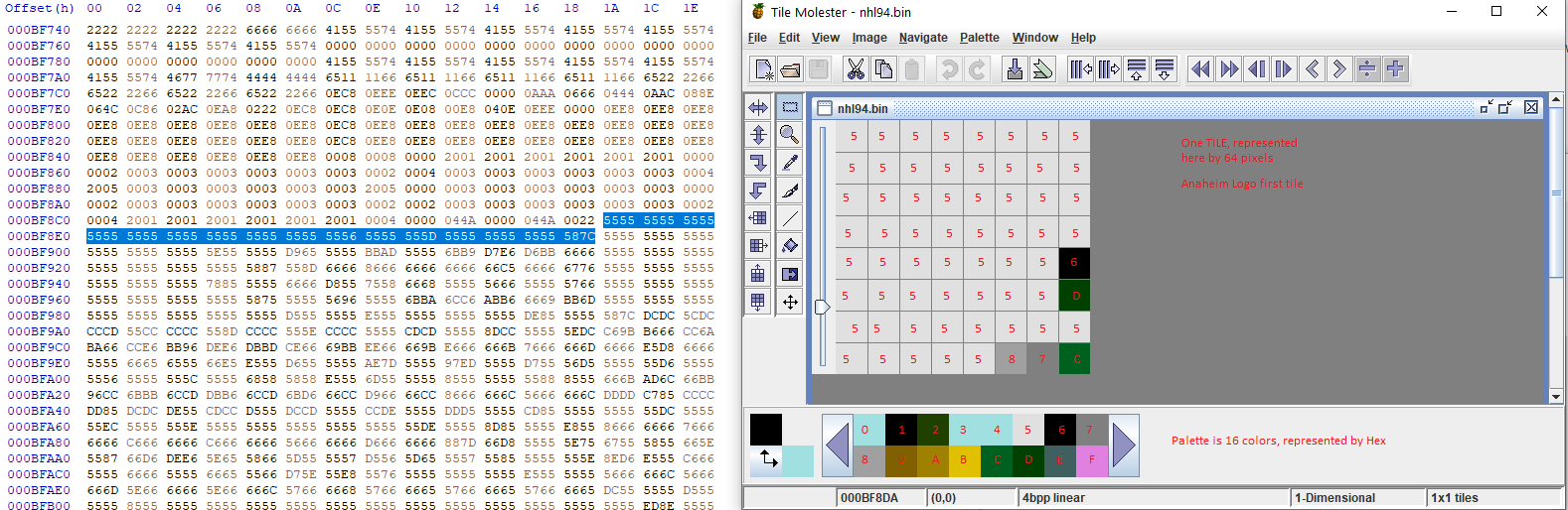
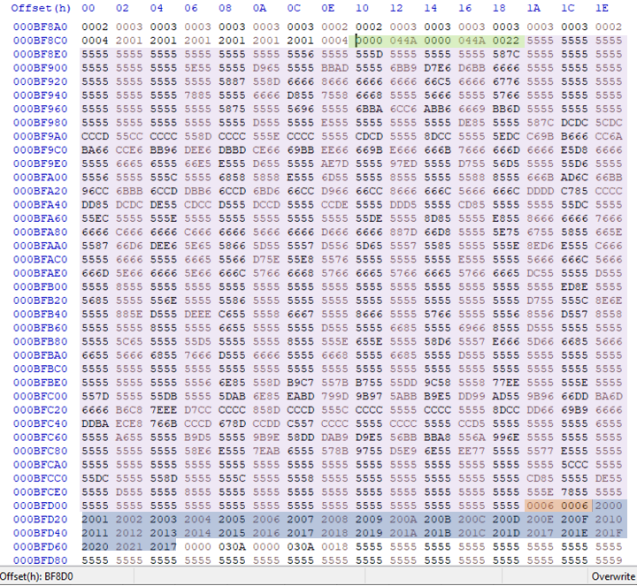
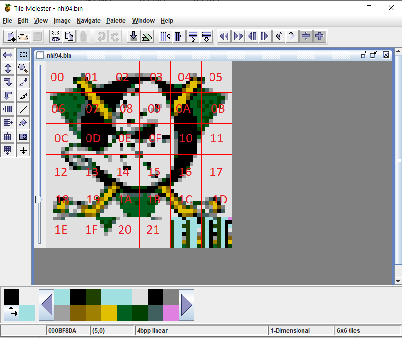
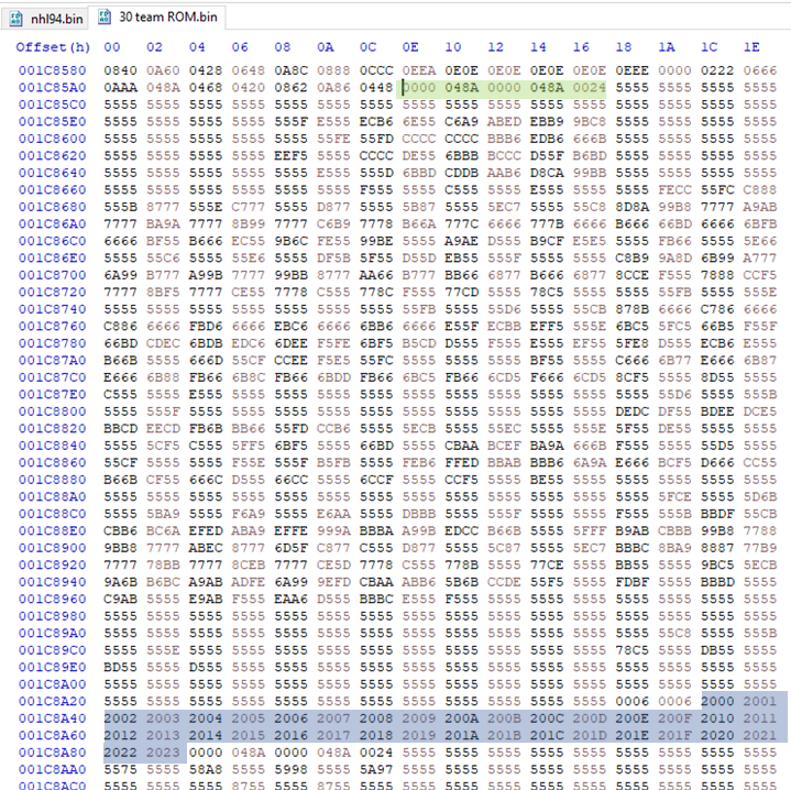
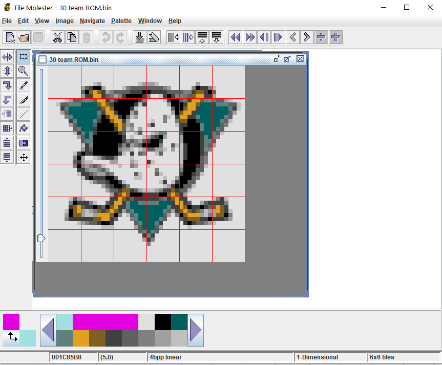
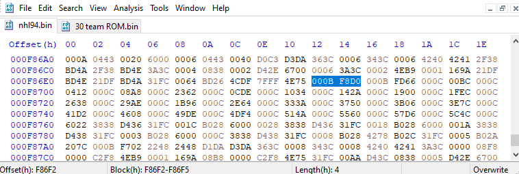
When we say the hacked ROMs for Genesis had the graphics "decompressed", that's not exactly the right terminology. The graphics that are used, at least in the EA series that I've looked at, have shared tiles. They are not "compressed" as you can still see all the graphics when you open Tile Molester, but it won't look exactly like the "what you see is what you get (WYSIWYG)" in the game. That's due to the use of shared tiles. Back in the 90's, chip size was important/expensive, so the smaller you can make the game work the better. Graphic data by far takes up the most space on the ROM, so if you can re-use certain tiles for an image, that would help reduce the size without impacting the game. I'll explain how this works, and how @wboy and others fixed this. I won't go into how to find the locations/palettes as this can be found elsewhere in the forums. I'd also like to thank @slapshot67 for explaining this to me a while back. A few basics: Everything uses Hex values. This means each digit goes to F instead of 9 (base 16 instead of 10). Google for more info separately, but it's not that hard to grasp. Graphics in Genesis are broken down into tiles. Each tile is 8x8 pixels, or 64 pixels in total. Tiles are basically a "paint by number" - I explain that here Each tile can use one 16 color palette. There can be 4 different palettes to choose from First, let's take a look at how the data structure works in Hex for MOST graphics. There are instances where this may not be the same, but for the vast majority of graphics work this way. Let's start with the Anaheim Ducks team selection logo. This is a 6x6 (tiles) logo. The location of the information for the Anaheim logo is BF8D0 in the original ROM. Here's how everything looks in Hex. I'll break down each section and explain. The start of the graphic is always a 10 byte header, which I highlighted in green. I think it will make more sense to explain the header later. The purple highlighted section is the graphic tile data. This is the data that is much better viewed in Tile Molester. I'll explain and show you how TM translates this data to a user friendly interface. As I mentioned earlier, graphic tiles are 8x8 pixels. Each tile is represented in hex by 32 bytes, with each byte representing 2 pixels ,for a total of 64. Each digit is simply what color on the palette to load, starting on the top of the tile, working from left to right. For example, here is the first tile (first section of purple) translated from hex in TM: Not the greatest example, but it's easy to follow. When you see a bunch of "5555", that's the 6th color (starts at 0) in the palette, in this case white throughout the first tile. So the purple section is all the tile information for 34 total tiles (explained later). After all the graphic data, you'll see the tile layout information begin with the orange section. The orange section tells you what the layout is in the number of tiles in length x width. In our logo example, this is 6x6. That's pretty straightforward. The last highlighted section is the tile layout. Each 2 bytes represents which tile to use, and you'll find 36 tile layouts for the 6x6 logo graphic. The first digit is the palette being used: 0 - Palette 1 2 - Palette 2 4 - Palette 3 6 - Palette 4 If the tile is flipped vertically, the number is 1 higher (1,3,5,7). The next byte will show the horizontal flip. 0 is normal and 8 will flip horizontal. You're likely not going to be flipping tiles vertically or horizontally for your new image, so don't worry too much about that. The next byte is the tile number used. In our example, you'll see the tile layout starts with 2000, 2001, 2002...until all 36 are listed. This means the logo is using palette 2, tile 00, tile 01, etc. Now back to the header! The first 4 bytes of the header is the length of the data. This is usually just adding the header (10 bytes) and the graphic data (tiles). Remember, the graphic data is 32 bytes for every tile. The next 4 bytes is usually the length of the data plus the palette if it's located. A lot of times a graphic will have the palette located right after the tiles, and these bytes will account for the extra palette information. Our team logos do not, and as such the 4 bytes will both be the same. I'll show another example that has a palette later. The final two bytes is the number of tiles represented in hex. So in our Anaheim logo example header reads as follows "0000 044A 0000 044A 0022" Starting at the end - "0022" says that this graphic has 34 tiles (22 is hex for 34). The beginning and middle both have "000 044A". That represents a data length of 1,098 bytes (044A is hex for 1,098). Here's the math -- 34 tiles x 32 bytes equals 1,088. Add 10 for the header and you have 1,098! This is important to understand because when we expand the graphic, we will have to adjust the header accordingly for the game to understand. SO NOW, how do we "decompress" or make the graphics more hacking-friendly? Using our logo example, the first thing we need to do is make each graphic 36 tiles. You may have picked up that our Anaheim logo in the game has 34 tiles, which means that 2 tiles are used more than once in the graphic. If you looked closely at the layout, you will see that tile 17 is used 3x. This actually the blank tile, which is pretty common. So let's "decompress" Anaheim's logo to fix the shared tiles problem. The first thing we need to do is find some room in the ROM for the new logo! Wboy expanded the original ROM from 1MB to 2MB, thereby giving him plenty of space to put in some new graphics. Expanding from 1MB to 2MB is pretty easy, but I won't cover that here. Just know you need to find some space. The 95 ROM actually had enough blank space already for new graphics. Use TM to paste in the new picture in the empty part of the ROM, say location 1C85B8, and that picture is now 36 full tiles for Anaheim logo, not 34. Right before the tile data, we need to update the header for the graphic. The new size will be 36 tiles x 32 bytes or 1,152 bytes. Add 10 for the header and our data length is 1,162, or 048A in hex. We also know we are using 36 tiles, and that is 0024 in Hex. Our new header should read "0000 048A 0000 048A 0024 Immediately after the TM data, we need to now put the tile layout in Hex. The logo remains 0006 0006 (6x6) and the tile layout will be sequential since we are not using any shared tiles. The layout will be 2000, 2001, 2002....all the way to tile 36 (2023). This is how it looks like in the 30 team ROM: I highlighted the header and tile layout. So now that you have the full "uncompressed" graphic loaded, the final step is to change the pointers in the game to the new graphic. A pointer is just what it sounds like -- it points the ROM to the new graphic. You can typically find the pointer by looking for the header location in the ROM itself. So in our example, the Anaheim logo header for the original game was BF8D0. If you search for hex values "000B F8D0" in the ROM you'll find that the pointer is located at F86F2. If you change F86F2 to your new location (1C85AE), the game will now read the new logo. NOTE: In wboy's 30 team ROM, he also changed the location of the pointer table, so this particular part of our example won't be 1:1. I hope this was a helpful crash course into how graphics work and how we "decompress", or get rid of shared tiles. I'll give another example of a graphic that has the palette information within the data structure as a response to this post. This took me a little longer than I thought, lol. But basically every graphic that was hacked followed this procedure. In short: * Make or find room in the ROM for a new graphic * Make sure the header and layout information reflects that graphic correctly. * Change the pointer to the new graphic

 1 point
 -
Hey @AdamCatalyst, sorry for the late response. It's been a bit busy and stressful for me lately. "As you know, the blue shoulders are, well, wrong. But that being said, I feel like, in play, the blue shoulders end up balancing out the uniform to give a closer impression to the real deal, despite being technically less correct." - I completely agree! Although it's "wrong" and everything, I think it looks good! It looks good in motion too. I've noticed the new face-off animation frames and composite sticks as well and it's looking great. I'm not sure if you could have the colors look any better than they do now with the 4.2 revision. I appreciate it again that you gave my suggestion another look. I think in terms of how the jersey colors are laid out for NHL 94, that's as accurate as I think it'll get. Great job!1 point