Jkline3
-
Posts
209 -
Joined
-
Last visited
-
Days Won
38
Content Type
Profiles
Forums
Events
Everything posted by Jkline3
-
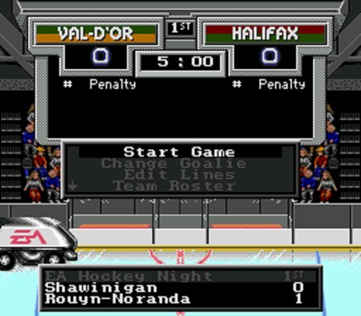
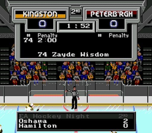
I made NCAA roms for each of the individual conferences and then made a combined 32-team rom of the best teams from all the conferences. I'll update them for 2021 after the season ends.
-
I've crossed the Atlantic and leagues are getting smaller. Winter is coming and I've got nowhere to go. I may make it further than I originally thought...
-
Not going to follow the NFL's lead with a Color Rush version of the ROM?
-
Don't adjust your TV...
-
These are hilarious / awesome. Brings back so many memories of the first "roms" (if you can even call them that) that I would make when I started using NOSE but wasn't brave enough to try and learn Tile Molester yet. Absolute garbage but I still had a blast playing them and fooling around with all the different variables.
-
It is, hands down, my least favorite part of making a ROM. So much work goes into finding out that you picked a lousy image and it doesn't look good in-game...
-

The Hockey News: The Making of NHL'94: An Oral History
Jkline3 replied to kingraph's topic in NHL'94 Media / Press
-
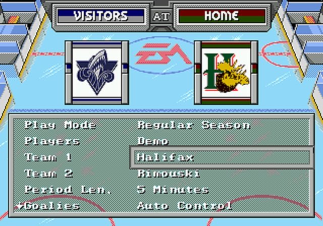
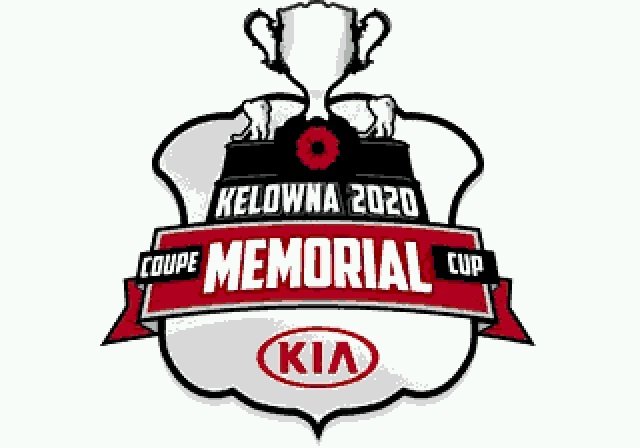
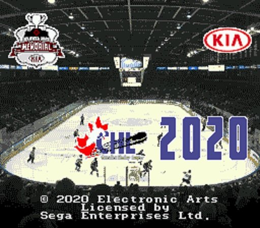
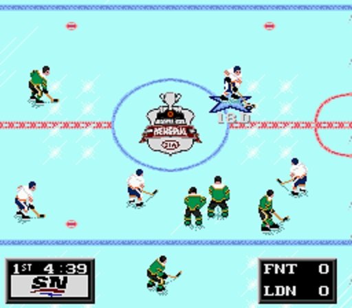
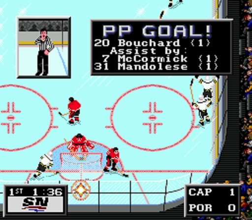
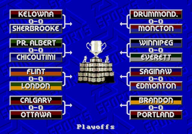
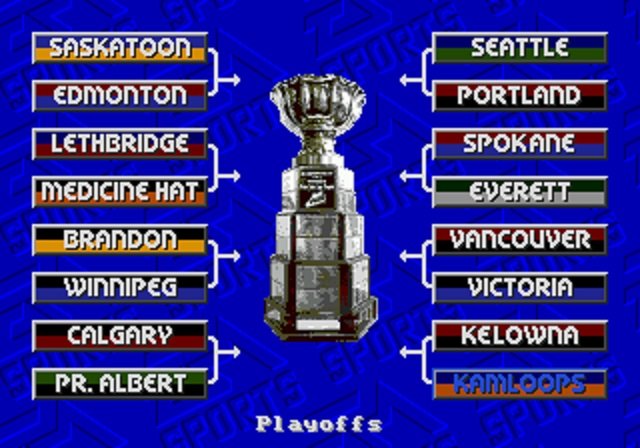
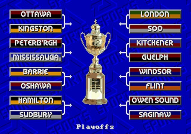
A compilation of the best teams from the QMJHL, OHL and the WHL. And the Kelowna Rockets... 2020 Memorial Cup.bin
-
Thank you, these have been a lot of fun to make and after really only watching the draft eligibles over the years I have learned a TON about the CHL. Any tips, ideas or suggestions to improve them are greatly appreciated.
-
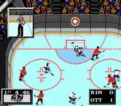
Just in time for the 2020 draft, the last of the Canadian Junior Leagues: 2020 WHL.bin


-
@slapshot67 pointed this out for '94, at least for fixing the socks... A74EC - CHANGE 4801 TO 6801A74FC - CHANGE 4801 TO 6801A750C - CHANGE 4801 TO 6801
-
La Tormenta's cover collection (work in progress)
Jkline3 replied to LaTormenta's topic in Genesis Roms
These are fantastic! -
Mолодец!
-
My pleasure, hope it all makes sense. I'm sure there are better ways but it's a start!
-
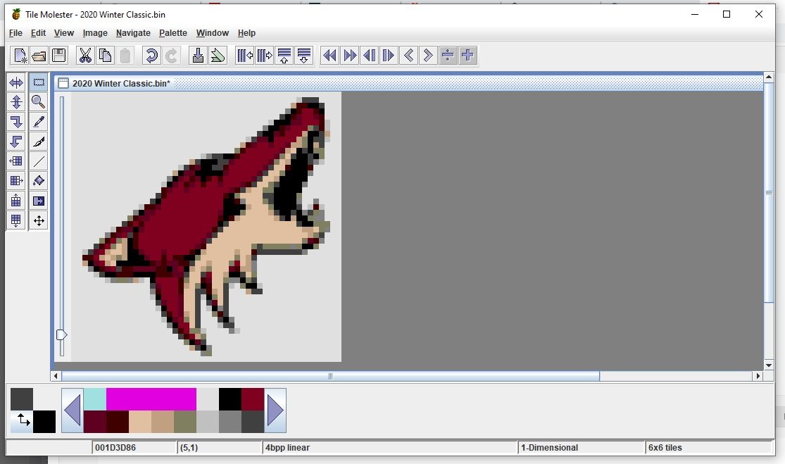
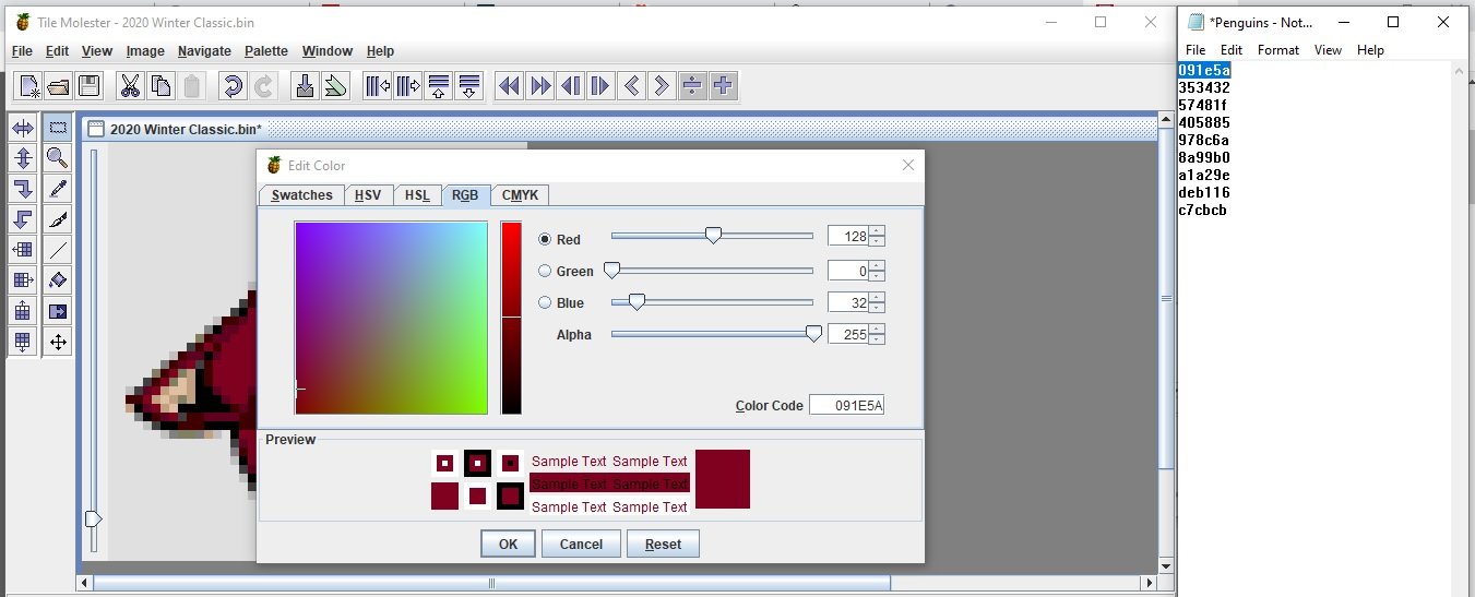
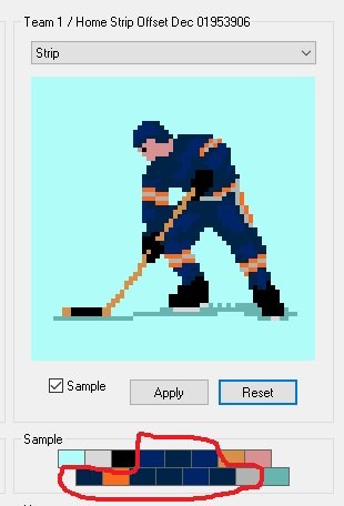
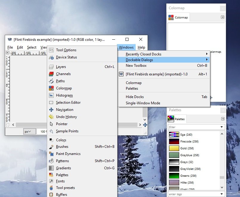
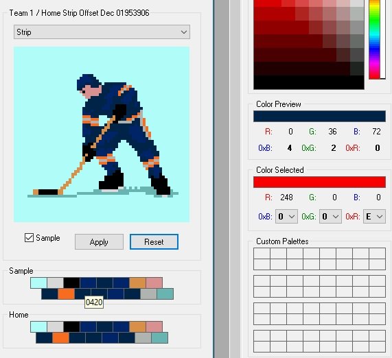
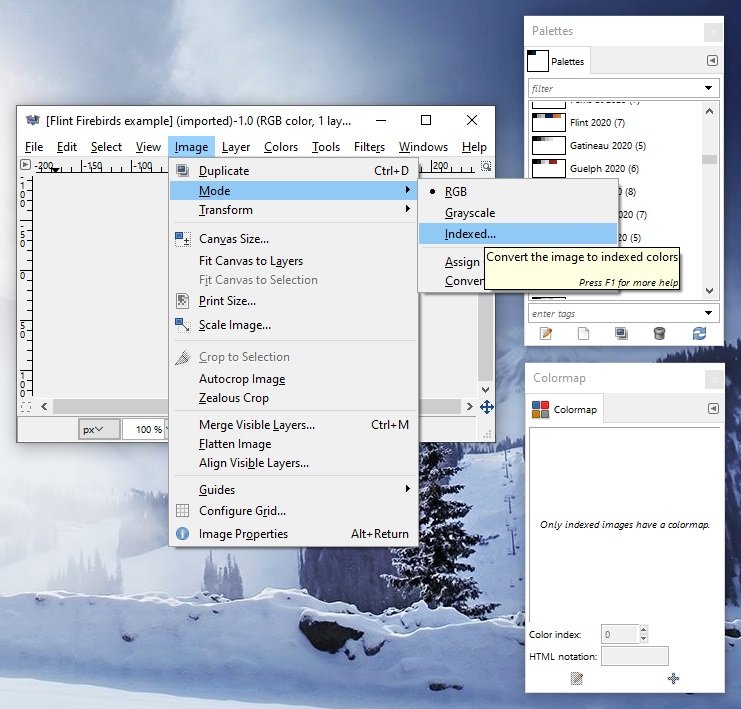
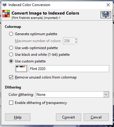
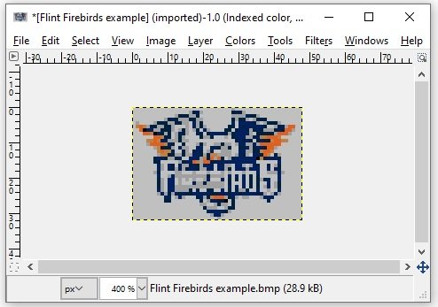
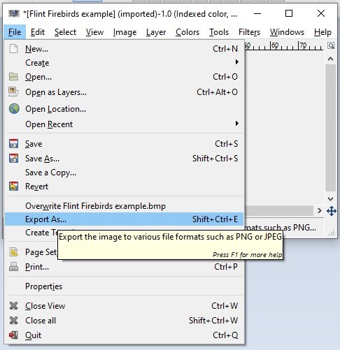
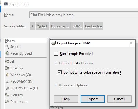
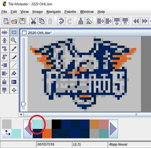
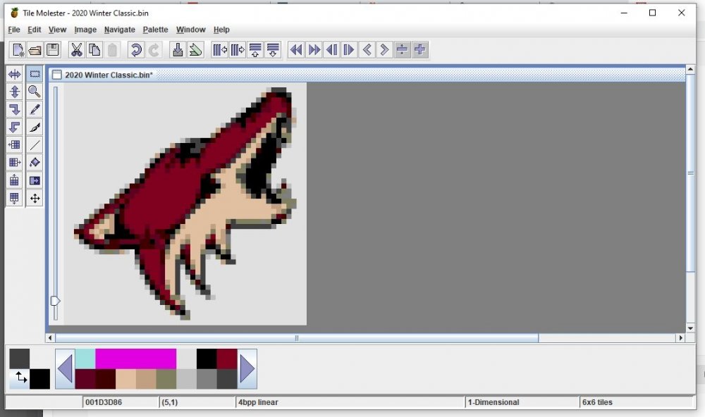
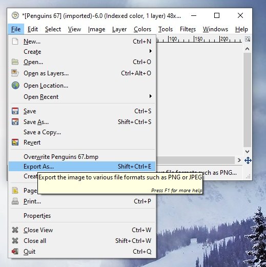
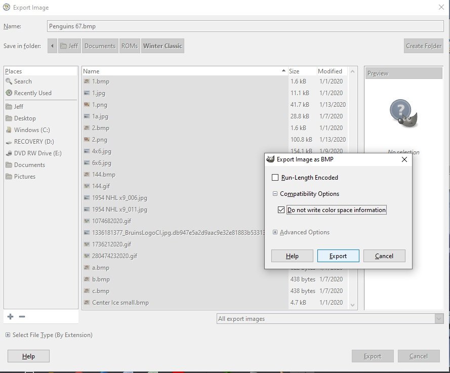
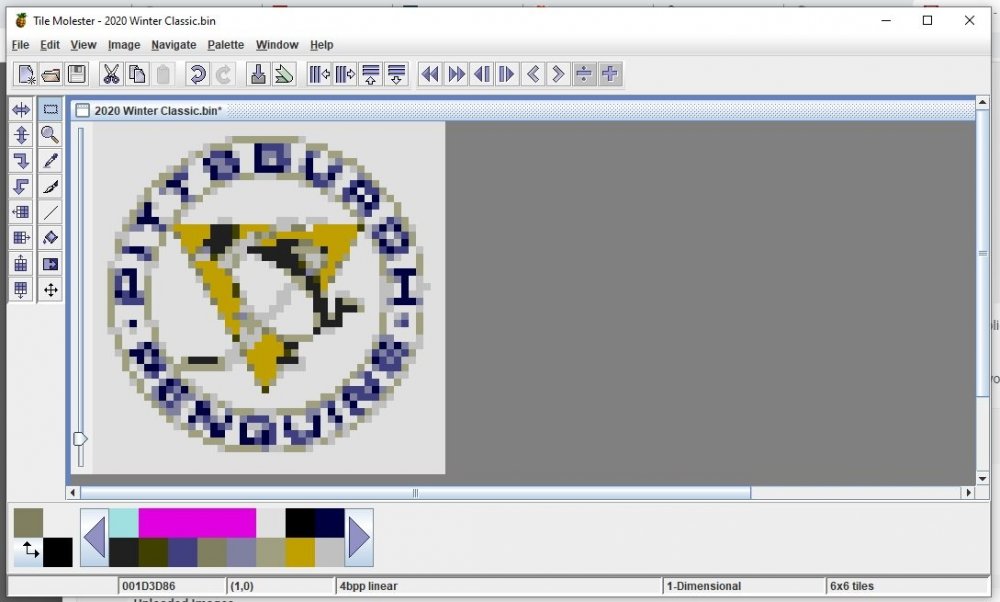
Here's a step-by-step of what I do to make center ice logos. Compared to the team selection logos these are a lot more difficult because they require you to fit everything into an even smaller graphic. Would love to hear any other tips/tricks from anyone on improvements that they have made. 1. I use sportslogos.net for the majority of the base artwork. Another great resource I've found is thefaceoff.net which is a great reference to check what teams have used as their center ice logos over the years. 2. Using Paint, I resize the 150x100 .gif image that I downloaded from sportslogos.net to 48x32. Since these are the same proportions as the original image sometimes you get lucky and only need to shrink with no cropping necessary. Save that as a 24-bit .bmp image. 3. In order to make this next step work you must already be done setting the team's uniform colors as the home unis are going to give you the colors that you have to work with. There are 16 colors in the palette, 10 of them specific to the team and 6 "standard" colors used for everyone (ice, skate/blade, stick, face, shadow). Many of these colors will probably repeat depending on the uniform style. The trick is to force your center ice logo to use these colors prior to loading into TM. The automatic color choosing feature in TM can be nice but also very frustrating on some of the "busier" logos with some weird results. Open your ROM with NOSE so you can view the palette. NOTE: I use my own sprite edit so this may be a little different for you but the general idea is the same. 4. Open your image in GIMP and open both your Colormap and Palettes windows. If these don't automatically open for you they can be found in the Windows > Dockable Dialogs> menu. 5. Next step is to create a palette that only uses the colors that you chose for your team uniforms in NOSE. Create a new palette, create a new entry (color) and then edit that color to match one from your team uniform. 6. In the color edit screen you will need to input the RGB values of your uniform colors in the HTML notation field. To determine your color codes you can hover over them for a 3-digit code or check the color preview in the sidebar. In this case navy blue is 420 (or 4B, 2G, 0R). The easiest way I've found to convert them to HTML format is to just reverse them and input necessary zeroes. In this example navy blue would be 002040. Repeat this process to add all of the colors from your uniform into the palette and save. I always also include black (000000) and light gray (c0c0c0) from the skates. Most teams will end up with 5-7 colors in their palette. Not to get off on a tangent, but you may also find it useful to add some of the other standard colors from the stick, face and shadows to substitute for a color not in your uniform but that may be in the logo. As an example, the pink for the face makes a passable red at such a small scale and the tan can fill in as a yellow or flesh tone. I DO NOT include them unless they would have a place in the logo as more colors just confuses the color selector in TM more. 6. Now you're going to want to convert the image you opened into one that only uses the colors from your uniform palette: Image > Mode > Indexed You're going to use the palette that you just created. You'll end up with something like this but don't panic, yet... 7. Last step in GIMP is that you're going to save your file. Choose 'Export As', I keep the image as a bmp. SUPER IMPORTANT - make sure you check the 'Do not write color space information' box or your image will not be usable in TM. 8. Open your ROM in TM and paste your logo in the proper spot. Because the colors in your logo should match exactly with colors in your palette TM will not modify anything. Add your ice color... Here's where you can let your OCD run wild... You've already got a good working base but most logos can be improved with a little manual cleanup. Text will always be very difficult to make readable because of such a small scale but it can usually be sharpened up a bit so that if you squint your eyes you may be able to make it out... Sorry if that was super long-winded but it took me a ton of trial and error to come up with a system for making new logos that were usually passable in-game. Any time you need a pick-me up, go back and look at the logos from the original game... Hopefully that made sense
-
I must be missing something, I use Ditherer all the time for other graphics and darkening images but don't know how to reduce the number of colors. Wouldn't be the first time something went over my head! I use GIMP because it's the easiest (and freeist) program I've found to be able to limit the number of colors in a palette - or conversely forcing a palette onto an image for center ice logos.
-
I just posted an outline of how I get my logos with Paint & GIMP. Not sure if that's useful to you or not. Very similar method for doing center ice but your colors will be limited even further. I can put something together on that too if you would find it useful (or others tell me I'm an idiot and there's a much easier way to do this...).
-
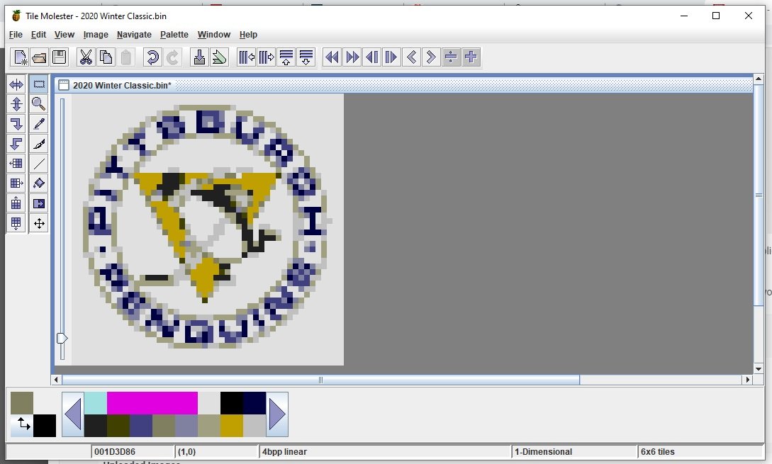
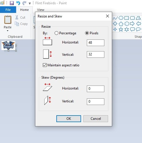
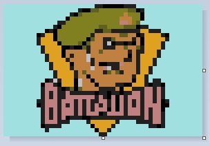
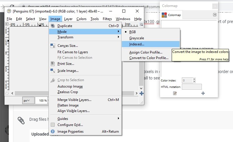
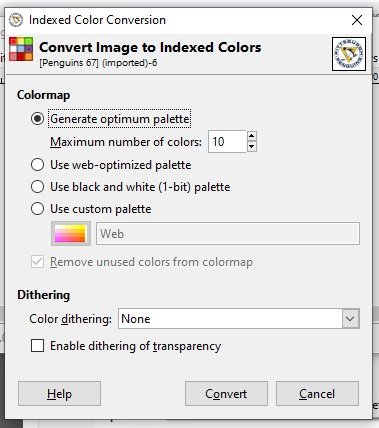
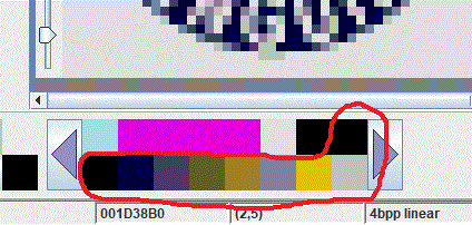
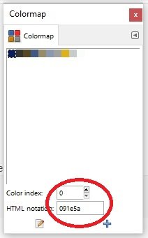
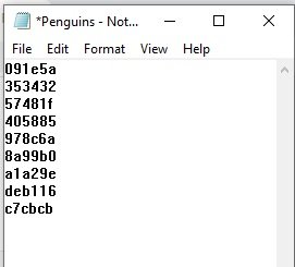
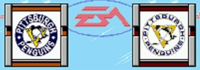
Here's a summary of a conversation between Mr. @Sauce and I had regarding team selection logos. This is the basic outline of the method that I use. Some manual cleanup is still often necessary but it generally gets me a workable image and some consistency. This is just the method that I use, I'm all ears if anyone has other thoughts. I am in no way, shape or form a graphics expert. In fact the below lists the sum of my knowledge of using GIMP. Only figured out enough to accomplish what I wanted to do with reducing the palettes. 1. Download logo from www.sportslogos.net. I like using the small 150x100 .gif files because they're already sort of preshrunk and they are also in the right proportions for using as center ice logos. More on that later. 2. Using Paint, I shrink the image to a maximum height OR width of 46 pixels (depending on orientation) in order to give a minimum pixel border on each side. Regardless of how you want to crop, resize to 48x48 and save as a 24-color .bmp. I also take out any TM or R marks at this point because they're too small to see at scale anyway. 3. Using GIMP, I open the file and convert to an indexed image. Image => Mode => Indexed. 4. There are 9 available slots in the Tile Molester palette for team selection logos. You'll want to convert your logo to fewer colors in order to have it match the palette in Tile Molester. Depending on how many colors are in the logo you can reduce it to as few as 1 color (plus B&W). Generally I prefer to use as many colors as I can so that it gives a fade effect. Fewer colors can produce a "too sharp" effect, but it's all just style and preference. In Indexed Color Conversion, select "Generate optimum palette". You'll already have white permanently available in the palette so you can select up to 10 as the maximum number of colors. 5. After converting your image the colormap will show the colors that were used. (If the colormap is not visible, go to Windows => Dockable Dialogs => Colormap in the GIMP menu bar). Copy the 6-digit HTML notation to notepad, then scroll to the next color using the arrows in Color index. 6. To save your reduced-color image go to File => Export As. IMPORTANT: while saving, make sure that you have checked the Do not write color space information box. 7. In Tile Molester, navigate to where you want to insert your new logo and load the correct palette: 7. Double click the color that you want to change (don't touch the first 7 colors as they are attached to the team selection banners). Select the RGB tab and copy/paste your color code from notepad and hit OK. Tile Molester will automatically convert to the nearest available RGB color. Since there are only 256 specific colors available to the game, occasionally 2 colors are so close that Tile Molester will consider them the same and you could have duplicate colors in the palette - it's not a problem. 8. Once all the colors have been changed, go ahead and paste your logo into your ROM. Generally speaking the images come out pretty good but occasionally you'll want to make a tweak or two to fine tune. 9. Here's how it looks in-game: 10. For this example, I probably would have tried to darken some of the detail in the penguin (gloves, scarf) and maybe a little in the text to sharpen it up.


-
I was leaning towards Jarvis but a lot depends on finding the right picture. Been buried in scouting reports lately so the draft eligibles kind of have my attention right now.
-
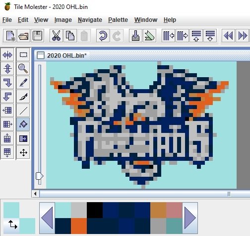
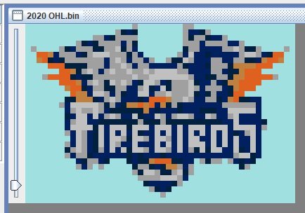
Continuing the trek westward... 2020 OHL.bin Enjoy!

-
Are the banners for '95 the same as '94? The Jokerit one looks really cool but if you wanted to go old school I already did these for an unfinished '94 version and would be happy to share.
-
In the original game the helmet colors match the jersey colors. Helmet patch rearranges the colors in the player sprite so that teams can use the proper helmet colors.
-
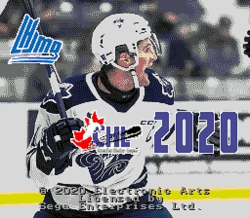
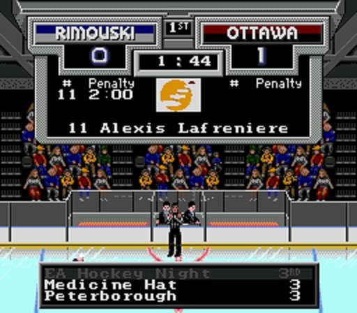
2020 QMJHL.bin In addition to the 18 league teams I included the All Star Team and Team QMJHL from the CIBC Canada/Russia Series. As a special bonus, I created a "French" version for fun. Much of the text cannot be translated due to byte limitations but I changed up a few things to give a bit of a different flavor: 2020 LHJMQ .bin Enjoy!