
Jpark
-
Posts
19 -
Joined
-
Last visited
-
Days Won
1
Content Type
Profiles
Forums
Events
Posts posted by Jpark
-
-
Hey @von Ozbourne, I know this is an old thread, but I was wondering if you're going to add any updates to this rom like adding other cities/countries. It'd be cool to see Seattle, Las Vegas, Colorado, etc etc added.
-
This is very well done! Been having a blast playing it. Hope you can come back next season to make another one.
-
Yes dude! I'm very happy to see you come back @AdamCatalyst! Seamor took the words out of my mouth. I love all the work and effort you put into your roms.
-
 1
1
-
-
-
Hey @UltraMagnus, when are you gonna be posting the opening night update to the rom?
-
6 hours ago, UltraMagnus said:
It looks great! Thanks for the fix @UltraMagnus
")
-
2 hours ago, UltraMagnus said:
Yes. Likely every 2 months. Also we run an online league too.
That's good. The NHL 23 logo I've noticed is off to the right a bit too. But a online league sounds like it'll be fun!
-
1 hour ago, UltraMagnus said:
Yup. Will be releasing an update opening jight.
Great! Will you be making updates throughout the year?
-
Hey @UltraMagnus could you fix the kraken logo please?
-
Wanted to say I appreciate all the work you've put into version 6.0 @AdamCatalyst! I hope you continue to add things as time goes on and I hope you continue to make more iterations as well. In a way it's starting to look and feel like a whole new game and I appreciate the work you've put into it.
Also I'm not sure if you've mentioned this before, and if you have I apologize in advance, but when games go to OT, shouldn't it be 3v3 vs 5v5? I'm not sure you've you could change that and/or if you've mentioned that before.
-
 1
1
-
-
1 hour ago, AdamCatalyst said:
Thank-you so much for your kind words (and your help!!!
Please let me explain about the banners… The banners on the main menu screen each have their own custom 15 colour palette shared only with that teams corresponding logo, which works quite well. However, the banners on the playoffs screen and on the scoreboard in game all share one single 15 colour palette… with the audience in the arena!!! And some of those colours (the browns and light reds) are useless!!! So basically, you need to colour every teams banner with the same red, orange, yellow, green, a slightly darker green, blue, a slightly darker blue, , medium gray, dark gray, black, and… that’s about it.
In the past I had complaints that I had coloured San Jose in blue, just ROMs by Sauce, Naples, etc. For v5 I went back to the original NHL ‘94, and realized that they handled San Jose differently back then, by “dithering” colours. This was a common practice back in the day on the Sega MD/Genesis, where two different coloured pixels are used in a pattern to optically blend to a third colour. Of course, the effect isn’t perfect, but after trying it for every single team, I found that for about 6-8 teams the effect looked more accurate to me than the solid colors one is stuff with.
I really appreciate you noticing that level of detail, and reporting back to me! If it was a mistake, I totally would have wanted to fix this ASAP! But it was actually intentional for better or for worse.
Ohh! Gotcha! Thanks for explaining everything! Wasn't sure if it was a glitch or not, I see now. Keep doing what you're doing
-
1
-
-
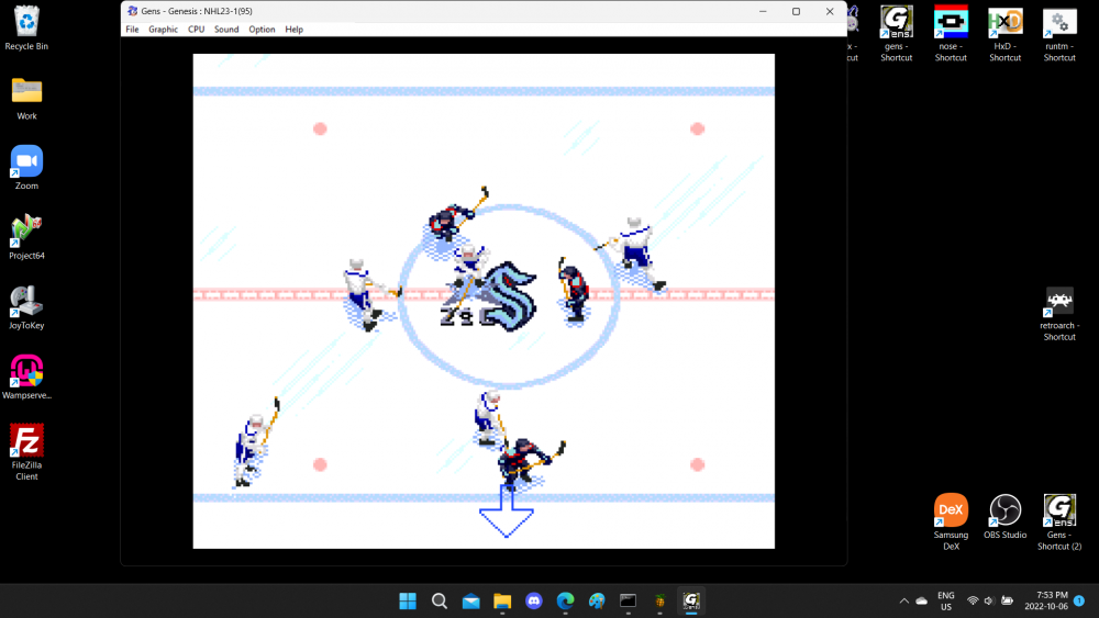
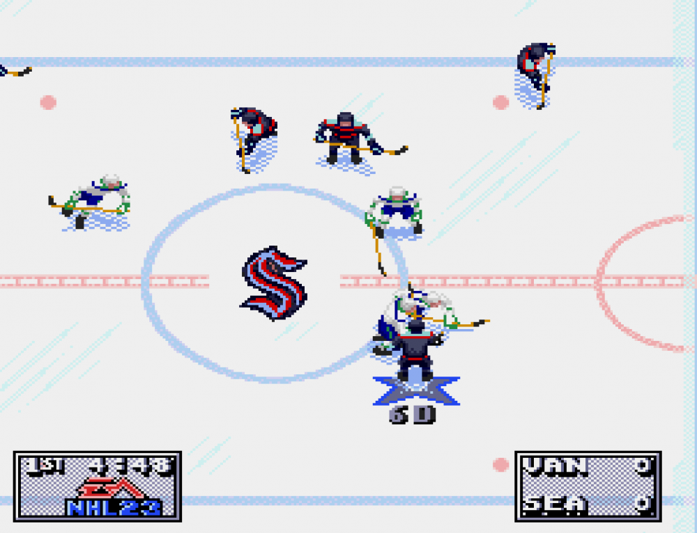
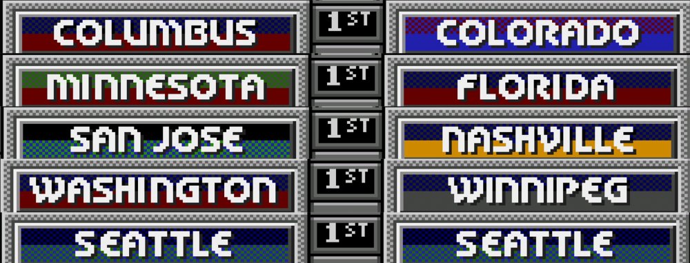
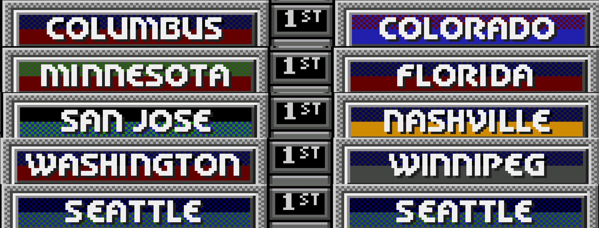
Started playing tonight and I love how you've redone the on ice logos of every team. They all look great. A glitch that I've found so far, is once you select your teams and you get past the overall ratings of the teams and you get to the versus screen (pause menu), the colors of some teams are messed up. I noticed it first with Seattle, and they seem to have it the worst, but I went through every team and found that Colorado, Columbus, Minnesota, Florida, San Jose, Nashville, Washington, Winnipeg and Seattle have this issue.
-
1
-
-
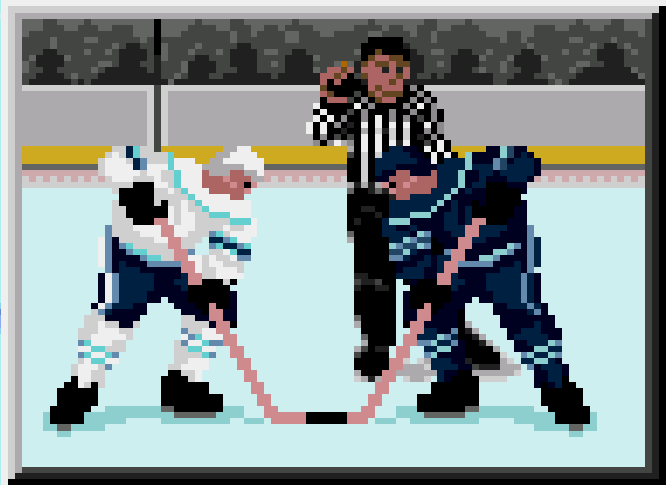
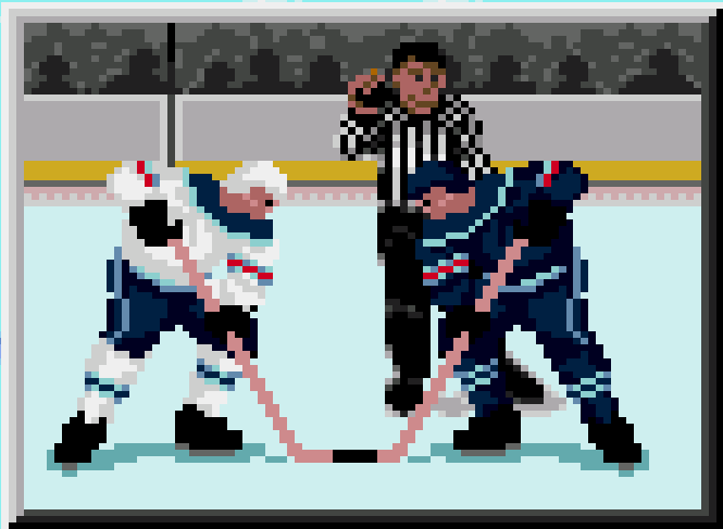
On 4/11/2022 at 8:52 PM, AdamCatalyst said:
OK @Jpark , it's Seattle review time!
I've attached a bunch of images from version 4.1 and a beta of version 4.2, where I tried messing with the Seattle colours as you suggested. As you know, the blue shoulders are, well, wrong. But that being said, I feel like, in play, the blue shoulders end up balancing out the uniform to give a closer impression to the real deal, despite being technically less correct. I could really go either way on this. You are the Seattle fan, let me know which you think give a more authentic sense in motion. PM me if you want me to send you the Beta so you can play with it yourself.
cheers,
-a
p.s. look closely, and you can also see the new face-off animation frames, composite sticks, and more.
![NHL 94 [h] 2022 AC v4.1 - 2022 03 29 2022-04-11 22.31.18 2.png](https://forum.nhl94.com/uploads/monthly_2022_04/1775549534_NHL94h2022ACv4.1-202203292022-04-1122_31_182.thumb.png.35d39f2c6275d75e85961a02c10b2533.png)
![NHL 94 [h] 2022 AC v4.2 - 2022 04 11h 2022-04-11 23.35.30.png](https://forum.nhl94.com/uploads/monthly_2022_04/263226034_NHL94h2022ACv4.2-20220411h2022-04-1123_35_30.thumb.png.847f861869e095028d148d5eaa7e8e95.png)
![NHL 94 [h] 2022 AC v4.1 - 2022 03 29 2022-04-11 22.31.28.png](https://forum.nhl94.com/uploads/monthly_2022_04/1922529529_NHL94h2022ACv4.1-202203292022-04-1122_31_28.thumb.png.8172d366d150e712e7746d7800fc7475.png)
![NHL 94 [h] 2022 AC v4.2 - 2022 04 11h 2022-04-11 23.35.40 2.png](https://forum.nhl94.com/uploads/monthly_2022_04/200837041_NHL94h2022ACv4.2-20220411h2022-04-1123_35_402.thumb.png.faa38f8eeda9f6a80cbb1969f29336ba.png)
![NHL 94 [h] 2022 AC v4.1 - 2022 03 29 2022-04-11 22.31.30.png](https://forum.nhl94.com/uploads/monthly_2022_04/1083121887_NHL94h2022ACv4.1-202203292022-04-1122_31_30.thumb.png.b716a9ecc16693758c61d8ec2731d861.png)
![NHL 94 [h] 2022 AC v4.2 - 2022 04 11h 2022-04-11 23.35.42 2.png](https://forum.nhl94.com/uploads/monthly_2022_04/29253161_NHL94h2022ACv4.2-20220411h2022-04-1123_35_422.thumb.png.b7cb4f933f33d81de1f54c5f1e7a845c.png)
Hey @AdamCatalyst, sorry for the late response. It's been a bit busy and stressful for me lately.
"As you know, the blue shoulders are, well, wrong. But that being said, I feel like, in play, the blue shoulders end up balancing out the uniform to give a closer impression to the real deal, despite being technically less correct." - I completely agree! Although it's "wrong" and everything, I think it looks good! It looks good in motion too. I've noticed the new face-off animation frames and composite sticks as well and it's looking great. I'm not sure if you could have the colors look any better than they do now with the 4.2 revision. I appreciate it again that you gave my suggestion another look. I think in terms of how the jersey colors are laid out for NHL 94, that's as accurate as I think it'll get. Great job!
-
1
-
-
14 hours ago, AdamCatalyst said:
Thanks for your kind words.
I promise when I get to my final Seattle tweek, and I will review everything you wrote here.
No problem! And I'm glad to hear that. I'm sure when you get to Seattle, you'll do what looks best and do what is most accurate. The more I look at the jerseys, but more I see that the only thing that may "need" to be added is just a deep sea blue stripe in-between the ice blue of the away jerseys. But, you can change it to what you think looks the most accurate when you get to it. I just want to make sure it's accurate, but I can tell you're trying to be as accurate as possible with jersey colors, ratings, pictures, and many other things in your list. I'm sure what you decide on will look the best. Keep up the good work!
-
1
-
-
I understand where you're coming from when you mentioned the colors are set to look accurate in motion. The red stripe may stand out too much like you said. It is barely visible with players in real life. Maybe for the away jersey, the stripe in the middle should be the same color as the home jersey is. I think it already is? And the stripe on the legs should also be the same color as well vs it being white. I think Seattle is the only team where their away jersey has white on their collar, which is how it is in real life. I thought the shade of the blue from the home jersey might look good with it being on the collar of the away jersey, but I think it looks good either way. The home jersey honestly looks good at is it. I think the away jersey could use some more blue on the stripes on the sleeves and legs, and the stripe on the pants. The collar looks fine either way if it was white or blue.
I appreciate you giving my suggestion another look. I can tell you put a lot of love and care into this rom, especially with the trade deadline version. Thank you so much for all that you've done with this rom and it's current revision.
Cheers!
-
 1
1
-
-
Hey Adam! I've noticed something with the Kraken jerseys, mostly the away jerseys. The first picture is how they look in game, and the second picture is how I think they should look. What do you think? Are you able to make those changes?
-
Hey Sauce,
Just a very small nitpick, I've noticed looking at teams who play at home that their logo vary in size. Some are bigger than others. If it's not too much of a hassle, could you have all the logos be the same size? If possible, maybe using embroidered logos might make them look sharper.
Just a thought.
Cheers!
-
25 minutes ago, Sauce said:
Hi everyone!
As a nice, little surprise, I have added the Seattle Kraken to my 2020 Playoff rom (NHL94 2020 vPO). There is no longer a NHL Prospects team. The Kraken players are based on the players from the 1917-1919 Seattle Metropolitans. 5 of them (Frank Foyston, Harry Holmes, Lester Patrick, Jack Walker and Gordie Roberts) are in the hockey hall of fame. The Mets were the first US-based team to win a Stanley Cup which they did in 1917. Around that time, Foyston was considered one, if not the, top skaters in hockey. Some of the players got some games in the NHL once that league started up but, by that time, were near the ends of their careers. I don't believe any of the players are alive today so, basically, you're playing with ghosts until the Kraken gets some players on their roster. LOL. Also, back in the early 1900s teams only carried 9-10 players so this particular roster has 2 goalies, 7 forwards and 5 defensemen. The rest of the teams have the usual 3/14/8 structure.
Because they are an expansion team, I gave them a low team rating (same rating as Detroit, which is the lowest for 2020). However, they do have some good players on the team so it may not feel like an expansion team if you play as them.
I have also added Seattle to the playoff brackets. They open against Vancouver. I also fixed a mistake in the brackets of my last PO rom (which this replaces).
If you have any questions or if you notice any errors, please let me know. Enjoy!
Cheers!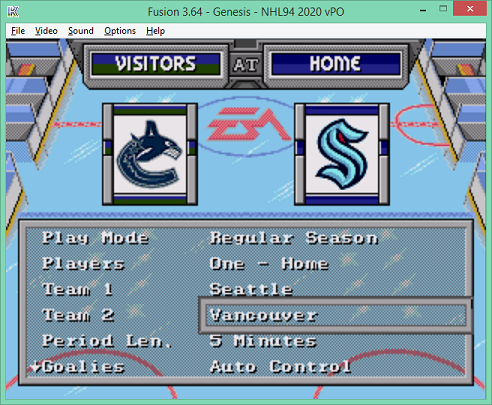
Thank you for adding the Kraken! Can't wait for this team to start playing next year.


![NHL 94 [h] 2022 AC v4.1 - 2022 03 29 2022-04-11 22.31.18 2.png](https://forum.nhl94.com/uploads/monthly_2022_04/881980987_NHL94h2022ACv4.1-202203292022-04-1122_31_182.png.7a146c3fa0e2aa0d60f23e84a295316a.png)
![NHL 94 [h] 2022 AC v4.2 - 2022 04 11h 2022-04-11 23.35.30.png](https://forum.nhl94.com/uploads/monthly_2022_04/786774044_NHL94h2022ACv4.2-20220411h2022-04-1123_35_30.png.ff857f57a4c615ba99380e3194f4ee48.png)
![NHL 94 [h] 2022 AC v4.1 - 2022 03 29 2022-04-11 22.31.28.png](https://forum.nhl94.com/uploads/monthly_2022_04/294454567_NHL94h2022ACv4.1-202203292022-04-1122_31_28.png.d95ab29b36fdae29f2a4933f7bac0c63.png)
![NHL 94 [h] 2022 AC v4.2 - 2022 04 11h 2022-04-11 23.35.40 2.png](https://forum.nhl94.com/uploads/monthly_2022_04/2117338781_NHL94h2022ACv4.2-20220411h2022-04-1123_35_402.png.ef51c22016ef661de929ac5e9179e8be.png)
![NHL 94 [h] 2022 AC v4.1 - 2022 03 29 2022-04-11 22.31.30.png](https://forum.nhl94.com/uploads/monthly_2022_04/1309859486_NHL94h2022ACv4.1-202203292022-04-1122_31_30.png.958152cfbe8d1ecf80f9acc139874d1f.png)
![NHL 94 [h] 2022 AC v4.2 - 2022 04 11h 2022-04-11 23.35.42 2.png](https://forum.nhl94.com/uploads/monthly_2022_04/1518585785_NHL94h2022ACv4.2-20220411h2022-04-1123_35_422.png.3fd771b5c47c0ca1ea596f444792cb27.png)
Blades, of Steel, II *shink* [EA Hockey 91]
in Genesis Roms
Posted · Edited by Jpark
Yeah I get how this rom was based on fictional teams from the famicom disc system version. The idea of having other cities/countries always popped in my head when revisiting this rom, a big "what if". If you ever do a part 3, I think that'd be a fun idea. I admire all the work you put into this rom, it's probably my favorite that you made. Cheers!