AdamCatalyst
-
Posts
487 -
Joined
-
Last visited
-
Days Won
64
Content Type
Profiles
Forums
Events
Posts posted by AdamCatalyst
-
-
15 hours ago, George said:
On another note, is it possible to increase the speed at which this is emulated or something? It seems to run slower than I remember it or maybe it's just me. But it would be nice to speed up the game a bit.
I’m not clear what you are asking… Are you asking about simulating overclocking or some kind of water playback mode with your emulator software? I wouldn’t really know about that, but I am under the impression it is possible with some emulators, with some games.
-
1 hour ago, smozoma said:
Doesn't this already have hot/cold randomness minimized? It says "less variance in Hot/Cold rating randomization" in the description. If this is Chaos's hack, then it reduces the hot/cold effect from +/- 6ish percent down to 3 percent.
Yeah, but I actually didn’t set it as low as he did (4), I’ve got it somewhere in-between (7). I’m embarrassed to say I never could quite wrap my head around the seemingly simple logic, but set it based on play-testing instead. If I understand you & chaos correctly…
…the original RNG of 9 plays out as…
~6% (1/18) odds of -3 (random values -9)
~17% (3/18) odds of -2 (random values -8,-7,-6)
~17% (3/18) odds of -1 (random values -5,-4,-3)
~28% (5/18) odds of 0 (random values -2,-1, 0,+1,+2)
~17% (3/18) odds of +1 (random values +3,+4,+5)
~17% (3/18) odds of +2 (random value of +6,+7,+8)
…while my RNG value of 7 should plays out as follows…
~14% (2/14) odds of -2 (random values -7,-6)
~21% (3/14) odds of -1 (random values -5,-4,-3)
~36% (5/14) odds of 0 (random values -2,-1, 0,+1,+2)
~21% (3/14) odds of +1 (random values +3,+4,+5)
~7% (2/14) odds of +2 (random value of +6)
Not a huge change, but I like it this way.
") Most importantly to me, it reduced the chance that an attribute will be boosted or cut by more than 1 from 40%, to 21%.
Most importantly to me, it reduced the chance that an attribute will be boosted or cut by more than 1 from 40%, to 21%.
-
5 hours ago, George said:
sure I can beta test it.
Is the ripple effect such a problem? Player stats should remain relatively constant I would think. Maybe sometimes a player went to sleep late or ate too much steak the day before but like you know a players stats are a players stats lol
Is it such a problem? Well, the unknown is the problem, and I don’t want to invite the unforeseen. The randomization settings have already been thoroughly tested, and I don’t want to disrupt that.
Whether or not player attributes should remain constant game to game is a matter of opinion or preference. I'm happy with the way the variance has been managed, reducing, it from the original, but still keeping some minor variance game to game, situation to situation, to keep things fresh.
-
1 minute ago, George said:
Maybe reduce the amount of randomness?
Unfortuneately that would have a ripple effect on other things.
I am going to try remapping the Aggression distribution. It should make a minor difference. Would you be willing to Beta test this for me?
-
Hi everyone,
Just a quick note, related to my post above.
I will be releasing a version 5.5, that has minor updates to a myriad of things, but it won’t be released until I get more feedback and have logged more playtime hours.
Right now my focus has been on getting the energy Depletion & Recovery rates right, as I am still unhappy with how they play in some games.
In my current v5.5 betas, I have got it better, but still not quite right. If there is anything else in the game that you notice that you think could be better, please let me know ASAP!
I won't be making any big revolutionary changes, but I do want to make sure that every mod has been thoroughly play tested, and any issue teased out. And your input on this is both welcome and encouraged.
cheers,
-Adam
-
 1
1
-
-
6 hours ago, George said:
In playing like ~10 games in a row I noticed there are too many penalties called. And it's just random. It's usually for something the AI did I think. Also injuries from a direct body check happen.. I wouldn't say frequently but 5-6 times in 10 games or something. Maybe that's how the original game is, I don't remember but it's just... not realistic. Then I get a penalty for kneeing... ok... otherwise good.
Hi there,
Thanks for the feedback! Lately I’ve been playing a 20 minute game a night, and I know exactly what you are talking about. Most of my games are fine, but the other night I was Edmonton playing Calgary, and Calgary just lost their mind and took penalty after penalty. And I hate when I get called for a penalty on a hit where I've not charged the opponent.
I'm not sure what I can do about this, but I will share with you what I did, in case you can think of a way to do it better! And so that you can tweak it to suit your own tastes better.
I ran simulations with a myriad of Player Rating combinations, and found that two attributes had the most significant impact on penalties being called…
1. Aggressiveness. This was exactly what I expected.
2. Checking. The checking rating doesn’t just affect the quality of a players body checks, but it also a higher rating also increased the frequency and tendency to body check in a scenario.
I learn this stuff by trying settings, then running 24 games at once, and tracking the statistics from those games. What I found was that both of these settings had a similar affect on Penalties called AND Body Check thrown by the CPU. Setting them both to zero would reduce penalties called, but reduce body checks thrown to the point that it made the CPU easier. In the end, I relied on Naples & Smozoma’s excellent research, and conformed my checking & aggressiveness ratings curves to the original distributions, but a tiny bit lower on checking, and a tiny bit more lower on aggressiveness. This *should* produce results similar to the original, with very slightly fewer penalties called, and I believe I verified this in testing. I say “should” & “I believe” because I can't find any records of that test! Of course I would have done it, but of course I make mistakes and forget things sometimes. If you were willing to run a bunch of demo simulations of the original vs mine, and report back, I would appreciate it!
There is a third things that affects penalties called…
3. Randomness. Bear in mind that every player attribute is varied by a random amount each game. It is entirely possible that this random process will sometimes disproportionately give a team higher aggressiveness ratings.
I will be releasing a version 5.5, that has minor updates to a myriad of things, but it won’t be released until I get more feedback and have logged more playtime hours to make sure that 5.5 is stable.
Right now my focus has been on getting the energy Depletion & Recovery rates right, as I am still unhappy with how they play in some games.
I would be willing to include an adjustment to the Aggressiveness ratings (but not the Checking ratings), if it reduced penalties without making the CPU easier to play. If you wanted to run any tests and make any suggestions, I would definitely consider them. I have tried to incorporate every piece of feedback I have received to date. But at this point I don’t have time to do anything other than fit in a game for fun, and make notes on what I’d observed, and tweak a value here and there. So I would need your help.
cheers,
-Adam
-
11 hours ago, kingraph said:
I admit I haven't truly taken the time to appreciate the work here until recently. The attention to detail, the extra graphic work done, the organization and explanation is a damn masterpiece. Thank you, it's going to take me some time to fully digest it all @AdamCatalyst!

Thank-you so much. Your kind words mean so much to me. Thank-you again. And thank-you for early on tipping me off about Rewind's graphic treatments, which I ended up scraping and using either as references, or the basis of many revised logos.
-
 1
1
-
-
2022 05 22 - Version 5.4 released (in the first post as alway)
Gameplay: Energy depletion rate reduced, for better gameplay balance.
-
1
-
-
2022 05 21 - Version 5.3 released (in the first post as alway)
Sprites: St. Louis home uniforms had a wrong dark blue colour specified.I discovered this issue as I was archiving the very last of my notes, on team colours. Project frozen now, unless anyone reports a bug.
-
NHL’s 2023–2024 Team Colours
Key Team Colours mapped to the Sega MD/Genesis colour space.
I undertook a massive re-colouring exercise in my 2023 v2+ ROMs, using a wholistic approach to developing a full ROM colour palette, and making colouring decisions based on the relative context of this palette. Here are the key team colours that I eventually settled on. I have spent countless hours working on this, and I believe this to be the most perceptually, relatively, accurate colouration for the league as a whole. I have listed these colour values in two ways. First as a table of all team colours used (top), and secondly as a look-up table for each individual team (bottom, scroll down).
Grouped by Colour
 32  96 160 - Blue (COL)
  0  96 160 - Blue (WPG secondary)
  0  64 160 - Blue (NYR)
  0  64 128 - Blue (VAN logo)
  0  32 128 - Blue (BUF, MTL uniform, NYI, STL, VAN uniform)
  0  32  96 - Blue (EDM, MTL logo, TBL, TOR)
  0  32  64 - Blue (CBJ, FLA, NSH, SEA rounded lighter, STL, VAN logo, WSH, WPG)
  0   0  32 - Blue (SEA rounded darker)

128 192 192 - Blue-Green (SEA)
 96 160 192 - Blue-Green (SEA)
 32  96 128 - Blue-Green (SEA)
  0  96 128 - Blue-Green (SJS 2023)
  0  96  96 - Blue-Green (SJS 2022)

128   0  32 - Burgundy (ARI)
128  32  64 - Burgundy (COL)

224 224 192 - Cream / Sand / Wheat (MIN uniform)
224 192 160 - Cream / Sand / Wheat (MIN logo)
192 192 160 - Cream / Sand / Wheat (ARI)

192 160  96 - Gold (VGK)
160 128  96 - Gold (ANA)
160 128  64 - Gold / Tan (FLA, OTT)

  0 128  64 - Green (DAL, VAN)
  0  64  32 - Green (ARI, MIN)

192 192 192 - Grey / Silver (LAK)
160 160 160 - Grey / Silver (ANA, COL, CBJ, WPG)
 96  96  96 - Grey Dark (WPG)
 64  64  64 - Grey Darker (VGK)

224  96  32 - Orange (NYI)
224  96   0 - Orange (SJS)
224  64   0 - Orange (ANA, EDM)
192  64   0 - Orange (PHI)

64  32 128 - Purple (ARI)

192  32  32 - Red (NYR)
192   0  32 - Red (CGY, CHI, CBJ, DET, FLA, NJD, OTT, SEA, VGK, WSH)
160  32  32 - Red (MIN)
192   0   0 - Red (CAR)
160   0  32 - Red (MTL, WPG)

224 160  32 - Yellow (BOS, CGY, STL)
224 160   0 - Yellow (BUF, MIN, NSH, PIT)
Grouped by Team
Anaheim
Anaheim
224  64   0 - Orange
160 128  96 - Gold
160 160 160 - Silver
Arizona128 0 32 - Burgundy 0 64 32 - Green 192 192 160 - Cream 64 32 128 - Purple
Boston224 160 32 - Yellow
Buffalo0 32 128 - Blue 224 160 0 - Yellow
Calgary192 0 32 - Red 224 160 32 - Yellow
Carolina192 0 0 - Red
Chicago192 0 32 - Red
Colorado128 32 64 - Burgundy 32 96 160 - Blue 160 160 160 - Grey / Silver
Columbus0 32 64 - Blue, Darkest 192 0 32 - Red 160 160 160 - Grey / Silver
Dallas0 128 64 - Green
Detroit192 0 32 - Red
Edmonton0 32 96 - Blue (2023) 224 64 0 - Orange
Florida192 0 32 - Red 0 32 64 - Blue 160 128 64 - Gold / Tan
Los Angeles192 192 192 - Grey / Silver
Minnesota0 64 32 - Green 160 32 32 - Red 224 224 192 - Cream (uniforms) 224 192 160 - Wheat (logo) 224 160 0 - Yellow
Montreal160 0 32 - Red 0 32 96 - Blue (Logo) 0 32 128 - Blue (Uniform)
Nashville224 160 0 - Yellow 0 32 64 - Blue
New Jersey192 0 32 - Red
New York Islanders0 32 128 - Blue 224 96 32 - Orange
New York Rangers0 64 160 - Blue 192 32 32 - Red
Ottawa Senators192 0 32 - Red 160 128 64 - Gold
Philadelphia224 64 0 - Orange (2022) 192 64 0 - Orange (2023)
Pittsburgh224 160 0 - Yellow
San Jose0 96 128 - Blue-Green (2023) 0 96 96 - Blue-Green (2022) 224 96 0 - Orange
Seattle0 0 32 - Blue (rounded darker) 0 32 64 - Blue (rounded lighter) 128 192 192 - Blue-Green Light 96 160 192 - Blue-Green Medium 32 96 128 - Blue-Green Dark 192 0 32 - Red * Note, menu logo is using slightly different palette
St. Louis0 64 160 - Blue (highlight) 0 32 128 - Blue (main) 224 160 32 - Yellow 0 32 64 - Dark Blue (uniform)
Tampa0 32 96 - Blue
Toronto0 32 96 - Blue
Vancouver0 64 128 - Blue (logo light) 0 32 128 - Blue (uniform) 0 32 64 - Blue (logo dark) 0 128 64 - Green
Vegas192 160 96 - Gold 64 64 64 - Grey 192 0 32 - Red
Washington192 0 32 - Red 0 32 64 - Blue
Winnipeg0 32 64 - Blue 0 96 160 - Blue Light 96 96 96 - Grey (dark) 160 160 160 - Grey (main) 160 0 32 - Red-
2
-
-
Hi there folks,
The last update I made (v5.2) had a significant change on gameplay, with the player Speed Burst, Energy Depletion & Recovery all changed. I want to explain how you can change this and more yourself, to customize the ROM to suit your own tastes. If that interests you, please check out this linked post below where I document some of the hacks in this ROM, and how you can customize them.
cheers,
-Adam
-
How-to: Use the Hacks in Adam Catalyst’s ROMs (NHL '94)
This is a counterpart to my ROMs NHL 94: 2022 Edition, NHL 94: 2023 Edition, and NHL 94: 2024 Edition, but you can use this information with most NHL '94 ROMs. I wanted to document and share how you could tweak some of the game to suit your own tastes better, and to document what each of these hacks do. Furthermore, I wanted to make it easier for anyone to lift any of these hacks for their own ROMs. Grab a HEX editor (I use Hex Fiend but any will do), download the latest version of my ROM (below) and change things up!
Important Note on Player & Team Data Allocation (v24.1.0 / 2023 12 01)
The Adam Catalyst ROMs are built on @slapshot67’s 32-Team ROM as a base. One key difference, is that the 2022 & 2023 editions were restructured to use a fixed 820-bytes for each Team’s Data, while the 2024 version was increased to use 1024-bytes per team. This makes some aspects easier to manually edit. If you are editing this in NOSE, I strongly recommend that you do not enable “Auto-Bytes Allocation” as it can easily break this structure.
Hacks Index
Each Hack is explained in a self contained post within this thread, and each posted is linked in the index below. You can use this first post as an index to navigate the thread.
-
Allocate Player & Team Data
-
Opening Logo Screen Timing
-
Title Screen Credits
-
Period Lengths
-
Default Settings
-
Text Edits
-
Menu Crash Fix
-
Player Photo Order
-
Player Overall Ratings Formula
-
Smaller Hot/Cold Variance
-
Speed Burst Multiplier
-
Stopping & Crossover Rate
-
Energy Depletion & Recovery
-
Rink & Net Size
-
Goalie Range of Motion
-
Goalie Hold Time until Whistle
-
Clock, Score, & Line-Change Overlays
-
Penalty Shot & Shoot-out Overlays
-
Injury Overlays
-
Goal Overlays
-
Penalty Names
-
Players in the Penalty Box (Rink View)
-
Players in the Penalty Box (Sideboards View)
-
Stars of the Game Formula
-
Stars of the Game Layout
-
Player Cards - Vegas & Washington Crash Fix
-
ROM Header
Additional Resources IndexThese are separate How-To posts that I've written, outside of this thread. They don't specifically reference my ROMs, but they cover methods that I have used. I've tried to write them to be as thorough and user friendly as possible. Always be sure to check out the comments, as people sometimes share some great tips and tricks of their own.
Got any questions? Just let me know!
-Adam
-
 2
2
-
3
-
Allocate Player & Team Data
-
I was archiving my files for this project, and realized that there was one more hack that I had researched, but not implemented. And this actually has a significant affect on gameplay, and so…
2022 05 20 - Version 5.2 released (in the first post as alway)
Once more with feeling…Gameplay
- Players: Speed Burst reduced by 25%, for a more realistic feel, and higher difficulty. No more winning every loose puck race.
- Players: Stamina Depletion & Recovery rates both raised.
And that should be it.
-
This is awesome, I love it!
-
OK folks, so version 5.1 has dropped in the first post. Just two things to see here:
- Face-Off sprites have been further refined. Some of the sticks looked a bit curved before, and there was still some minor shadow overlapping problems. All 108 sprite combinations have been tested, it is perfect now.
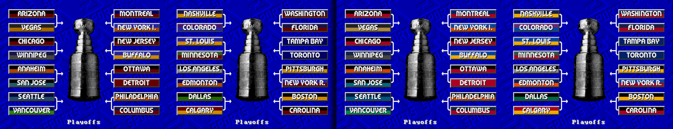
- Play-Off tree Banner colours have been made more authentic.
-
3 hours ago, The Dopefish said:
I agree that the colors in 5.1 look more accurate, and I like them more than 5.0. I think in many cases the colors are legacy holdovers from previous iterations and haven't been updated as the team's have changed their uniforms.
I do feel like there could be an effort made to vary the banners a little more. For example, there's a lot of black-top/color-bottom styles; in fact I see none here that are the reverse (color-top/black-bottom) and I feel like Dallas and Chicago both could go that route. To me it would make sense if those banners reflected the sweater (top) and pants (bottom) colors of the "home" (color) jersey, but I see a few teams already in my research where black is the color for both the sweater and pants, so that should be considered as well. I just feel like the banners need a bit more personality and variation. If it were me I would simply go through each team's Wikipedia article and pick the first two colors for each team and try to match both the color and order.
Thanks for the feedback! I've slept on it, and still definitely like it better today.
Those were't old colours before, I'd already updated them more than once! It’s just an extremely restrictive scenario on that page, and dithering only occurred to me last week, and then another workaround occurred to me where I could tweak the definitions of the colours for just the Face-Off window (can't do much more about the Arena banners, at least, I can't with the limitations of my skillset).
OK, you like, I like, let's do it!
-a
p.s. I literally tried *every* method you described (great minds think alike?). I can't recall why I landed on what I have here formula, but I can assure you, it’s a nightmare trying to balance authenticity, consistency, and preferred art direction, when you are limited to just a handful of colours that have to be used for other things. I’m also 100% sure that it can be done better, it always can.
-
1
-
-
On 5/18/2022 at 1:46 AM, Jpark said:
Started playing tonight and I love how you've redone the on ice logos of every team. They all look great. A glitch that I've found so far, is once you select your teams and you get past the overall ratings of the teams and you get to the versus screen (pause menu), the colors of some teams are messed up. I noticed it first with Seattle, and they seem to have it the worst, but I went through every team and found that Colorado, Columbus, Minnesota, Florida, San Jose, Nashville, Washington, Winnipeg and Seattle have this issue.
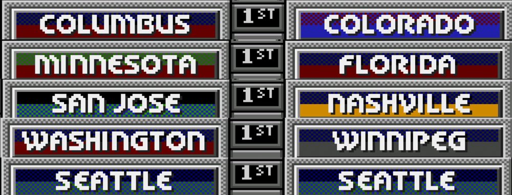
Hey guys. I am still preparing notes and images, and realized, that I hadn't quite got the face-off animations perfect. I couldn't let this one go, and got them refined and thoroughly tested last night. SO… version 5.1 incoming. But before I spit that one out, I had an idea. I can't do the in-game banners any better than I have, but I can tweak the Playoff banners different. Can anyone let me know which colours they prefer for the Playoff banners?
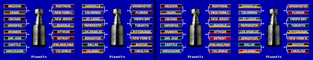
On the left is version 5.0. On the right is the proposed change for version 5.1. The colours are more accurate, but I wonder if some are too bright. Any and all feedback welcome & encouraged.
-
1
-
-
1 minute ago, Jpark said:
Ohh! Gotcha! Thanks for explaining everything! Wasn't sure if it was a glitch or not, I see now. Keep doing what you're doing
No prob! You too, keep doing what you’re doing! Your feedback is always appreciated.
 .
.
-
1
-
-
33 minutes ago, seamor said:
Just tried this out again yesterday before the Battle of Florida. Awesome work.
Thanks man! That really means a lot to me.
I hope the Battle of Florida works out the way you want. I can’t make up my mind with the battle of Alberta, but I suppose I want to watch as much McDavid as I can…
-
1
-
-
6 hours ago, George said:
Honestly Jpark, that is such a minor thing.
Adam, I hope you make this an annual thing. Amazing job.
Thank-you so much! It makes me so happy to hear that people are enjoying this.
-
8 hours ago, Jpark said:
Started playing tonight and I love how you've redone the on ice logos of every team. They all look great. A glitch that I've found so far, is once you select your teams and you get past the overall ratings of the teams and you get to the versus screen (pause menu), the colors of some teams are messed up. I noticed it first with Seattle, and they seem to have it the worst, but I went through every team and found that Colorado, Columbus, Minnesota, Florida, San Jose, Nashville, Washington, Winnipeg and Seattle have this issue.
Thank-you so much for your kind words (and your help!!!
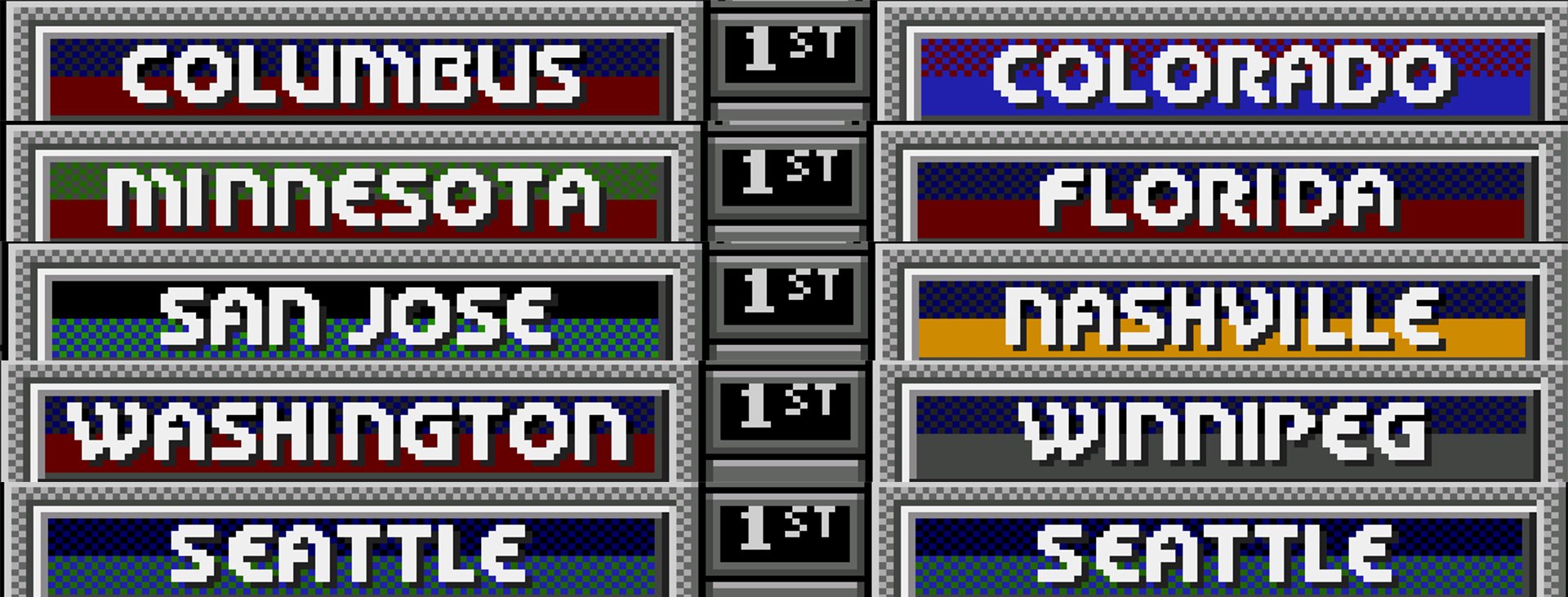
Please let me explain about the banners… The banners on the main menu screen each have their own custom 15 colour palette shared only with that teams corresponding logo, which works quite well. However, the banners on the playoffs screen and on the scoreboard in game all share one single 15 colour palette… with the audience in the arena!!! And some of those colours (the browns and light reds) are useless!!! So basically, you need to colour every teams banner with the same red, orange, yellow, green, a slightly darker green, blue, a slightly darker blue, , medium gray, dark gray, black, and… that’s about it.
In the past I had complaints that I had coloured San Jose in blue, just ROMs by Sauce, Naples, etc. For v5 I went back to the original NHL ‘94, and realized that they handled San Jose differently back then, by “dithering” colours. This was a common practice back in the day on the Sega MD/Genesis, where two different coloured pixels are used in a pattern to optically blend to a third colour. Of course, the effect isn’t perfect, but after trying it for every single team, I found that for about 6-8 teams the effect looked more accurate to me than the solid colors one is stuff with.
I really appreciate you noticing that level of detail, and reporting back to me! If it was a mistake, I totally would have wanted to fix this ASAP! But it was actually intentional for better or for worse.
-
OK, version 5.0 finally posted. The amount of refinements are… well, its a lot. I've got a full break-down with images coming in tomorrow, but for now I just wanted to get this ROM up and out there. It's been an epic trip.
-
On 1/3/2022 at 9:40 AM, The Dopefish said:
This might be a question that is pretty easy to those who are in the know, but: the Sharks' teal can be made on the jerseys, but not on the banner? What gives?
Hi there!
I figured out a solution fro v5. Not a perfect one, but it's better no IMHO. Should be out tonight, take a look and let me know.
-
On 12/27/2021 at 3:24 AM, brianski71 said:
As someone who notices small visual details, though, I do wonder one thing. I am a huge Penguins fan. And one thing that puzzles me is why all three of you guys have the Pens wearing different styles of jerseys home and away. The NHL 94 Genesis template doesn't do the current Pens jerseys any favors, and it's impossible to recreate them perfectly. But I wonder why all three of you have the white jerseys having gold shoulders and the black jerseys not having gold shoulders, rather just a thin gold outline. Since the actual jerseys are essentially the same with just the black and white flipped, I'm curious why the same (either way) isn't done for both home and away on the ROMs. Not criticizing...just wondering!
FYI, after some further experiments, I did finally figure out how to make the Pens jerseys work better, IMHO. I am pretty sure that you will like it better too!
It is done, just still a little more beta testing before I release it, most likely tomorrow.

NHL 94: 2022 Edition by Adam Catalyst
in Genesis Roms
Posted · Edited by AdamCatalyst
Out-of-date Beta build pulled.
Attached is a Beta RC1 of v 5.5. It needs testing of everything below, but most importantly…
If you notice anything is off, please let me know.
--------------------------------------------------
Full change-log as follows:
Main Menu
- Graphics: ~64 Player Photos were re-scaled and re-cropped for better visual balance.
Arena
- Sprites: Zamboni driver wave hand colours adjusted.
- Graphics: Coaches (implied) arm shortened.
Rosters & Lines, & Ratings
- Ratings: Minor changes to virtually all Aggression Ratings.
- Ratings: Minor ratings changes to many Goaltenders, and minor changes to Anaheim’s Defence.
- Rosters & Rosters: Minor changes to Anaheim’s Defence.
Gameplay
- Players: Energy Recovery rate slightly increased, for better gameplay balance.
--------------------------------------------------
EDIT: Beta has been pulled, as it is out of date. If you downloaded this and have any feedback, I'd love to hear it!