

Jkline3
-
Posts
209 -
Joined
-
Last visited
-
Days Won
38
Content Type
Profiles
Forums
Events
Posts posted by Jkline3
-
-
13 hours ago, skip said:
Nice work man! I'd love to see some CHL ROMs but doing 3 ROMs for one season is TOUGH! Well done.
Someday... Trying to finish my NCAA stuff but it's on the list.
-
Updated version based on final season stats. Going to be more than a few of these kids showing up in the NHL in a few years.
-
Doing some housecleaning of some old projects I started and never quite finished up and came across some pre-NHL and early NHL vs PCHA/WCHL roms that kind of fell between the cracks. I did some graphics updates with the ice markings and net layout but then kind of got sidetracked with other things...
In the interest of accuracy, was wondering if anyone had ever figured out the possibility of permanently including the extra attacker (therefore bringing back the Rover position) and making the game 6 v 6 with a goaltender? I've seen @The Sauce has a 3 v 3 but was curious if you could also go the other direction?
Early games were also often played in two halves instead of three periods, any chance it would it be possible to make the 3rd period into OT and eliminate the OT period? I know the owners would be unhappy because it will cut into concessions but trying to stay accurate to the rules at the time as much as possible.
Anybody have any ideas where to start digging? It would be nice to give the game a different feel for those early Stanley Cup days.
-
Been discussing this on another thread but posting this separately (mostly so I can find again later...) in case anyone else cares to use.

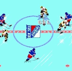
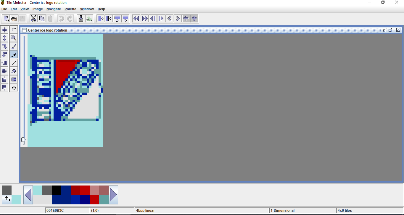
Changing the orientation of the center ice logo to match the layout of current NHL ice surfaces is pretty simple, you only need to rearrange the order of the tiles in a hex editor.
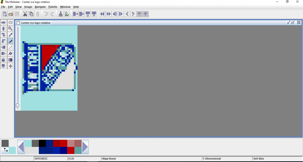
In Tile Molester, add your ice logos as usual, however rotate them -90 degrees and change your view from 6x4 to 4x6:

In a hex editor the following needs to be updated to change the orientation from horizontal to vertical:
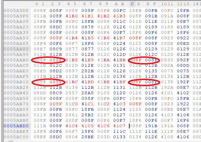
If you want to bring the red line up to the logo and not leave blank space, change the top 2 pairs of circled 008F to 012B and the bottom 2 to 112B.
-
 3
3
-
 1
1
-
-
Here are the hex codes that need to be rearranged to make vertical:

The 008F circled in red need to be changed to 012B for the top pairs and 112B for the bottom pairs to bring the red line up to the logo.
Here's how the logo should appear in Tile Molester:
-
2
-
-
3 hours ago, The Sauce said:
Agreed... it does look better than before. Nice job bud! I’d be curious to see what it would look like with the red line extended.
Oh, small detail, the center ice logo needs to be rotated (if you ever go this route on a ROM). The logos face away from the team benches. But again, nice job figuring a way to make it less “squished.”
Details, details
 !
!
Pasting the logos in Tile Molester are actually MUCH easier than what I did the first go around... All you need to do is rotate the logo and set to 4x6 in TM as opposed to 6x4. No cutting and pasting of individual tiles necessary.
-
2
-
-
Here's an example of what a vertical logo would look like at 48x32, please don't mind the quality as I just slapped this together quickly...
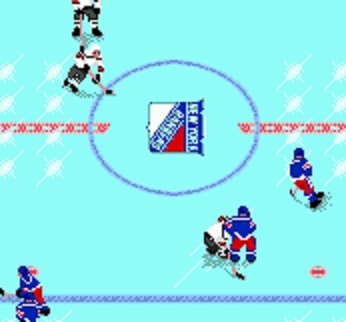
@The Sauce, you might notice this looks less "squished" than our previous conversations as the logo used had been "stretched" (really busting out the technical jargon
 ). Maybe this accounts for why it looked so awkward? It's also relatively simple to bring the red line up to the logo.
-
1
-
-
Yes, it can be done but it does take a little work. You just need to change the order of the center ice tiles in a hex editor. The trick is that you need to cut the logo into individual tiles then rotate and reorder them in Tile Molester so that they appear correctly on the ice. I'll see if I can dig up the specifics later.
Personally, I prefer keeping them horizontal even if it is less realistic. Not sure if it's just familiarity or the fact that the game scrolls top to bottom and it looks better on screen that way.
-
1 hour ago, smozoma said:
Yes, I think something similar was done for the amazing "soccer" ROM
There was also some really outside-of-the-box stuff in the Ball Hockey ROM.
-
Interesting idea... It wouldn't be super difficult to remove the crowd/stands to make an "outdoor" rink, just time consuming. May have already been done before, actually.
-
I re-purposed The Sauce's 2020 ROM with Winter Classic graphics to give my kids something to do for the last couple days of break...
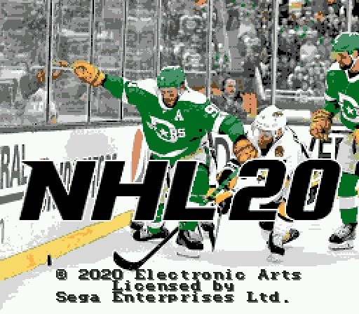
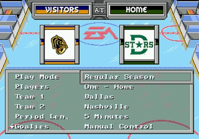
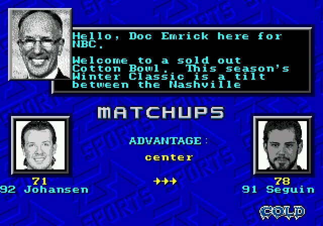
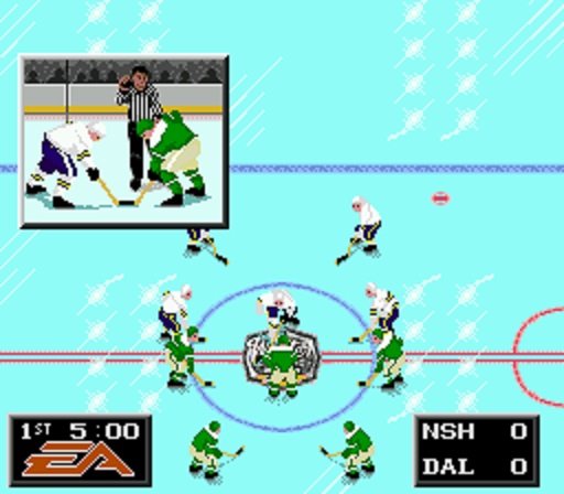
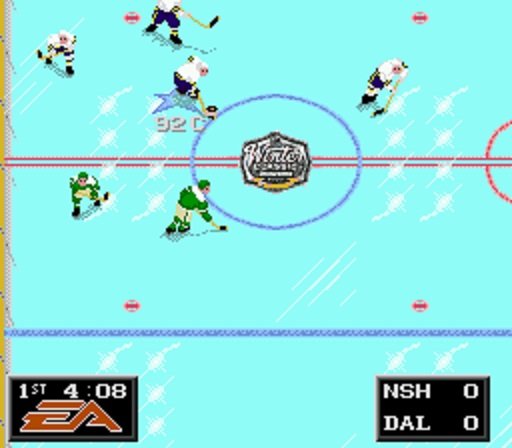
Please note that it's really only meant for Nashville at Dallas as changes I made to the ROM have effects on other teams that don't translate. If there's any interest I could update to make the other teams with outdoor-style uniforms,
-
6
-
-
Keep plugging away and let me know if there's anything else you need help with. Trust me, it gets easier and easier!
-
I've started a few things with artwork (for me, the biggest time consumer since many of the new-ish logos don't shrink to 48x48 or 32x48 nicely with a limited palette and generally require a lot of playing with to look decent in-game) and partially finished a QMJHL one. I put these together in my free time, which unfortunately I don't have enough of...
Probably someday?
-
Sorry, just uploaded the version that includes the playoff tree. I don't normally use playoff mode so it's the last thing that I do.
-
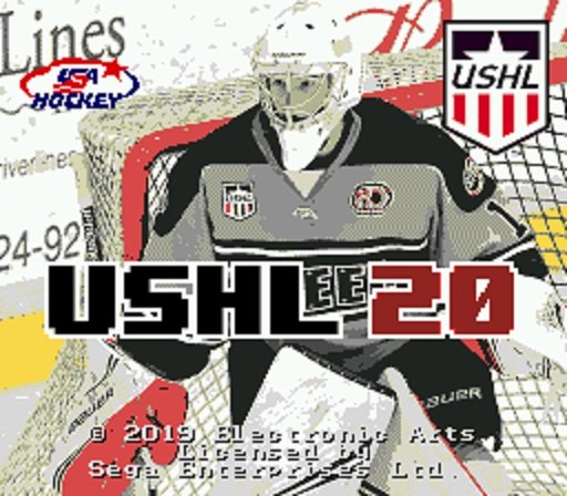
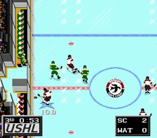
Something a little different. For those not familiar, the USHL is the only Tier I junior league in the US. Last season 52 players were selected in the NHL entry draft including 17 from the US National Team Development Program. Teams are based upon current(ish) USHL rosters and line combinations. Player ratings are based on a combination of scouting reports and actual performance through the first 20% of the 2019-20 season.

-
2
-
-
Thanks for the note - always nice to hear someone is using these! I've been working on some more era-realistic graphics and will make sure to update this one when I'm finished.
-
1
-
-
On 8/7/2019 at 12:24 AM, smozoma said:
Amazing prep
Don't hesitate to ask questions if you get stuck on anything.
#1 tip: keep multiple backups as you go, so if ever you realize you made a mistake, you can go back to an earlier ROM.
THIS - a million times over, in bold and 72-point font. Nothing more dejecting than realizing you flubbed something along the way and have to start from scratch.
-
Just speaking for myself, yes... ish. I've updated previously patched roms to change other features such as ice and other edits to jersey and pant striping.
In my particular case the issues came about after changing stick tape to blade color in advance of changing the (patched) stick color to a dark gray.
-
Strangely enough I ran into something very similar today while updating sprites to match current IIHF national teams' jersey styles. Everything was good until I changed the stick color and then helmet colors went haywire for several teams. Funny thing is that it seems to primarily affect tiles which contain an "eyeball" which is also the color that I used for the sticks...
-
It's easy to extract the player photos, you would just need to rescale them unless you've got some *really* tiny frames...

-
On 4/10/2019 at 1:17 PM, Brodeur30 said:
Those are very useful. Thank You. I was trying to find those earlier but was unsuccessful in my code searches. I plugged those into RAM Watch in Gens and moved around the player to see all the values.
Now that I can see the values, it looks like the left most X point is FF80 and the right most X point is 0080.
I had a look in memory editor. I can get the player on the other side of the boards by editing the value of FFB14A, i.e. changing FF80 to FF60. or changing 0080 to 00A0. If I do that, the player warps to the location beyond the boards, but then you try to move him from there and he starts sliding back towards the ice. There may be a value somewhere near there that removes or extends the barrier, so you can freely skate from FF80 to FF60 for example, but that X position code may need to be traced to find that. Generally the methods I use to find codes are by searching.
I attempted to edit those X and Y speed addresses but I haven't been able to edit the player's speed like I was able to move the player with the position codes.
If you have any luck with extending the barriers I volunteer to redo the rink graphics.
-
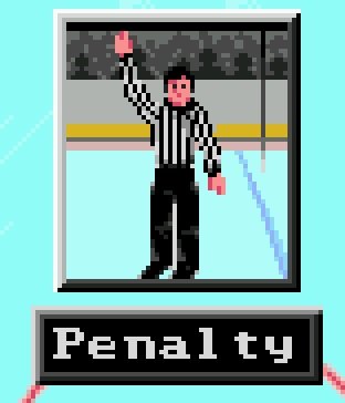
Yikes, that's even more of a jumbled mess than expected... I'm building some historical rink layouts and am almost finished with a 1950s style that has blue kickplates instead of today's yellow.
I changed out the yellow everywhere except for those referee popups (you might notice it in the top picture) and it was really bugging me. Some of the yellow pixels in that jumbled mess are part of the kickplates, others are not. Going to be a lot of trial and error!
I had already given up any hope of orange ref shirts but those would look so nice.

-
1
-
-
Anyone know where to find these guys?

-
I was heading in the opposite direction with 2 kids in tow, having a spirited discussion as to whether or not Dippin' Dots counted as a treat because it's not "really" ice cream

NCAA 2020 - Atlantic Hockey
in Genesis Roms
Posted
This has taken far longer than I had hoped (save your work regularly ladies and gentlemen!!!) but this is what I plan to be the first of the six NCAA conferences followed by a consolidated ROM for the Frozen Four tournament.
2020 Atlantic Hockey.bin