

TruePensFan1981
-
Posts
243 -
Joined
-
Last visited
-
Days Won
2
Content Type
Profiles
Forums
Events
Everything posted by TruePensFan1981
-
Look at the 6 teams Rich Nash would approve a trade to
TruePensFan1981 replied to PRoBob38's topic in NHL Discussion
If the Pens are to make a deal with the Oilers, I would gladly trade Martin to them for Paajarvi. We would be rid of Martin and his smooth skating would be an upgrade to that horrible Oilers defense. Paajarvi is tremendously talented and needs to have talent surrounding him. I think he would be a perfect fit for the Penguins' 2nd line on the LW side. Despite Paajarvi's possible upside, I don't see the Oilers being able to command a high return for him, especially since Paajarvi isn't a big part of their plans anyway (they have an abundance of young talented forwards). -
Look at the 6 teams Rich Nash would approve a trade to
TruePensFan1981 replied to PRoBob38's topic in NHL Discussion
I don't think the D was overblown at all. It really was that bad and Fleury was bailing them out for most of the year. Niskanen is clueless in his own end (always has been) and only deserves to play when it's on the PP. I knew the Martin and Michalek contracts were bad and would bite them in the ass since day one. Engelland is physical, but horrid defensively. At best, Engelland is a fringe NHLer/AHLer. Lovejoy is a joke and does not belong in the NHL. I'm glad they finally got rid of Michalek (he was never a physical d-man, despite Shero's claim that he was a physical d-man). Rather than overpaying Michalek, they should have just kept Mark Eaton if they wanted a shot-blocker. At least Eaton is more defensively sound! They should give Despres more playing time. He is a smooth skater who can move the puck and make the outlet pass. He's no Gonchar and he's no Goligoski, but he's good. -
Look at the 6 teams Rich Nash would approve a trade to
TruePensFan1981 replied to PRoBob38's topic in NHL Discussion
I thought San Jose would be a very real possibility. I was thinking the Sharks would maybe trade Vlasic, Clowe and a 1st rounder for Nash; however, the Sharks just gave Vlasic a five-year extension. I have doubts that they would move Brent Burns, so I'm curious as to what the Sharks would be willing to move if they're going to keep Vlasic. Although I do not think it is going to happen, I consider the Penguins to be a very real possibility. After drafting more defensemen this summer, the Penguins have a plethora of talented young d-men who are not in the NHL yet. Perhaps the Jackets would be interested in Eric Tangradi, a 1st and several of those young d-men? If I were the Penguins, I would advise against trading for Nash, however. They do NOT need Nash and his $7 million cap hit. What they need to do is improve their defense after that moron Shero dismantled the blue line several years ago and reduced it to nearly nothing. I cannot believe he seriously thought he could replace Gonchar, Goligoski, Gill and Scuderi with the likes of Martin, Niskanen, Michalek and Engelland! Pathetic. -
Clearly, I screwed up when trying to follow the steps in this thread to get hits to be counted. When I tested the ROM, it froze after a shot on goal. Thankfully, it was only my backup copy. Now to delete the backup copy, open the original and save a new backup copy!
-
Updates: Applied simple weight bug fix (done) Speed affects goalie OVR rating (done) Custom OVR Rating formula for skaters and goalies (done) Replaced PIM with CHK (in progress) In-game clock (done) Center ice logos (done) Team select logos (done) Banner colors at team selection (done) In-game banners (done) Rosters and player cards (in progress) Obviously, the rosters and player cards will not be finished until the NHL season nears. I opted to replace PIM with checks in this game; unfortunately, I have screwed up somewhere. @ 00993, I changed the value from 50 49 4D to 43 48 4B (this changes the stat listing from PIM to CHK). Although CHK is the new stat now, the game does not count the hits (it is still counting PIM). Obviously, I missed something somewhere. Going to go find out what I need to do (I think Smoz posted the steps in the weight bug fix topic).
-
TOOL: Genesis Image Ditherer to 16 Colours (and now SNES, too)
TruePensFan1981 replied to smozoma's topic in Tools
I did have it in the same folder as the executable when using option 1. When you gave me the 48 images, I had the 48 images in a separate folder because I did not feel like having to scroll all the way up to drag my chosen image onto the EXE at all. Once I found the image I wanted to use among the 48, I copied it and then pasted it into the same folder as the EXE, then dragged it to the EXE and was able to successfully do step 3. I find it rather odd that I was unable to have the 48 generated images when I did step 1 with the image in the same folder as the EXE. -
I'm not rich at all. In fact, I don't pay him a damn penny. I think he helps me because I'm Italian and he doesn't want to take any chances of saying no to me.
-
My NHL 13 title screen is finalized. Many thanks to Smoz for his contributions to my development as an NHL 94 editor! Thanks to him, I am able to apply a simple weight bug fix, enable speed to affect a goaltender's OVR rating and can now get a decent title screen!
-
TOOL: Genesis Image Ditherer to 16 Colours (and now SNES, too)
TruePensFan1981 replied to smozoma's topic in Tools
It is my recommendation that this topic be pinned and that Smoz use it to provide any necessary notes to help users with this program of his (unless he decides he wants to create a new topic himself to pin). To those of you who try Smoz's program: in my experience, I found that I had to make the first color in the palette 0-0-0 and the 16th color in the palette 224-224-224. The remaining colors are the RGB values found in the notepad file that his dithering program provides you. The only mystery that remains in my experience now is wondering why I did not get 48 images... thank you, Smoz, for providing me with the 48 images yourself. Your program did the work for me after that point; however, it boggles my mind that the earlier steps did not work for me. -
TOOL: Genesis Image Ditherer to 16 Colours (and now SNES, too)
TruePensFan1981 replied to smozoma's topic in Tools
WTF? Going to try again for a 2nd time to attach the bitmap image. Hoping this works... Girouxcover.bmp -
TOOL: Genesis Image Ditherer to 16 Colours (and now SNES, too)
TruePensFan1981 replied to smozoma's topic in Tools
Hey Smoz. Here's the image. -
TOOL: Genesis Image Ditherer to 16 Colours (and now SNES, too)
TruePensFan1981 replied to smozoma's topic in Tools
Neither of your suggestions work, unfortunately. I had a theory that maybe the problem was my original .bmp had spaces in the title; therefore, I chose to try the whole thing again. What I originally used: Claude Giroux NHL 13.bmp What I tried moments ago: Girouxcover.bmp Space or no space, I still get the same results. It does all the mutations/randomizations and whatnot, and then it says "Press any key to continue." I press any key and.... NOTHING. I even refresh the folder... nothing. I used the searches (with and without the *).... nothing. -
TOOL: Genesis Image Ditherer to 16 Colours (and now SNES, too)
TruePensFan1981 replied to smozoma's topic in Tools
Hey Smoz. I chose method 1 and I followed your instructions precisely. It took about half an hour to run all the evolutions and randomizations and whatnot; when it finished, it said to press any key to continue (so I did). NOTHING. Where are my 48 images? Aren't they supposed to be in the same directory where I dragged my .bmp image onto the thing? -
Now that I look at my title screen again, I'm beginning to think maybe it wasn't as bad as I originally made it out to be. I don't know... I figured I'd post the image here to let you guys judge for yourselves. Not too bad, eh?
-
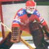
In-game clock logo (done) Center ice logos (done) In-game team logos at team select screen (done) Banner colors (done) In-game banners (done) As for the in-game team logos at the team select screen, the Winnipeg Jets logo looked like crap with all sorts of colors there; however, I corrected it by creating a palette for the Jets and using that palette. Looks great now! All that remains now is for me to edit the energy bar (if I decide I want to do that), finalize the rosters later this summer and edit the title screen. As for the center ice logos: I noticed some of them did not look as good as I wanted them to; so I scrapped some of them and started over again. My palette-editing skills are improving. Logos like the Senators and Sharks look much better now than they did earlier. I have not yet improved the Coyotes center ice logo, but I'm not bothered by the way it looks. The title screen: it doesn't look too bad when I work with it; however, it doesn't look as good as I hoped it would, either. I don't know if it's because I reduced the color depth of the original photo down to 16 colors (for the sake of having a palette to work with) or if maybe I'm just choosing bad photos to begin with. For instance, my original photo was of Claude Giroux skating in on Tim Thomas during a breakaway. After decreasing the color depth to 4bpp (16 colors) and putting it into the game, you can still see Giroux skating in on Thomas; however, the red goal line doesn't look so red anymore and the crease color is barely visible (looks more lightly greyish). Any tips/guidelines on title screen photos, or are they just never going to look as great as I would like them to be?
-
Thanks to those of you who helped me out in the sprites pixel editing topic. Your help is greatly appreciated. Most of all, thanks to Wboy for making this possible for anybody with the 30-team ROM template! Obviously, NHL 13 is far from done; however, here is the progress I've made thus far:
-
Sprite editing pixels...
TruePensFan1981 replied to TruePensFan1981's topic in General Questions & Discussion
Center ice logos and team uniform colors are done. Now onto the team select menu logos! Player cards are in the distant future as rosters become more official by then. This whole thing can be quite tedious sometimes, but I can always count on Scott Hartnell for comic relief. HARTNELL DOWN! -
Sprite editing pixels...
TruePensFan1981 replied to TruePensFan1981's topic in General Questions & Discussion
Making excellent progress thus far. I have put every center ice logo into the game (except the Buffalo Sabres, which I will get around to). I think I did a good job with the Winnipeg Jets logo and palette. Now I must edit the uniform colors for every other team and then I will move on to the team select logos. Here is the Winnipeg Jets logo at center ice after I edited the palette. -
Sprite editing pixels...
TruePensFan1981 replied to TruePensFan1981's topic in General Questions & Discussion
Update on my progress: I put my in-game clock logo into the NHL 13 rom and I like the way it looks. I also eliminated the Anaheim Mighty Ducks logo and replaced it with the more current Anaheim Ducks logo. Displayed below is the Ducks logo at center ice. I think it looks great. Unfortunately, the Ducks logo in the team select startup does not look very good to me. I loaded the palette before importing the image; however, the original palette (Wboy's Anaheim Mighty Ducks palette) did not look right; therefore, I cycled through the palettes until I found one that I thought looked best. It looked good in Tile Molester; however, it did not look great at the team select menu when you start the ROM. In case you were wondering: no, I did not mess with the banners or uniforms yet. As you can see, the Ducks logo in the startup menu doesn't look very good when compared to the center ice logo. Thankfully, I have a backup ROM so I am always able to experiment before finalizing everything. Rather than cycling through the 30 team palettes for the startup menu logo and picking one that looks best, I am going to take a chance later and choose which colors I want to place into the palette itself. Hopefully, this will yield better results. -
Sprite editing pixels...
TruePensFan1981 replied to TruePensFan1981's topic in General Questions & Discussion
Now I feel like an idiot... Wboy's tutorial said DECIMAL offset, not hex offset. You were right, Smoz. And this pic below is what the home strip offset was (I'm supposed to use the decimal offset for the home strip). -
Sprite editing pixels...
TruePensFan1981 replied to TruePensFan1981's topic in General Questions & Discussion
Grumble grumble... so much for editing the graphics in NHL 94! I have come to a dead end with no idea what to do next. Here is my progress thus far... Applied Wboy's 30-team ROM patch to NHL '94 rom (now NHL 13) Opened NHL 13 rom in NOSE and saved it Used the "copy to" function so that I could save .png files of the team logos from the team select menu Used NOSE to find the home strip offset for every team in NHL 13 ROM Dead end: for whatever reason, Tile Molester will not allow me to type in the entire offset I wanted to use the "copy to" function on the teams' center ice logos; unfortunately, I need the correct palette for each logo. I am unable to import the correct palette because Tile Molester will not allow me to type the letter D in the offset at all! For example, Anaheim's center ice logo is at hex offset 001D6F02 in my NHL 13 rom; their home strip offset is 001DCA4E. I cannot import this palette because Tile Molester will not allow me to type in the D for importing the offset! Did anybody else ever run into this problem while working with Wboy's 30-team rom template? -
Sprite editing pixels...
TruePensFan1981 replied to TruePensFan1981's topic in General Questions & Discussion
Using the colors that were already in the palette itself (and selecting the paintbrush tool in Tile Molester), I was able to successfully put my clock logo in the game and have it displayed in the colors of my choosing. Thanks for the help, guys! I am going to do more exploring and see how many pixels each graphic that I want to edit is. Here is what I've found thus far: In-game clock logo: 56 x 16 Player cards: 48 x 48 Title screen background: 256 x 224 Team logos (at team select menu): 48 x 48 I will find out the dimensions for the other graphics when I continue exploring. It seems like editing the graphics in this game doesn't appear to be difficult at all; however, I will have to make sure I don't touch the palette colors that I should not touch (thankfully, the screenshots I have from Wboy's Tile Molester tutorial should help). -
Sprite editing pixels...
TruePensFan1981 replied to TruePensFan1981's topic in General Questions & Discussion
Perhaps. Truth be told, there's a lot of crap I never clicked on before (like the color palette I see in the bottom left of Tile Molester) because I'm paranoid about goofing everything up. Plus, I don't want to get into the habit of trying to overcomplicate things if there are simple solutions. And maybe you guys have simple solutions to suggest to me, but they might be flying over my head at first if you say any of them. I have no experience/training in graphics work or programming work at all. I'm just some random guy trying this stuff for the first time. Prior to this, the only hand I ever had in any ROMs was helping Jesus out with his player ratings for his NHL '91 rom. The only graphics stuff I ever learned prior to this was how to do the player cards. For a guy with no skills in these areas, I feel pleased with the start I'm having thus far. -
Sprite editing pixels...
TruePensFan1981 replied to TruePensFan1981's topic in General Questions & Discussion
Well, after finally knowing how many pixels are in the in-game clock logo, my first test for putting in a clock which reads "NHL 12" is a success with mixed results! I am very glad to see that it was not difficult at all to put my graphic into the game and have it read NHL 12. However, I was disappointed that the "12" is showing up in green (it's supposed to be red). Obviously, I guess this means when I use microsoft paint, I'll have to use custom colors and define the RGB value of said color. It's apparently not as simple as just clicking on the red and drawing the 12. Thanks for the help, Smoz! I may experiment with other graphics and see what I learn. -
Sprite editing pixels...
TruePensFan1981 replied to TruePensFan1981's topic in General Questions & Discussion
*smacks self in head* No wonder I felt stupid. I was viewing it in Tile Molester at 7x2 tiles; however, I had no idea a single tile was 8x8 pixels. I assumed each tile was an individual pixel! That explains why the clock logo I tried to put in didn't look right.
