Leaderboard

Popular Content
Showing content with the highest reputation on 01/15/2024 in all areas
-
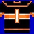
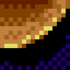
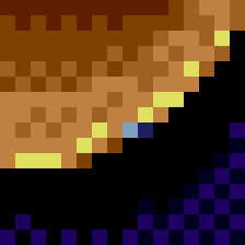
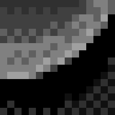
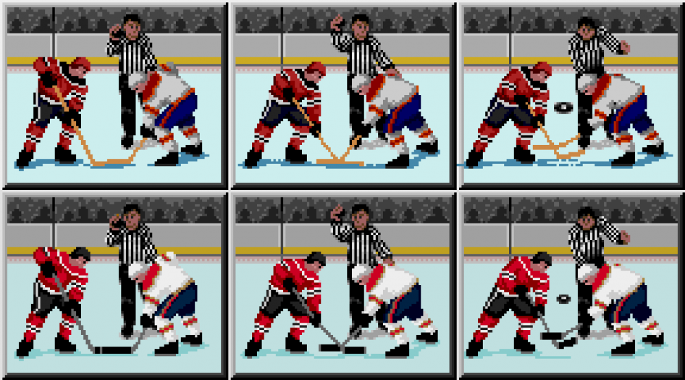
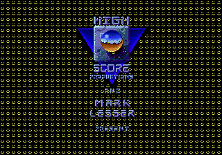
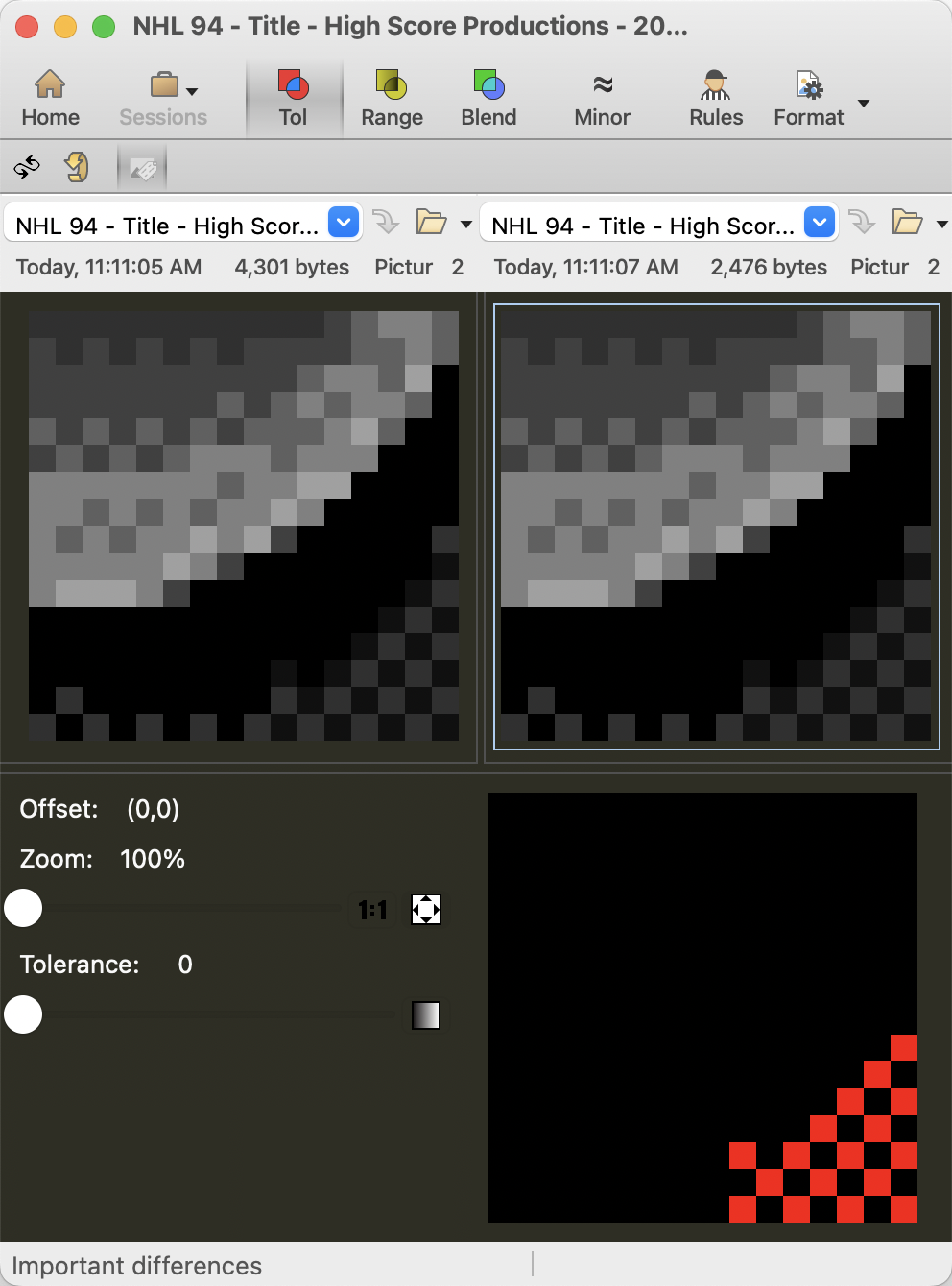
I struggled to figure out how to get it down from nearly four full palettes to three. I did everything but bash my head against a wall to get it down to three palettes, and even then I cheated by changing that one, single use coloured pixel. If anyone can figure out how to get this down to two palettes, I would *LOVE* to see how! As a random aside, I changed the colour of two pixels in my personal version (not the one I posted) because I believe they were mistakes. I instead used the colours that I believe the original author intended. Later on, I went back and converted both my revision and the original to grayscale, and ran a comparison. The two pixels that I changed were 100% identical in grayscale / tonal value to the colour included in the original. And I mean that literally, mathematically, 100% identical in tone. I believe that an automated tool was used to break up larger images into tiles, that sometimes mismatched across tiles, by only, or weighting tonal values over hue. I recall having similar issues when using tools to compress graphics in the mid to late 90's, where available algorithms didn't always maintain global palette values correctly when breaking an image into tiles and reducing it's palette. And because this image has numerous unused colours in its palette, it makes me wonder if it was initially too complex, and had its palette reduced while in production. I have seen similar "errors" in the ROM where I believe that an algorithm incorrectly converted a colour to mismatch the same colour in a related tile. Of course, I can't prove this, but that pattern I've noticed is that: It seems to happen more often in low tonal value (darker) colours. When it happens with medium or higher tonal value (lighter) colours, it is almost always in a very low frequency colour, like the single pixel that uses it's own colour in the High Score Production image. In case anyone is still reading, here is what I mean… 1. Check the bottom right area of the sphere. There are two blue/purple pixels that seem out of place. The excerpt on the right depicts four tiles. The "issue" is right near the middle, which is actually the first and second pixel in that particular tile. 2. Based on the tonal value of those pixels, it would have been more likely that the artist intended the light blue to be yellow, and the purple to be the medium brown colour, as below. 3. Now if we take both of those excerpts, and convert them to grayscale, which approximates how an algorithm would assess the colours tonal value, we get this: 4. They look 100% identical in that area. If we run it through comparison software below, it confirms that the original and my revision are 100% identical in numeric values in that area. (I purposely left an error in the bottom right area of the image, so you could see that my software picked up the false positive.) Of course, I might be wrong. Perhaps all this is a post-hoc rationalization for a mental disorder where I felt the need to change two pixels on a title screen that no-one really looks at, in an old game with a niche audience, and then write about it publicly. I am open to your diagnosis.

 2 points
 -
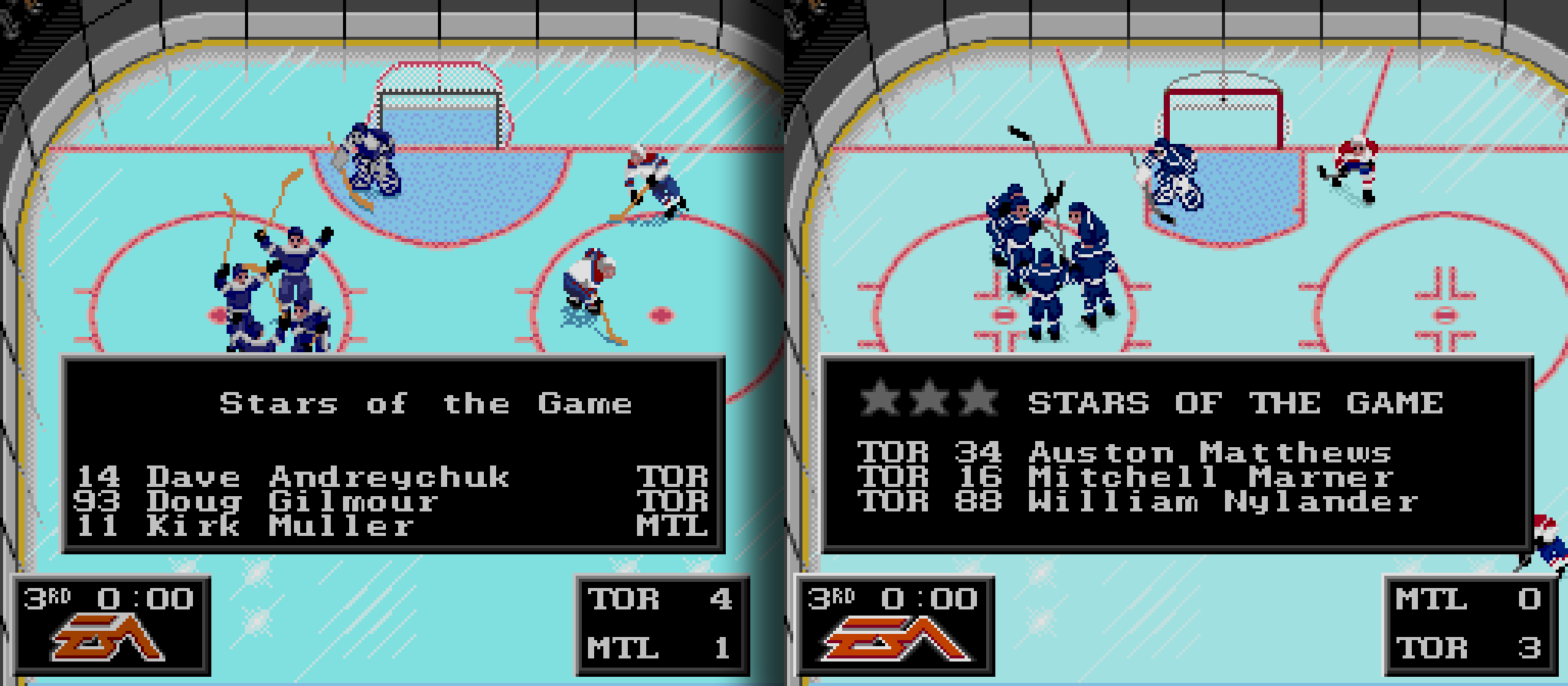
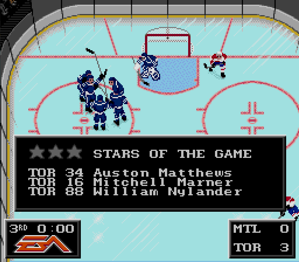
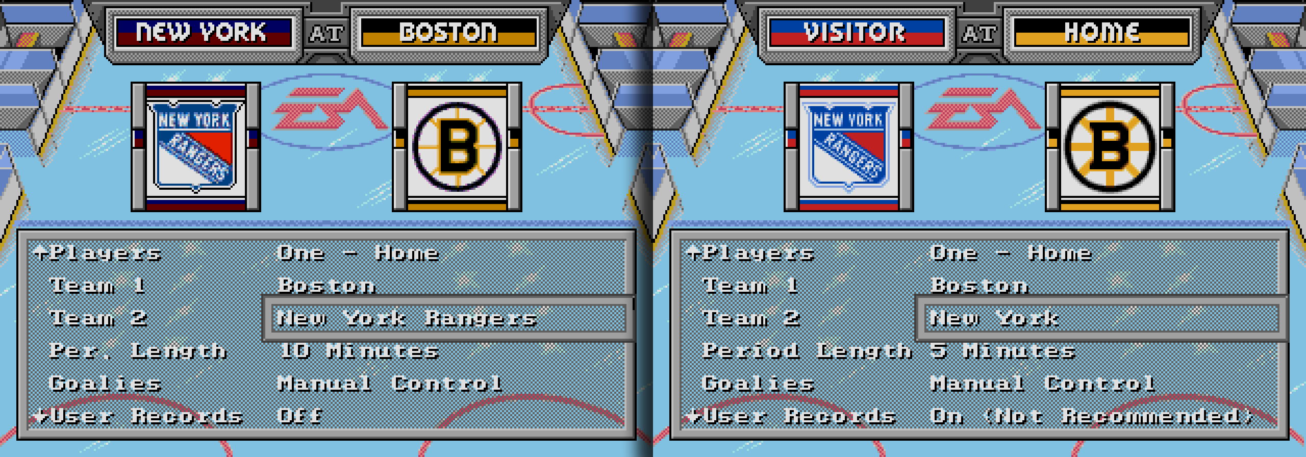
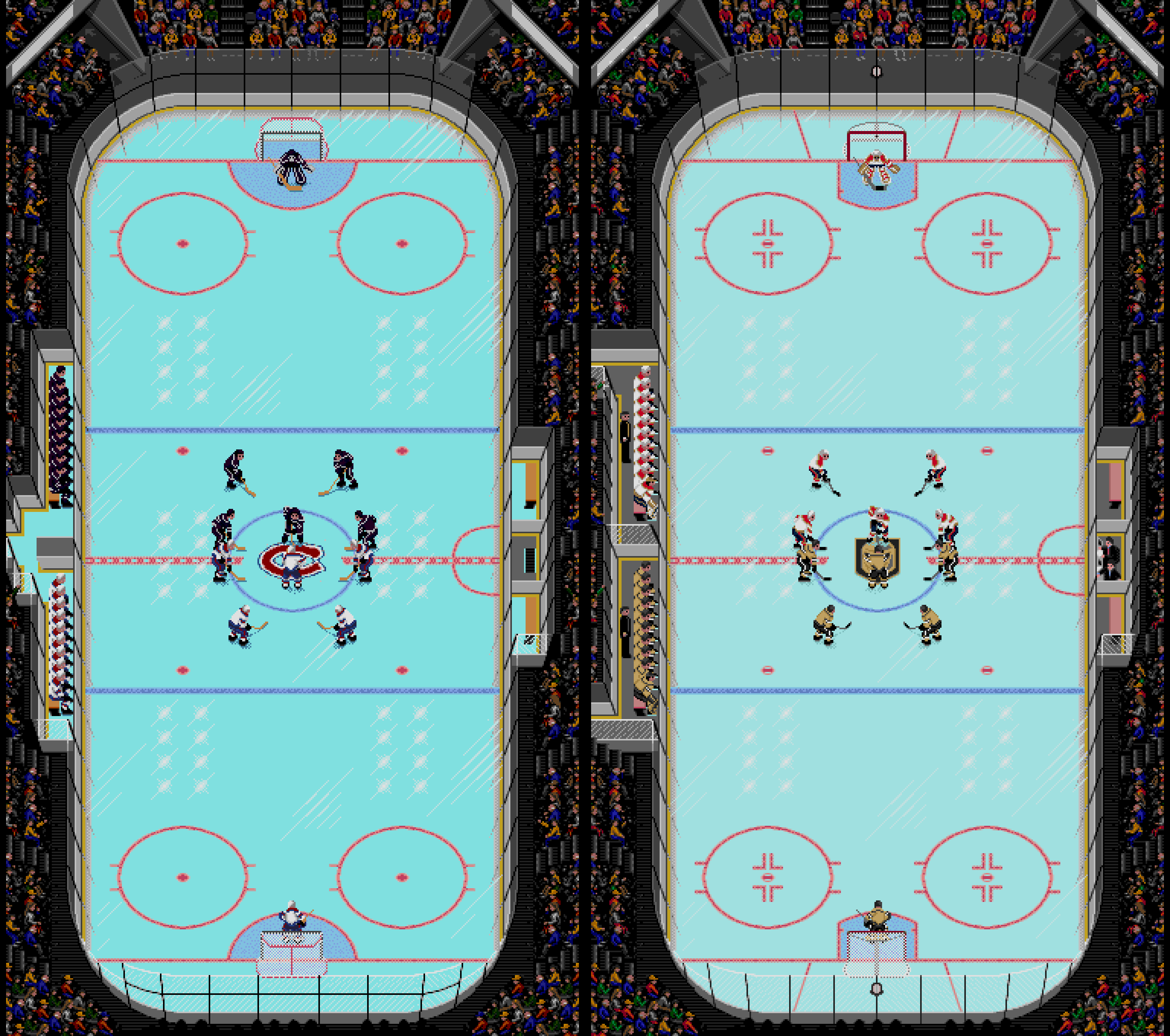
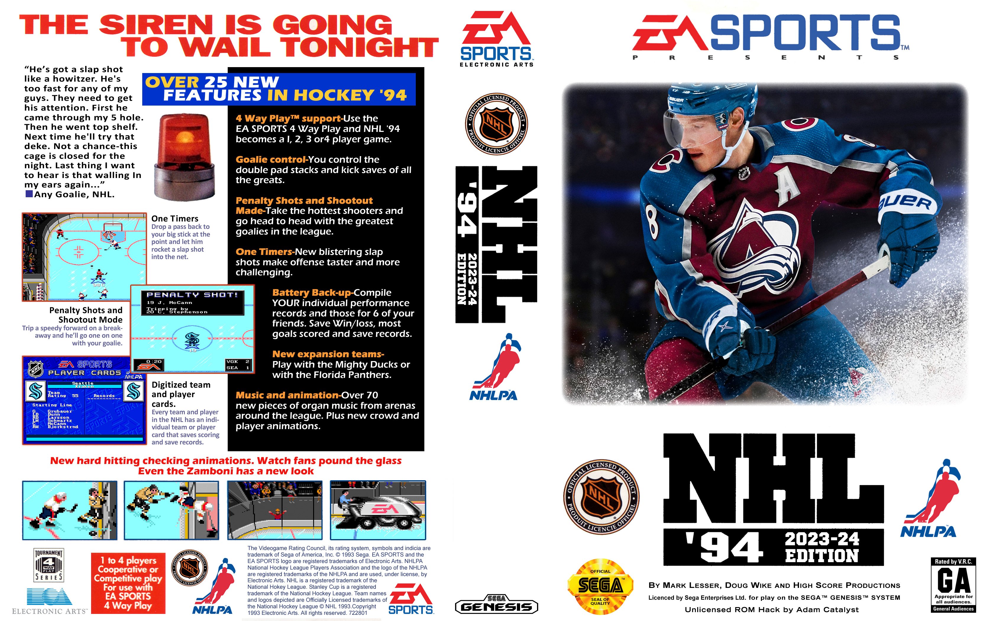
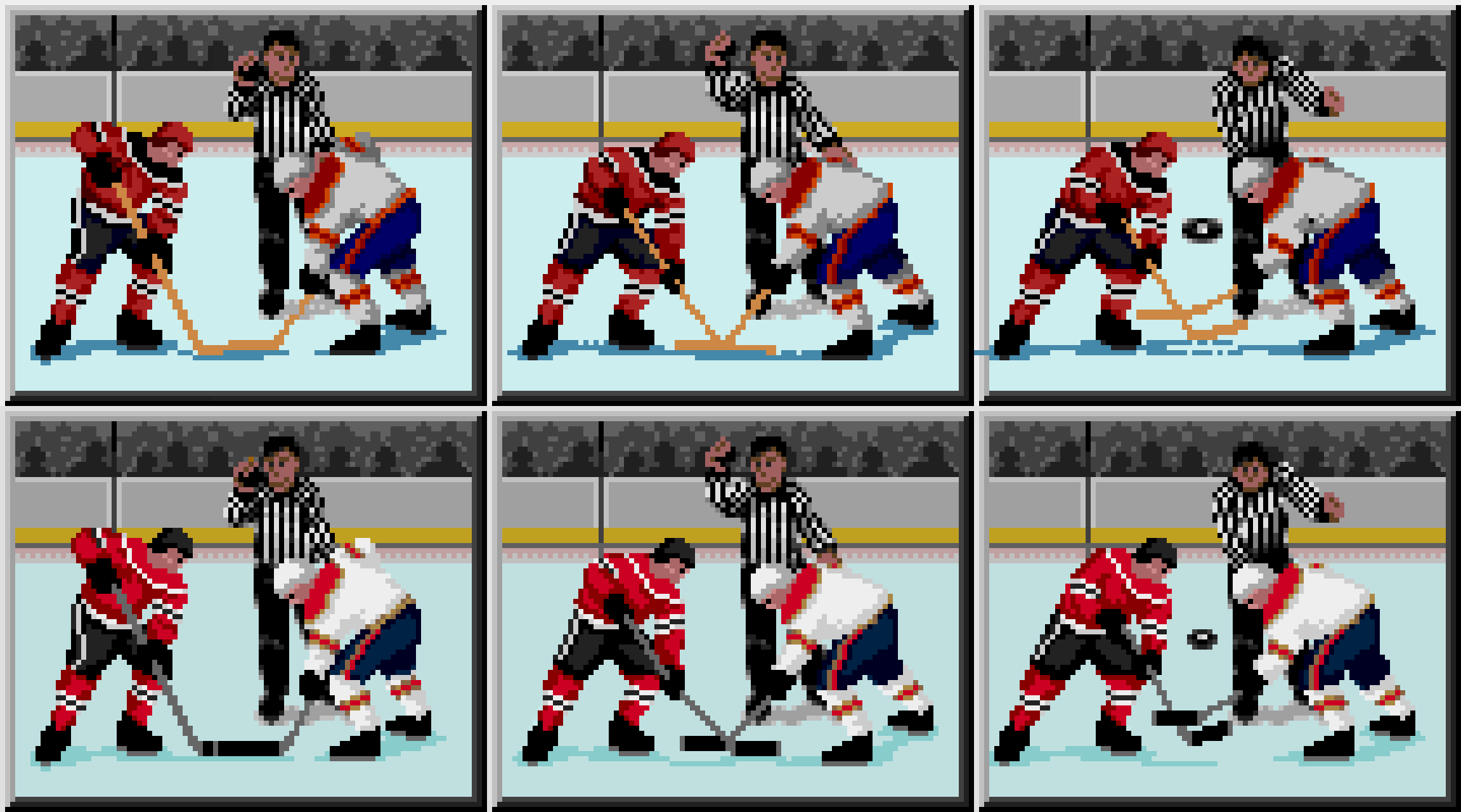
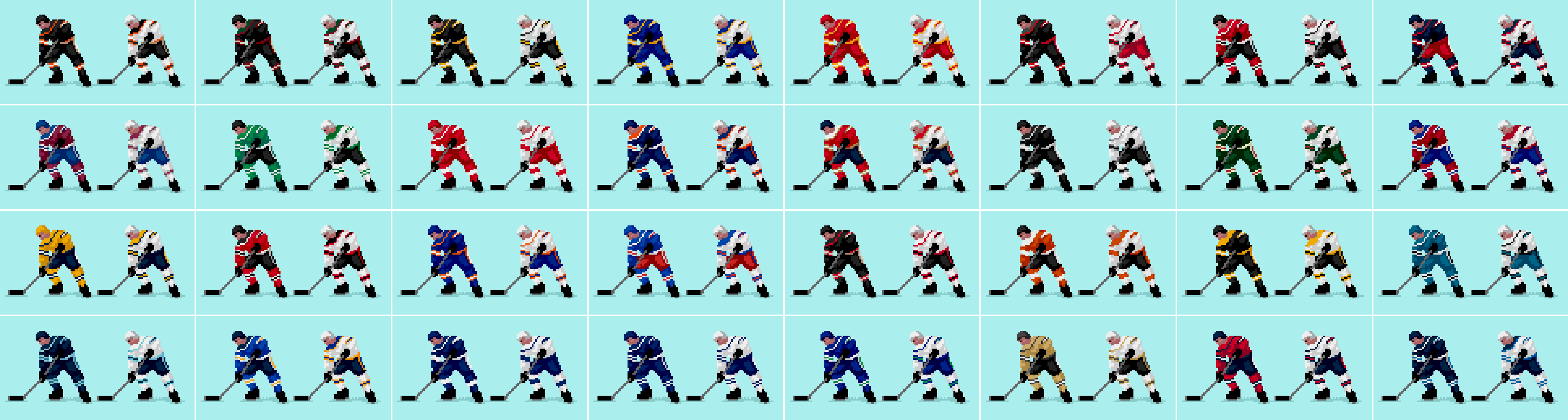
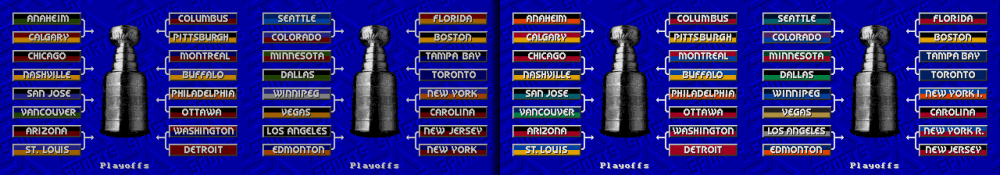
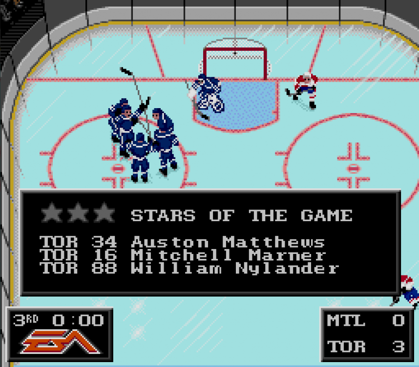
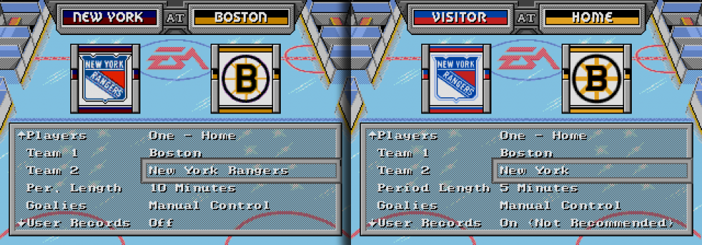
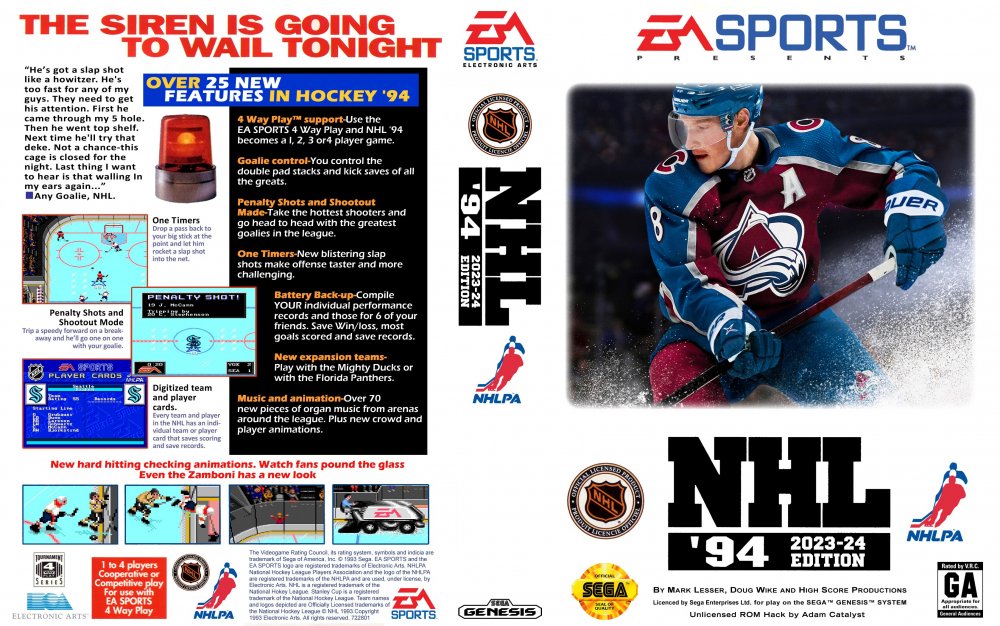
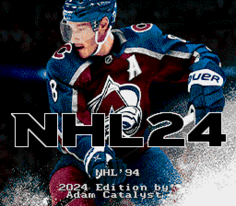
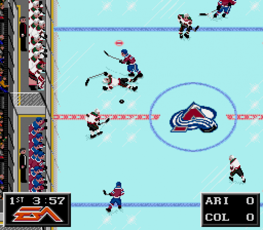
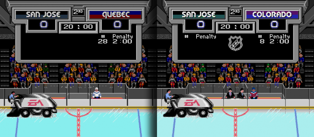
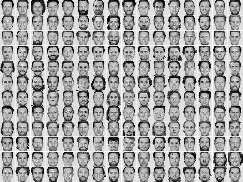
NHL 94: 2024 Edition by Adam Catalyst v3.0 updated 2024 04 21 Hello there friendly strangers, Here is the latest version of my 2024 ROM. The goal is to try to provide the most refined and realistic up-to-date versions of this all-time classic game. I'm thrilled to be able to share this with you. Here are the top reasons you might want to give it a try… New in '24 800 players obsessively rated, up-to-date rosters, and realistic lines, based on even more extensive 2020-2024 regular season data. Logos, Colours, Uniforms, Arena names… everything up-to-date for the 2024 season. The Bench area has been completely re-designed, new puck design & animation, re-designed graphic overlays for Shoot-Outs, Penalty-Shots, Goal, Injuries, Stars of the Game, etc. and numerous other refinements. Gameplay Revisioned The gameplay has been adjusted for a more realistic modern hockey feel, with harder to score goals, easier to hit crossbars and posts, more realistic speed burst, fewer penalty calls, custom energy depletion and recovery rates (balanced for more realistic line rolling and shift length), and player rating distribution curves that have been carefully calibrated for more realistic gameplay on the ice. Graphical Refinements Hundreds of other refinements have been made including title screens, banners, player photos, scoreboard, audience, face-offs, bench area, player sprites, nets, ice markings, scorekeepers, Zamboni driver, and more. The goal is to bring the most graphically refined version of NHL 94 ever made, while remaining faithful to the spirit of the original art direction. And so much more Of course there is the weight bug fix, but also a custom weight scale, less variance in Hot/Cold rating randomization, immediate goalie control by pressing the (Y) button with a six-button controller, a custom 3-Stars of the Game rating formula, a Vegas / Washington / Winnipeg Menu & Player Cards crash fix, and… Every single feature & modification is documented below. I would love it if you would give it a try, and leave me any feedback! -Adam p.s. I'd be flattered if you wanted to lift any of my mods for your own ROM. Anyone who contributes to making hacks or ROMs for nhl94.com is welcome to PM me, and I will happily send you source files, including Tile Molester bookmarks and palettes. Current Version NHL 94 [h] 2024 AC v3.0 - 2024 04 21.zip Previous Versions NHL 94 [h] 2024 AC v2.5 - 2024 03 18.zip NHL 94 [h] 2024 AC v2.0 - 2023 12 20.zip NHL 94 [h] 2024 AC v1.0 - 2023 12 01.zip Box Art Maximum Quality: Box Art - SMD - NHL '94 [h] 2024.png.7z Features & Modifications Title Screens & Under the Hood ROM Header: Updated to indicate support for Japan region, 6-Button Controller, both domestic & foreign ROM names, and updated checksum. Title Screen: Opening Logo screens display time reduced by 30%. Graphics: EA logo screen heavily modified and updated to reflect current Stanley Cup winner. Graphics: High Score Production screen refined. Graphics: Splash image updated with EA's NHL24 image. Graphics: Masthead re-drawn to match EA’s current NHL24 lettering. Graphics: Title screen Logos removed. Text: Credits re-coloured & edited. Above: The player sprites design was revised to more accurately accommodate the wide range of colourations for all 32 NHL teams. Taped taped composite sticks complete the more realistic contemporary look. Above & Beyond: A global colour palette for the entire ROM was built, with all key colour decisions made in this relative context. Teams have been systemically coloured to have as accurate a representation as possible, with a consistent sense of depth, and realistic colour shifts for shadows and highlights. Tests were done with demo play, and final colour decisions were made to give the most accurate impression in motion, and not necessarily what looked the best in stills. Main Menu Settings: Default teams set for the 2023 Stanley Cup finals. Settings: Playoff brackets updated to the 2024 seedings. Settings: 7-minute period length option added. Settings: Line Changes & Penalties defaults set to on "On," because that's how I roll. Graphics: Team Banners & Logos updated and refined. Graphics: Team Banner names removed, and replaced with "VISITORS" and "HOME" for clarity. Graphics: Player Photos all updated with official NHL headshot images, custom cropped & colour graded. Graphics: Error removed from the selection box. Hack: Player Photo carousel cycling order modified. Hack: Bug that would causes crashes upon cycling through the Player Photos for Vegas, Washington, and Winnipeg has been eliminated. Please note, this comes at the cost of preventing saved stats from showing under player names. Text: Re-wording of a couple menu options for greater clarity. Typesetting: Player names centred vertically. Above Right: All logos were revised or re-drawn by hand, and matched for visual weight. Official team colours were relatively mapped to the Sega MD/Genesis colour space, and banners were matched to key logo colours, with some minor re-wording in the menus. Pre-Game Graphics: Banners typesetting improved, and colours improved for greater clarity and consistency with the team colours used throughout. Graphics: The Pre-Game Announcer's picture frame has been altered to be more consistent with the design of similar elements throughout the game. Graphics: Ron Barr image restored to be closer to original. Arena Names: All up-to-date as of December 2023. Pre-Game: Match-up position names have been simplified to “Forward,” “Defence,” & “Goaltender.” Above: When EA released Rewind (left), they kept the same colour palette as the original, despite decades of new teams and new team colours. I've optimized this restrictive colour palette (right) so that all teams now look much closer to their authentic colours. Furthermore, typesetting has been improved in all banners to also be better than Rewind. Rink Graphics: Colour Palette has been altered to improve the audience affect with more uniform tonal contrast, improve the accuracy of the team banner colours, and to give the nets more realistic colouring. Sprites: Audience members design and animations have been refined. Graphics: Goal light & animation revised. Graphics: Instant Replay Reverse view inconsistencies fixed. Graphics: Minor refinements throughout the arena. Rink - On the Ice Graphics: Ice Colour lightened slightly. The darker colour was giving me eye strain. Graphics: Centre ice logos updated, adapted from NHL Rewind designs. Graphics: Face-off circles modification. (author unknown) Graphics: Net re-drawn to the most recent (2013) NHL proportions, with an updated goalie crease. Graphics: Trapezoid area lines drawn to NHL scale. Graphics: Glass & stanchions behind bottom net revised to be symmetrical and parallel to glass & stanchions at the top, horizontal seam in top glass has been removed, and on-ice reflections of stanchions have been fixed throughout. Above: There have been hundreds of refinements to the rink design. Beyond the big obvious things like the redesigned bench area and time keepers, there are far more subtle touches like the symmetrical glass re-design at the bottom, the updated net designs, and the refined audience member designs & animations. Rink - On the Sidelines Graphics: Bench area completely re-designed, including refined animations, and the addition of animated coaches and backup goaltenders inspired by @slapshot67. Graphics: Time-keepers added in, and time-keeper area Stanchion misalignment fixed. Graphics: Bench, Penalty Box, & Time-keepers area Stanchions modified to be consistent with the Sideboards view. Sprites: Bug fixed that would stack multiple Visitors players in the Penalty box incorrectly. Above: The original (Left) benches had floors coloured like the ice, and the players chirped with unhinged jaws, with no supervision from a coach. Over time (Centre), fantastic changes were made by slapshot67, adding a more realistic floor, fitting in a coach and a backup goaltender! I've built on this work (Right) completely re-designing the bench area, including re-designed players and refined animation, an animated coach, and more. Plus, a new more three-dimensional puck design! Above (Botton Left): I really liked The Sauce’s wide take on the EA logo (Centre), as well as the bevelled style of the original (Left). I’ve mixed the two styles together, and refined it to better fit the allocated vertical space. The Sauce’s excellent ROM is shown here for relative comparison only, no criticism implied of his inspiring work. Rink - Sideboards view Graphics: Sideboards Bench, Boards, Glass, Ice, Stanchions, etc. revised. Graphics: Scoreboard Banners refined to improve typesetting, and colours modified for clarity and consistency throughout. Graphics: Sideboard Scoreboard has custom drawn NHL logo. Graphics: Side-boards Score-Keepers added. (Based on the SNES version) Sprites: Zamboni driver revised to better match the perspective of the side-boards. Sprites: Player in Penalty box refined, and placement revised. Above Below: The original Zamboni driver (Left) looked like a small ruddy-faced hunchback. I re-designed him to fit the style and perspective of the scene better, adapted the design of the scorekeepers from the SNES version to match, improved the design of the player in the penalty box (who disturbingly had no lower body in the original), and have made hundreds of minor refinements to the audience, animation, bench, stanchions, the light refraction on the edge of the glass, etc. Above Top: Beyond the improved banners, the scoreboard features brighter lettering and scores along with custom drawn a modern NHL logo. In-Play Sprites: Player design was revised to more accurately accommodate the wide range of uniform colourations for all 32 NHL teams. Tests were done with demo play, and final colour decisions were made to give the most accurate impression in motion, and not necessarily what looked the best in stills. Sprites: Face-off animations revised. Sprites: Players given grey composite sticks, because grey pixels have better puck feel, more flex, and are lighter weight. Sprites: Goaltenders masks revised to reveal their faces. Sprites: Player Helmet colour patch. (@clockwise) Sprites: Player Eye, Boots & Gloves, and Stick Tape patches. (@clockwise) Sprites: Improved Checking animations patch. (@clockwise) Sprites: Player stick animations refined. Sprites: Puck design & animation revised. Graphics: On-Ice Player Numbers changed to white for better legibility against the ice. Graphics: On-Ice Player indicator (star) for Player 1 lightened to be less conspicuous and increase relative on-ice contrast for the Player 2 indicator. Graphics: Penalty box player colour error fixed. (Slapshot67) Above Top Row: The original face-off animations had a linesman that was looking in the wrong direction (Top Left & Centre), freakishly long & thin stick blades, stick shadows that would overlap incorrectly (Top Left), disproportionally dark shadows that sometimes overlapped the image frame (Top Right), a frisbee instead of a puck, and some rough detailing on the players. Above Bottom Row: I’ve painstakingly gone through the 108 possible graphic combinations that can occur during a face-off, revised every issue I could find, re-drew the sticks to be more realistically shaped & taped, and perhaps most importantly, turned the linesman’s head to face the right direction. We all need to do our part to improve NHL officiating. Rosters Rosters & Lines: Updated based on extensive 2020–2024 regular season player usage data. Rosters & Lines: 800 total players have been included, covering the 25 players (14F, 8D, & 3G) with the most ice-time in 2023-2024 on each team. Above. 192 official NHL headshots used in-game), all individually cropped and colour graded for visual balance. Ratings Team Ratings: Team attribute & overall ratings updated as per April 19, 2024 end of regular season data. Player Ratings: Underlying system has been changed from the default 1-6 scale to a 0-15 scale for more accurate differentiation of players. (@smozoma) Player Ratings: ustom player ratings based on a mix of real-world data and gameplay oriented parameters. The goal is to make gameplay more contemporary, and individual player performance more realistic. Player Ratings: Custom overall rating formula. Player Ratings: More parity between the best and the worst of the league, with all players having a minimum 52 rating before Hot/Cold variance. Player Ratings: Weight scale modification patch. (@smozoma) Player Ratings: Edit lines bug fix patch. (@smozoma) Player Ratings: Hot & Cold variance is hidden from the menus, so you will have to feel which players are hot or cold through gameplay. (@smozoma) Behind the Scenes: Rosters, ratings, and lines are based on extensive real-world data and advanced analytics. All of this is conformed to custom ratings distribution curves, which give the gameplay its unique feel. This single most important feature can't be shown in stills. You have to play it to feel it. Gameplay Controls: Goalie control can now be accessed immediately by pressing the (Y) button with a six-button controller. (clockwise) Gameplay: Goalies without the puck can move slightly farther towards centre ice. (@smozoma) Gameplay: Goalies can hold the puck very slightly longer before the play is whistled dead. (@smozoma) Gameplay: Body Checking and Aggressiveness have been balanced to reduce the penalty rate from the original, and approximate the real body checking and penalty rates of each team in the 2023–2024 season. Gameplay: Hot & Cold range of variance has been reduced by ~25%, and the frequency of variance has been reduced by ~50%. Gameplay: The "goal" area of the net has been reduced slightly, making it more difficult to score, and more likely that you will hit the post. Gameplay: Player Speed Burst set to 25% of the original, for a more realistic feel and higher difficulty. Gameplay: Custom Stamina Depletion & Recovery rates. Gameplay: Weight / Checking bug fix patch. (@smozoma) Gameplay: Second-Assist bug fix patch. (@smozoma) Gameplay: CPU pulls Goalie with 2 minutes left when trailing by 1 or 2 goals. (@McMarkis, @smozoma, & @chaos) Gameplay: Overtime set to 5 minutes, Penalty Shots set to 20 seconds. Player Ratings: Attribute rating distributions have been careful set and thoroughly tested to produce a faster more contemporary feel to puck movement & gameplay, with better goaltending. Stars of the Game: New custom formula. Above Right: The Timekeeper design has been adapted from the SNES version, and modernized with touchscreens. The players in the penalty box have been re-designed (and errors fixed), the puck & animation have been redesigned along with a "translucent" shadow, and the scorebox has been nudged off to the side. Above: Note how in the original (Left) the player one indicator is distractingly very high contrast, while the player two indicator is much more difficult to see with low tonal contrast. Brightening the colour of the ice (Centre) helps, but then the already muddy looking player numbers become very difficult to see. I’ve re-balanced the colours (Right) so that the player one indicator is quieter while still being easy to see, the player two indicator is equally easy to see, and the the player numbers are much clearer to see against the ice. The excellent Naples ROM is shown for relative comparison only, no criticism implied of their superlative work. In-Game Overlays Graphics: Linesman & Referee pop-overs refined. Graphics: In-Game Timer logo has been re-drawn. (based on @Sauce's design) Graphics: Score Clock and Line Change overlays relocated. Graphics: Line Change Energy bars have been re-drawn to have an inverse quasi-logarithmic gradation. Graphics: Overlays for Shoot-Outs, Penalty Shots, Goals, and Injuries revised. Graphics: Instant Replay controls graphic revised. Graphics: Stars of the Game overlay re-designed. Text: "Cross Check," "Face-Off," and "Fight Instigator" renamed to "Cross-checking," "Face-off," and "Instigator" as per the official NHL rulebook. Above: Various evolutions… Updated ice markings, including a to-scale trapezoid area and crease. The Net has been re-drawn to closely match the current NHL proportions, and to slightly reduce the scoring area. Improved sprite designs, including details like the Goalie’s mask now showing a bit of their face underneath (Right). The Stars of the Game overlay has been redesigned, along with the underlying selection formula. In-Game Menus Graphics: NHL & NHLPA Logos re-drawn. Graphics: "Hockey Night" Banner slightly re-coloured. Hack: Player Cards bugs that would causes crashes upon cycling through Cards for WSH (and possibly also VGK & WPG) have been eliminated. Hack: Player Stats now showing Checks instead of Penalty Minutes. (@smozoma) Text: The “Change Goalie” option for “no goalie” is now in ALL-CAPS for greater visibility. Extras Box Art: Matching box art was made! The artwork is high resolution, print quality, and stays very close to the original North American box design. Player Ratings: The distribution includes a CSV with all the player ratings. Thumbnail Art: The distribution includes thumbnail artwork for popular emulators. Known Issues The Main Menu and Player Cards do not show saved User Records, in order to prevent crashes that on these pages with Vegas / Washington / Winnipeg. User Records may incorrectly store user data if playing with Vegas / Washington / Winnipeg. Builds are tested with Genesis Plus 1.7.4.15 and Genesis Plus GX 1.7.5-RC1 r24-10-2021. If you are having any technical issues, you may want to try one of these emulators. If you are reporting a technical issue, please note the exact console or emulator version that you are using for me. Future Wish-List I'm not sure how much time I will have to work on this in the future, but if I did find more time, here is what I would like to focus on next… Interface: Alter the range of displayed values for player ratings. Gameplay: Increase the wrist shot speed. Gameplay: Increase the puck ice friction slightly. Gameplay: Reduce the force with which pucks rebounds off the boards, etc. CPU play: Increase the goaltenders lateral stopping abilities, reduce five-hole stopping effectiveness. Gameplay: Enable line changes to be initiated without possession of the puck, preferably with a dedicated button. CPU play: Prevent the goaltenders from skating into the trapezoid areas. Gameplay: Decrease accuracy of One-Timers. Gameplay: Reduce the passing speed slightly. Gameplay: Reduce the energy cost for each time a speed boost is used. Gameplay: Enable players in the Penalty Box to re-generate energy as if they were on the bench. Gameplay: Improve logic for how icings and offsides are calculated to use puck position instead of player position. Graphics: Redraw Sideboards Referee to better match the art style of everything else (requires "de-compressing" shared tiles.) Graphics: Improve the comparatively low visual quality of the on-ice officials throughout (requires "de-compressing" shared tiles.) If you are able to help me with any of these changes, please let me know! Credits This project was built decades of work by the NHL94.com community, and never would have been possible without them. I’m sure there are more contributors than I could ever possibly know, let alone acknowledge, but I will do my best… Contributors This ROM contains contributions from the following individuals… Brodeur30 Rink & Net collision logic. chaos Hot/Cold variation logic. Team Attribute bonus logic. Clockwise Goalie Control with a six-button controller. Player sprites boots & gloves colour patch. Player sprites eye colour patch. Player sprites helmet colour patch. Player sprites hockey tape patch. Player sprites improved checking animations patch. Dervin10 Roster extractor & importer tool development. Drezz Team uniforms Yoke colour isolated. kingraph Animation block logic. Sideboards modification logic. Stars of the Game modification logic. McMarkis CPU Goalie pull logic. (+ Smozoma & Chaos) slapshot67 30 to 32 team ROM re-structuring. Bench backup goalie hack and original design. Penalty Box player sprite colouring fix. smozoma 0–15 Player Rating scale patch. Checking / Weight bug fix patch. Credits editing logic. Displayed Ratings bug fix patch. Goalie range of motion. Goalie puck hold time before whistle. Period lengths logic. Player Overall rating formula logic. Player Stats Checking patch. Player Weight scale modification patch. Second-Assist bug fix patch. Stars of the Game formula logic. Tony H. Stopping & Crossover Rate logic. wboy 28 to 30 team ROM re-structuring. Default settings logic. Player photo logic. Player energy depletion & recovery rates logic. Rink modification logic. Speed burst rate logic. NOSE tool development. Author unknown Face-off circles graphic modification. Team uniforms colour restructuring. Special Thanks to… @Drezz - selflessly sharing original work & resources. @Jkline3 - tips, resources, & candor. @kingraph - tips, resources, & encouragement. @naples39 & @Sauce - inspiration. @Sean - tips, encouragement, & inspiration. @smozoma - utterly invaluable tips, resources, tools, & support. @von Ozbourne - brainstorming, resources, wit & wisdom. …and everyone at nhl94.com who tested Betas or provided feedback. Extra Special Thanks to… Ena - for nothing less than everything. I hope you enjoy!
.thumb.png.97f64be1b42cc7fd45f42b76969ed51c.png)


 1 point
 -
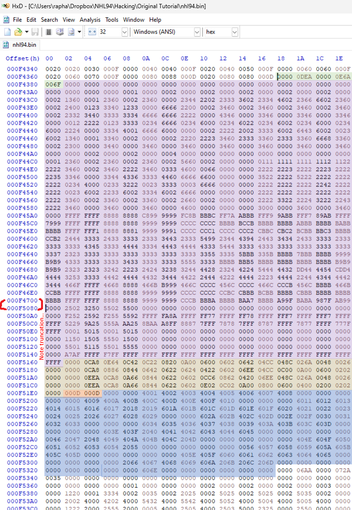
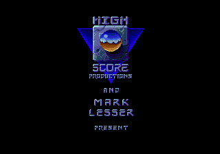
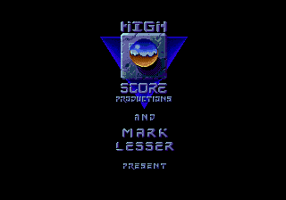
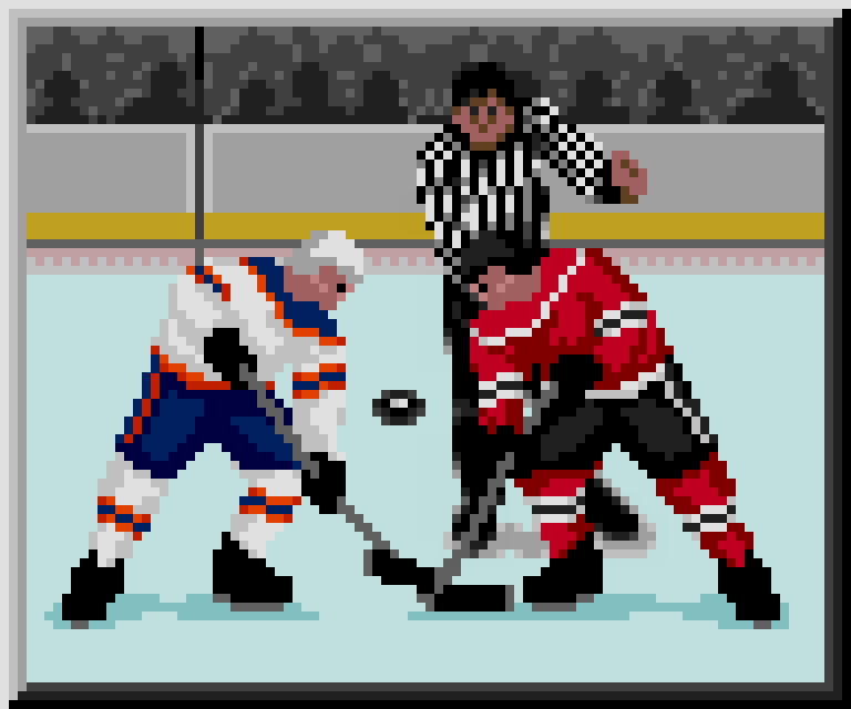
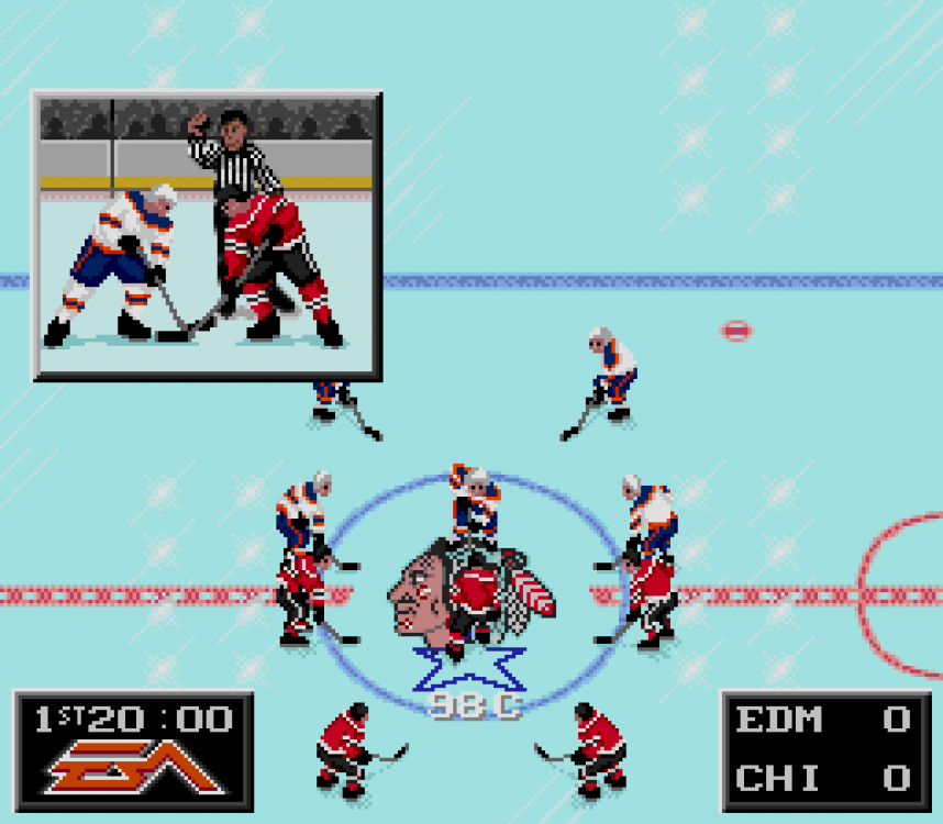
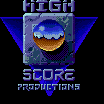
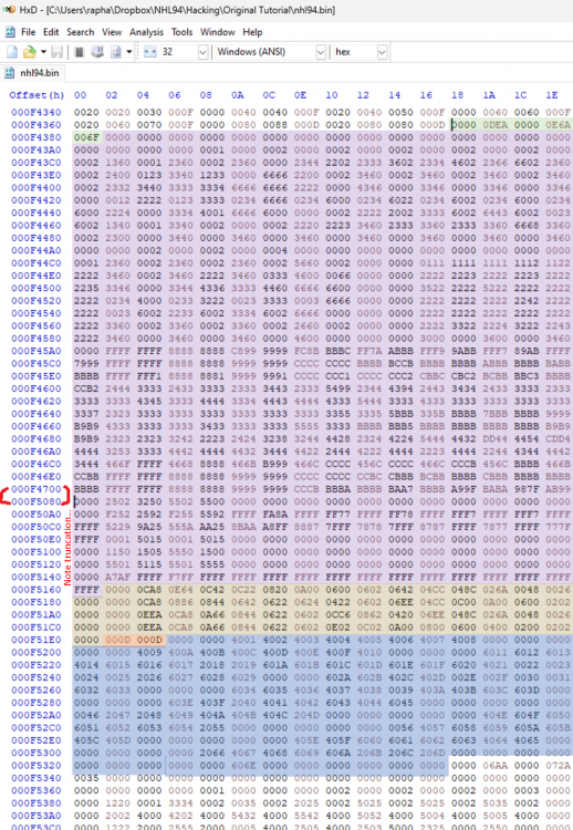
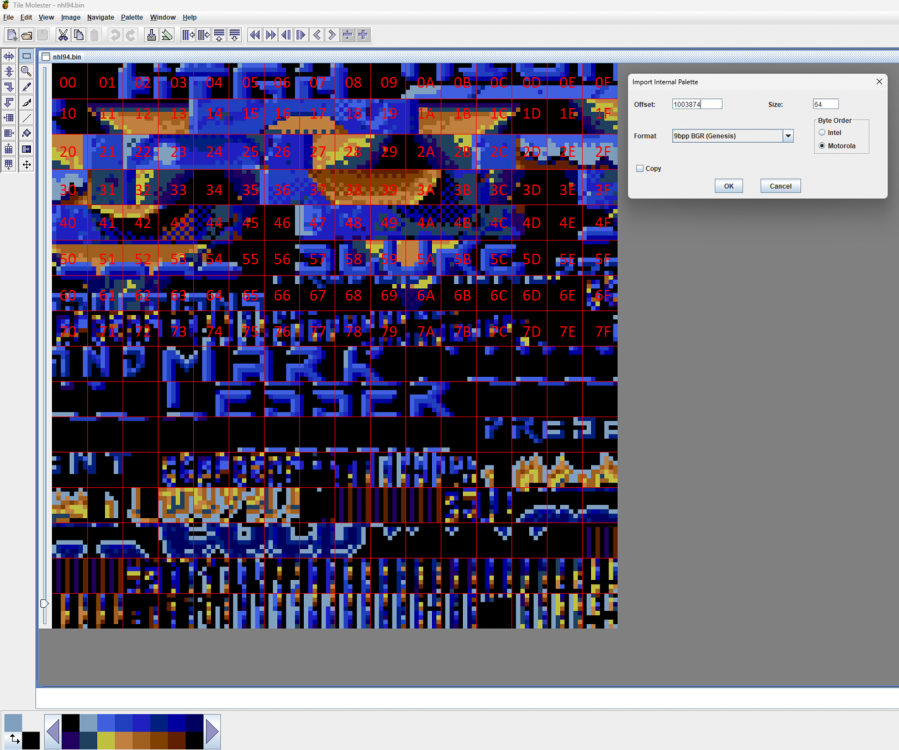
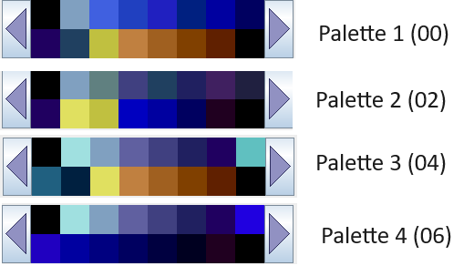
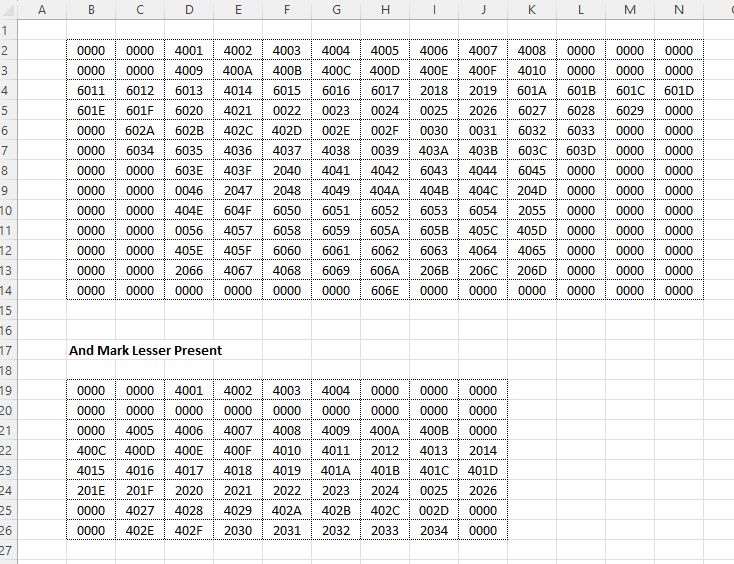
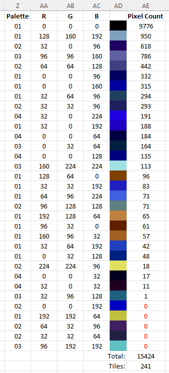
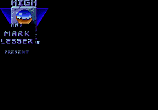
This post will give you more information than you ever wanted to know about the 2nd splash screen ("High Score Productions") in the original NHL'94 ROM. It's a little more unique that it appears, and I'll also explain what @wboy did to make this particular image much easier to modify. The first thing to note is that the original splash is actually two images that are overlayed on top of a background. Image 1 is the High Score Logo (this is the exact image ripped from the ROM): And the 2nd image is "Mark Lesser Presents" You'd never really notice because the images don't actually overlap and the background used is black. Location The location of the first image is at offset: F4378. This is the header. The header is 10 bytes long, and the tiles will start right after. The first part is the header in green. The values are 00000DEA 00000E6A 006F. I will start with the right 2 bytes. 006F is the number of tiles (in hex) that will be loaded for the graphic, not necessarily how many will be used. It turns out all the tiles in this splash screen are used, but I mention this because that is sometimes not the case with other graphics. 006F is 111 tiles. The purple section (which I truncated), is the image data for those 111 tiles. This is much better seen in Tile Molester. Here is the graphic tiles (purple section) represented in Tile Molester. I added the red numbers as those are how the tiles are numbered in hex, and that will be referenced later. I will also explain how I got that palette information. Back to the header. The first 4 bytes provide an relative offset from the header to where the palette is located. The value "0DEA" in hex is 3,562 in decimal. This is how many bytes from the header to where you'd find the palette offset. Adding ODEA (3,562) to F4378 (1000312 in decimal) gives you F5162 (1003874). That's the starting location of the palette, which I highlighted in that greyish tone. For some reason in Tile Molester v0.16 you need to input the palette offset in decimal. In later versions like v20 you can just use the hex offset. So now we have the palette used in these graphics: Quick note on data length. One graphic tile uses up 32 bytes of data. So when you have 111 tiles, as we do above, that equates to 3,552 bytes of data. Adding 10 for the header to that number and we get 3,562, or 0DEA in hex, our first value in our header. The second value in our header is 00000E6A. This is the relative offset to get to the size of the image in width x length. The value is 128 bytes more than the first value, which is the length of our palette. The location is F51E2, you can do the same math if you like above. The size will be 2 bytes for width and 2 bytes for length. I highlighted this in orange, and the value is 000D 000D, which is 13x13. So now we know we have a 13x13 image (169 tiles) that will be filled up with the 111 tiles that are loaded. The next part of the data is the layout of those tiles. That's the part that I highlighted in blue. While you don't necessarily need to read this for this post, @AdamCatalyst did a wonderful job explaining tile layout code here: Understanding How Layouts Are Specified Fortunately this layout is very simple and I will explain the basics. The first digit in the tile layout tells us what palette color the tile will be colored in. 0 = Palette 01 2 = Palette 02 4 = Palette 03 6 = Palette 04 The next 3 digits will be the tile number in the selected graphic in hex. The TM screenshot I have above has the red hex value of the tiles overlayed as a reference. Note that the last actual tile is 6E (111th tile, we start at 00). I put the layout in a 13x13 spreadsheet to help visualize it a bit: So the first two tiles are "000" and they are using palette 01, so that's "0000". This is just a black tile and you can see that's the one most frequently repeated. In fact, that's the only repeated tile in this example. The next set of tiles used is actually a pretty clean row of tiles 01 through 08. Note the first digit is 4, which means we use palette 03 for all 8 of those tiles. , followed by three more black tiles ("0000"). The second row is actually pretty similar, two black tiles with a set of 8 tiles (09-10) in palette 3 , followed by 3 black. The 3rd row is where it gets more complicated. The first three tiles now start with 6, which is palette 4, and that is tiles 11-13 (6011 6012 6013). Then there is one tile using palette 3 again (4014), followed by 3 tiles using palette 4 (6015, 6016, 6017), two tiles using palette 2 (2018, 2019) and finishing with 4 tiles back to palette 4 (601A - 601D)!!! You can read through the rest and notice that this image is actually referencing all 4 palettes!!! When you put this all together you'll get this image: I recreated this tile by tile, so here are the tiles for anyone interested: High_Score_Tiles.zip The second image follows the same process and the information immediately follows the first image. I.e. the header of the 2nd image begins where the tile layout of the first image ends (F5338): lesser_tiles.zip How many actual colors are used? I don't quite understand why this splash is using all 4 palettes. My guess is this is a leftover from the previous ROMs, but that's just a hunch. Here's some more information on the colors/palettes: The 4 palettes (16 x 4 = 64 colors) have 33 unique colors between them. The image itself uses 28 distinct colors. Here's the pixel count of the 241 tiles (13x13 and 9x8) I am guessing it's possible to recreate this image using 2 palettes, but perhaps not? Also, others have recreated a single palette 16 color version that is virtually indistinguishable from the original given how close the color variations actually are. What about the rest of the screen? You may have noticed that the two images are not big enough to fit the entire screen! The splash screen is 40x28 tiles, and these two images are 13x13 and 9x8, which don't fit the entire screen. Here's how this splash screen actually works. The entire background is filled with the first tile, in the first palette "0000". If you alter that tile, like putting a smiley face, you can see the impact here: You will also notice that the background becomes the first layer. The high score and the mark lesser images lay on top of the background. How are the images positioned? Each image has a pointer that also includes an x,y offset position for the image. The pointer for the first image is located at FEDCE. The value you will find is BE0E 0300 247C 000F 4378. The right side is 000F4378, which is the location of our header! 247C is the instruction code the game uses, no need to get into that now. The two values after BE -- 0E and 03 are the x,y values where the image starts. So the High Score starts at 14 (0E in decimal) tiles from the left and 3 tiles from the top. You can count the happy faces from the left and top to confirm The other pointer is located at FEDFC and has a value of BE10 1000 247C 000F 5338 I moved both images to the left (0) and overlapped them. What's interesting is you'll notice that the Mark Lesser sits on top of the first image. So to summarize, the original 2nd splash has apparently 3 layers: Layer 1 - Single tile repeating in background (black) Layer 2 - High Score Image Layer 3 - Mark Lesser Presents Image How did @wboy "decompress" this screen? The first thing wboy did was to change the size of the High Score image to 1 tile. He actually left the original palette and tiles in the same location, but instead of loading 111 tiles, the game loads just 1 black tile, with one tile layout. Now for the 2nd image, he changed the pointer from the Mark Lesser Presents graphic to a new 40x28 graphic that starts in the top left corner. So the new pointer at FEDFC (the 2nd image) BE00 0000 247C 0010 902E Notice the 00 00 location and the pointer now has an offset to 0010902E. That's the location of the new header for the large 40x28 image. That location doesn't exist in the original because the original ROM is only 1MB. This location is in the expanded 2MB section. So what is really happening is the new 40x28 image is sitting in top of the 1 tile image, and on top of the background! So there you have it! More than you ever wanted to know about this 2nd splash screen


 1 point
 -
Advice for Modders, Meddlers, and other Creative Rabble-Rousers (last updated 2024 01 03) Getting Started Start with as clean a ROM as possible. This will make it the easiest to edit, and puts you in the position of having the most creative control. I recommend starting with either the 28 or 32 team templates, and/or an original verified [!] good ROM dump. Beyond being able to accommodate more teams, the templates have the advantages of many of the graphics already being "de-compressed", which will make editing much easier. Just note that the templates are not "clean", in that they have some elements modified or removed that you may want to preserve or restore. I sometimes find myself going back to the original ROM to verify how things originally were. Basic good practices: Make sure that you have a file versioning and naming syntax system, as well as an automated backup system. Document everything that you do. Go slowly at first. When in doubt, change one variable at a time. Read lots of forum posts and do the tutorials. Even ones that you think don't apply to you. Valuable knowledge can be found in unexpected places. Don't be afraid to start over, multiple times. If you've documented things, this might go shockingly quickly. Learn from Others Review the detailed tutorial posts that folks have taken the time to write, the newer the (usually) better. The more you see the entire picture, you start to see patterns. The more patterns that you start to recognize, the faster you will get, and you will start to be able to make off-the-books discoveries of your own. Play lots of other people's ROMs. Take notes. Don't blindly apply pre-made patches to your ROM. Run a comparison after patching, to see exactly how the code has changed. Try to understand what was changed and why. Imitation is an underrated form of learning. Look at what others have done (and you admire), and then try to re-create it yourself. The process of manually recreating something is an invaluable learning process, where you can build explicit and implicit knowledge. Furthermore, even if you start with imitation, you will naturally make different specific choices along the way that will eventually lead to it becoming your own thing. Don't re-invent the wheel if you don’t need to. As a counterpoint to my advice to start with as "clean" a ROM as possible, or trying to manually imitate things, don't be shy about ripping off code from other people's ROMs. But always give credit where it is due. And if in doubt, give credit. You should clearly know when something was the result of your labour alone. Share what you know. But also share what you have found, but don’t understand. The more the community knows, the more than community will be able to help you. And your loose ends might be someone else's treasure. Getting More Done Use a comparison tool (I use “Beyond Compare”) to help isolate relevant differences in code from one person's ROM to another. By comparing ROM "A" and ROM "B", I've been able to sometimes make new discovery "C". This is my #1 tip for anyone. Consider using a prioritization model, such as MSCW, where you define what a release Must do, Should do, Could do, anger very importantly, Won’t do. Further to that last one… Give yourself limitations. This can be just as important as goals for some people. Develop efficient testing routines. This can take up a lot of time. Stop and think about re-designing your workflow from time to time. Personal Development Get off the computer. A good idea to play, then work on paper. All tools and interfaces have biases that effects us. Find the ones that wrk best for you and/or change things up to help you change up your thinking and doing. Make big picture decisions about art direction, creative direction, colours, etc. Give yourself both strategic guidance and limitations. Figure out what you want to do before you do it. Unless you find yourself stuck with indecision. In which case, just start doing it, and figure out what you want later. Make mistakes faster. Figuring out how much time to spend planning and critically evaluating plans versus just mindlessly doing is a lifelong challenge. It’s easy to waste time either which way. In my personal teaching, I personally find that most people over-think things. Push yourself to mockup up ideas as quickly as possible. If it’s a good idea, that will show up in a terribly rough mockup. But there is no way to know for sure until it is tried. Consider separating your personal creative process, your personal critical processes, your personal technical execution process, and your personal skill building processes. “Creatives” who work alone sometimes face paralysis from trying to think through too many roles at once. If you are an army of one, consider role-playing through different steps. For instance, when you’re creative, create with reckless abandon. Do not pre-judge. When your creative session is up, hand it to your critical self, and assess what is working, what isn’t, and give your creative self directives for the next creative session. This may sound silly, but trust me, I’ve been teaching young designers for over a decade, and this compartmentalization can be extremely helpful. Specific Areas of Interest Before editing player sprite uniforms, be aware that different ROMs have already changed the layout of the colours on the uniforms. This is a huge amount of work, and your ROM might benefit from taking the player sprite tiles from another ROM. You Amy also be able to make the changes that you want more easily by “diffing” two different sets of player sprites, in order to isolate key elements or colours… …Speaking of Colours Make sure that you are familiar with basic colour theory using a Hue, Saturation, Value model. Understand that human beings perception of tone is much more consistent than their perception of hue. Furthermore, we are much more sensitive to contrast of tone than contrast of hue or saturation (hence why we use 4:2:0 encoding in video etc). So, when making colouration decisions, you usually want to err on the side of prioritizing tonal relationships over accuracy in hue over accuracy in saturation. This usually looks better. You can toggle your screen into black & white mode to review the tonal values. “If your colours don’t work in black & white, your colours don’t work.” ® When selecting your colours, it is very helpful to have an overall concept of the colouration that you are looking to achieve. For instance, should it look realistic? Like watching a game in person? Vibrant? Like watching a game on TV in the current day? Like watching archival footage of a game? Like it was shot on film? Shot on video? A great example of this is @von Ozbourne's Olympic Hockey 1920 ROM. Consider your colours holistically. Put together a meta-palette of all the colour palettes in your ROM. I found this approach extremely valuable in setting the overall look and feel. When you track the relationship between the pink colours of players faces, the pink colours audience members faces, and the pink-ish highlights on red sweaters etc., you are able to make decisions that have a more immersive holistic impact. You might consider something like this as a start: While it is useful to look at the official colours for team logos, etc. understand that the colour that you see is not the same thing as the colours that are specified. There are all kinds of other factors that affect our perception of colour, including the lighting that it is shown with, the texture of the fabric the colour is applied to, any mediating lenses or recording mediums, etc. If going for anything other than an unnaturally vibrant presentation, you will likely want to skew those official colour values towards your intended art direction effect. Aside from collecting official colours, you may also want to collect image references for the colours that you are trying to achieve. For instance, grabbing a bunch of screen captures of recent broadcasts of Leafs home games will depict the blue colour of the Leafs uniforms differently than the official RGB colour values. You can use tools like the built-in “Digital Color Meter” on a Mac to sample the colour values used in the photos. Use a large aperture size to average the values in a range of contiguous pixels at once. Furthermore, note what you are sampling (sweater shadow, helmet highlight, etc.) to get a sense of how those official colour value transform in an image. If using official colours, you will inevitably come across scenarios where it is unclear what the Sega MD / Genesis equivalent will be. In general, I would advise in always “rounding” colour values in the same direction for relative consistency, but in some case it may be desirable to have exceptions, when considering the overall colour palette of your ROM. Further to the last tip, you will inevitably also encounter scenarios where you will want to darken or lighten an official colour in order to depict shadows and highlights on a players uniform, or anti-alias a logo, etc. Again, I would advise to make these adjustments with relative consistently for a more immersive effect, but you will also want to consider your art direction etc. It can be helpful to understand that in real-life colours look less saturated than when shown on a back-lit display like a television. Furthermore, in real-life a medium tone colour will usually appear to de-saturate (towards black) as less light is applied to it, and conversely appear to saturate more heavily as more colour is applied to it. However, eventually when too much light is applied it, it will again appear to de-saturate (towards white). When watching a game on a screen, the colour-grading on the broadcast (as well as the colour grading on the display device) can sometimes diminish this effect by compensating with more saturation, particularly in shadows. I don’t recommend importing images into TileM and using using TileM to reduce or assign the colour palette, as it often does a mediocre job. I highly recommend defining the colour palette in TileM or Retro Graphics Toolkit or similar software, and then assigning those colours manually in software like Photoshop for much higher quality results. Hand coloured (and had-drawn) almost always looks better than auto-coloured or (auto-digitized.) Tools that I Don’t Use, but I Do Recommend EA NHL Specific EARE (Smoz’s “EA Rom Edit” utility) https://forum.nhl94.com/index.php?/topic/10443-eare-ea-rom-editor-for-nhl94/ Libre Office Calc (free spreadsheet software) https://www.libreoffice.org Microsoft Excel (more powerful spreadsheet software) https://www.microsoft.com/en-CA/microsoft-365/excel Tools that I Do Use EA NHL Specific NOSE (Wboy's “New Old Skool Edit” app) https://forum.nhl94.com/index.php?/topic/26368-nose-latest-version-download/ NHL Hockey Roster Tool (tool for quickly exporting / importing rosters too and form CSV) https://forum.nhl94.com/index.php?/topic/11779-tool-roster-extracterimporter-tool/ Smoz's Patch Applicator (quickly and easily apply some popular hacks and patches) https://forum.nhl94.com/index.php?/topic/12181-tool-hack-applicator-aka-smozrom/ Rosters, Lines, etc. Apple Numbers (any good Spreadsheet apps will do. Every one has some uniquely valuable tricks, but lack some functions that others have.) https://www.apple.com/numbers/ Table Capture (utterly invaluable browser plugin for scraping data) https://www.georgemike.com/tablecapture/ Text Sniper (useful for quickly grabbing any text / numeric / tabular data from a web page) https://www.textsniper.app Visuals Adobe Photoshop Desktop (Bitmap editing, Dithering, Image Comparison, Rasterization, and nearly anything image related) https://www.adobe.com/ca/products/photoshop.html Adobe Photoshop Tablet (manually drawing / editing dithering with a stylus.) https://www.adobe.com/ca/products/photoshop/ipad.html Apple’s Digital Color Meter https://support.apple.com/en-ca/guide/digital-color-meter/welcome/mac HivePal (Palette editor) https://www.romhacking.net/utilities/1182/ Retro Graphics Toolkit (Dithering, Palette editing, and other specialized tasks) https://github.com/ComputerNerd/Retro-Graphics-Toolkit/tree/master TileMolester 0.16 https://www.romhacking.net/utilities/109/ Coding, Testing, & Export AFS FIX CS MD 32X (checksum fixer) https://www.romhacking.net/utilities/1610/ Beyond Compare (file comparisons and more) https://www.scootersoftware.com I can’t stress this enough: I have personally found file comparison software an utterly invaluable tool. I use "Beyond Compare" almost as much as I use my HEX editor. This enables me to isolate mods, quickly change variables, search for things way more effectively, debug way faster, and do a much higher level of quality control. I’m still discovering new ways that it can speed things up. Genesis Plus GX (more accurate Genesis emulator) https://github.com/ekeeke/Genesis-Plus-GX Hex Fiend (any Hex Editor will do) https://hexfiend.com OpenEmu (best emulator choice if you are on a Mac) https://openemu.org MultiPatch (best patching utility if you are on a Mac) https://projects.sappharad.com/multipatch/ Sega Genesis Mega Drive ROM Analyzer (great for reviewing header info) https://www.romhacking.net/utilities/1344/ Sublime Text (any good text editor to edit TileMolester XML or similar files) https://www.sublimetext.com More Please! Got any advice, tips, tricks, or other insights that you're willing to share? Please leave a post below!
 1 point
 -
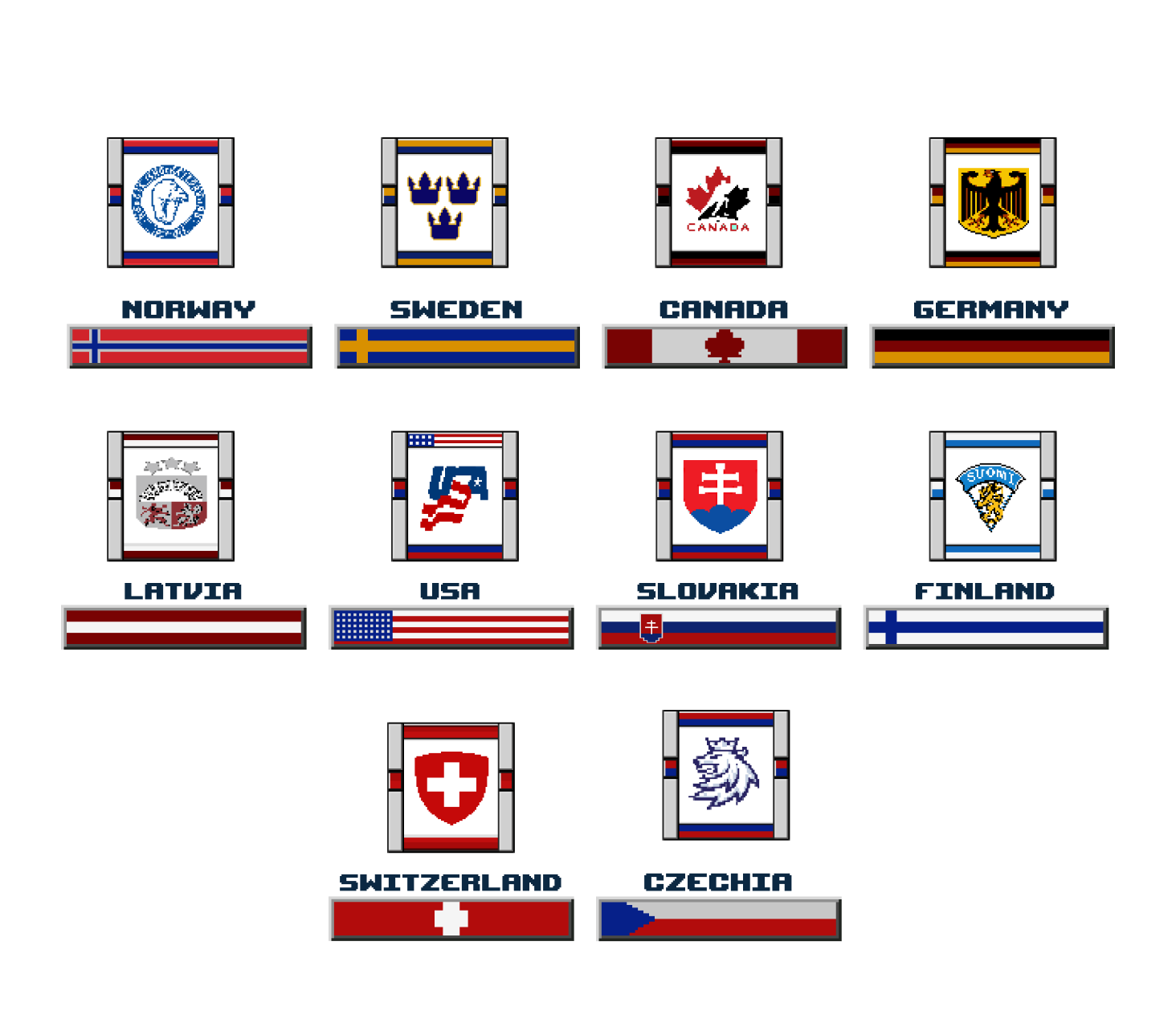
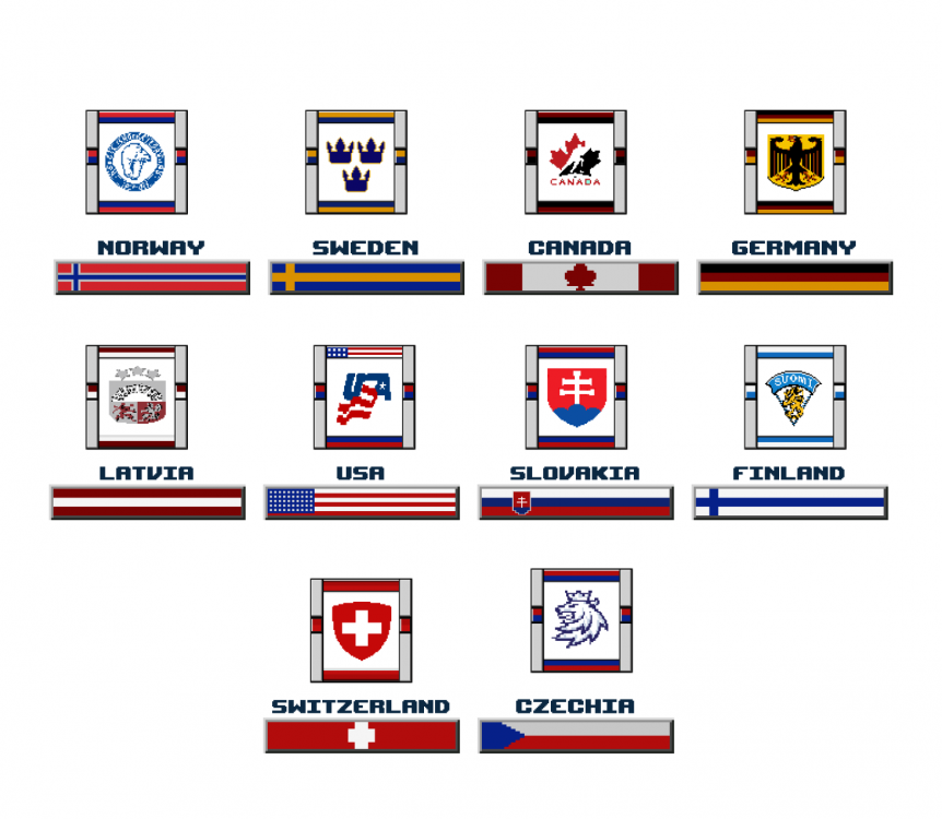
New Genesis ROM for the 2023-24 World Juniors tournament in Gothenburg, Sweden. ROM includes all 10 teams participating in the tournament: Canada USA Sweden Finland Czechia Latvia Norway Slovakia Germany Switzerland This is a WBF ROM. The weightbug fix has been applied to this ROM as well as removing CB checks. Fat guys can hit little guys and little guys struggle to hit bigger guys. Only B checks and normal C checks are effective. All team advantages have been set to neutral Hot and Cold has been reduced (Similar to CDL) Increased Goalie range Decrease time to grab goalie control Player Cards have been updated to include most players on each team Rosters updated as of today's date. Unfortunately it can change until the first elimination game so it is what it is Jerseys, logos, banners all updated Home Selection screen updated to be the Scandanavium (Arena in Sweden for the tournament) https://www.goalzz.com/?stadium=6777 OFFICAL ROM: WorldJuniors_2024.bin Enjoy WorldJuniors_2024.bin
 1 point
 -
Most Underated Player: Denis Savard Damn this guy can skate. This guy can take a hit like no other. Full blast, head on hits from super checkers Theo Fluery and Don Sweeney and this guy just keeps skating! Awesome Player!1 point
-
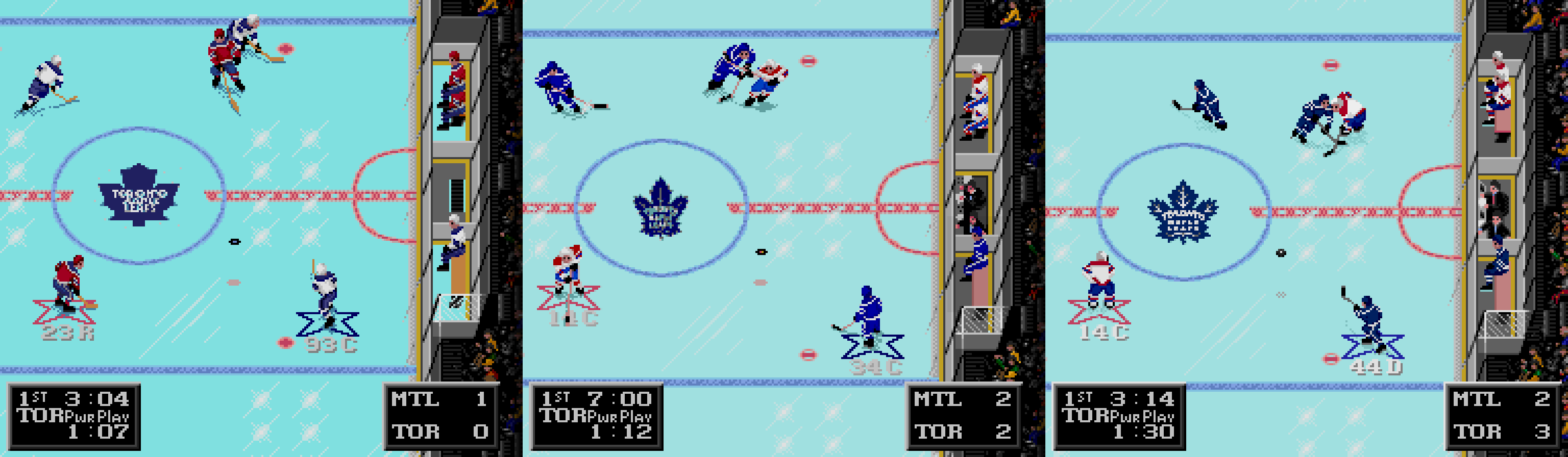
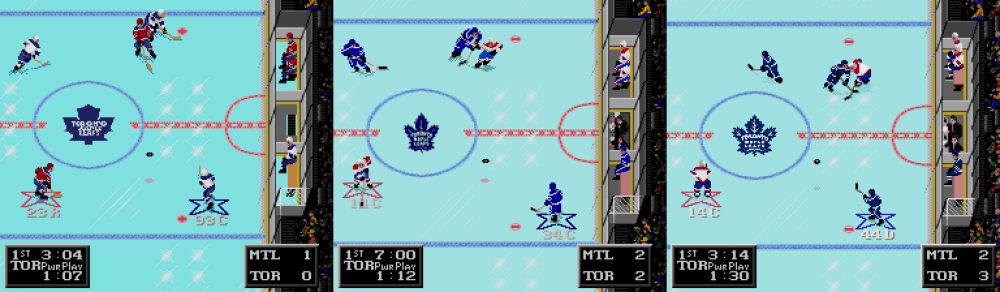
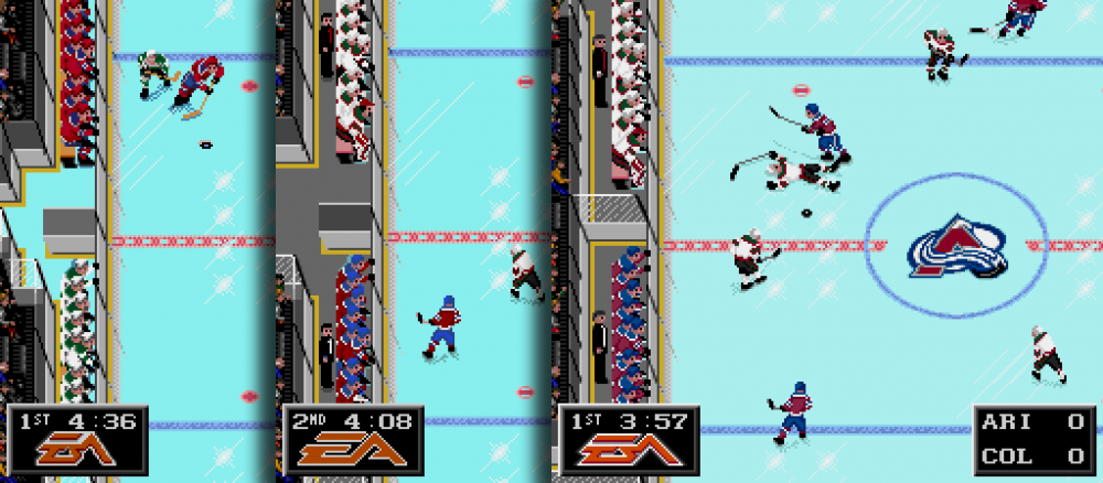
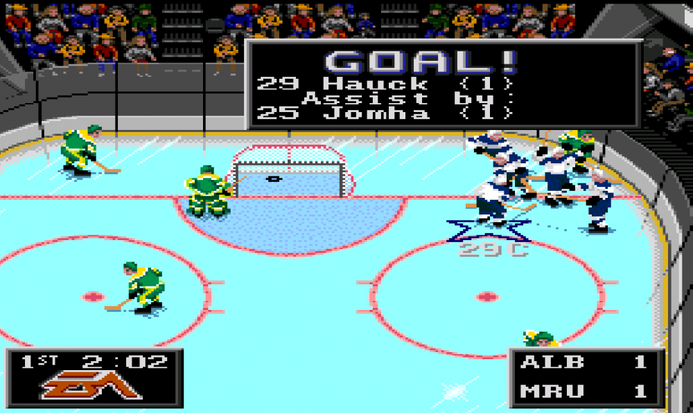
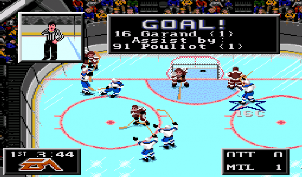
Hey all! First off, I finally joined after lurking for so long in trying to learn as much as I can. I've done a lot of the hacking based on what I've read and some trial-and-error, but I have teams set, rosters set, initial team banners on the team select screen coded to the right colours, and all uniforms set correctly. Based on the 27 teams with the most history at the U SPORTS National Championship in Canada (and with a slight bias towards Canada West), 29 teams are represented with the two All-Star Squads represented as the 2023 FISU Team Canada team and the 2023 All-Canadian team as chosen by U SPORTS. Ron Barr's chatter has also been updated. In short, I'm going to gather some advice on Tile Molestor and TLP from the forum because I haven't figured out how to set center ice logos, team selection logos, player cards, and in-game banners properly without them looking all wonky. I also want to change the title screen image and some league logos, but one project at a time. LOL. After all, I'm still working and learning, but suggestions would help immensely! Also, here are a few in-game moments I've captured in playing the game.
 0 points
.png.6eee13ac16c07321184764524f083459.png)