von Ozbourne
-
Posts
446 -
Joined
-
Last visited
-
Days Won
113
Content Type
Profiles
Forums
Events
Everything posted by von Ozbourne
-

Blades, of Steel, II *shink* [EA Hockey 91]
von Ozbourne replied to von Ozbourne's topic in Genesis Roms
Long time coming, especially given how easy the fix was, but the bench player sprites now match their on-ice counterparts. Updated in the original post as well, but here are the new versions. Blades of Steel 2 [US]1.1.binBlades of Steel 2 [JP]1.1.bin -
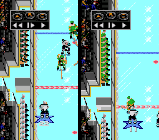
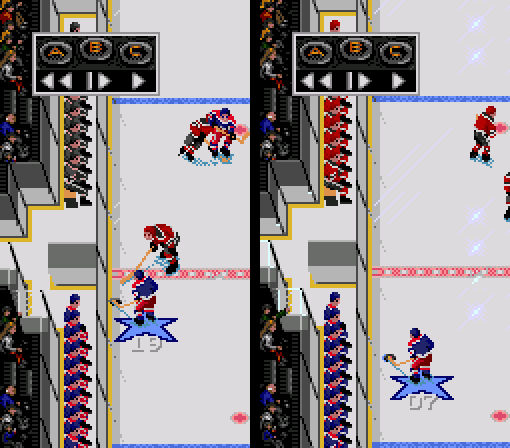
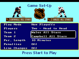
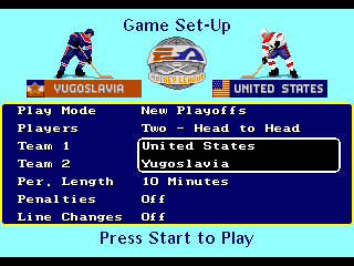
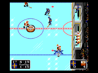
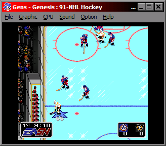
Figured I'd post these here. These are essentially the base ROMs of the original NHL Hockey [NTSC] and EA Hockey [PAL] with two minor fixes. First up: Finally figured out why the away team bench players had weird colours. They use different sprites from the home team... but... why? Corrected the sprites to match the home team and display the right colours. North Stars are darker because the original game was using the pants colours for the entire uniform. Using mod of EA Hockey to better display colour issue. Old yoke for both Home and Away teams used skin highlight tone and sweater in the pants colour. New sprites have the bench players' sweaters match the players on the ice. Also shortened the pants so they don't go down over the knee anymore. Fix number 2: All-Star teams are teed up for Playoff mode shenanigans/personal modding options in NHL Hockey. United States and Yugoslavia are available to try to win the EA Hockey League playoffs in EA Hockey. Fix #3 Penalty box player socks. Problem with these ones is that unlike the bench players where the home and away players use different sprites for whatever reason, the penalty box players use the same sprites, but different palettes. Unfortunately I was not able to figure out where the code that determined this is located. If anyone can be bothered to figure this out, let me know eh. Never mind. Many thanks to @kingraph for figuring that one out. 92 - NHL Hockey+Teams Fix.bin 92 - EA Hockey (E)+Teams Fix.bin

-
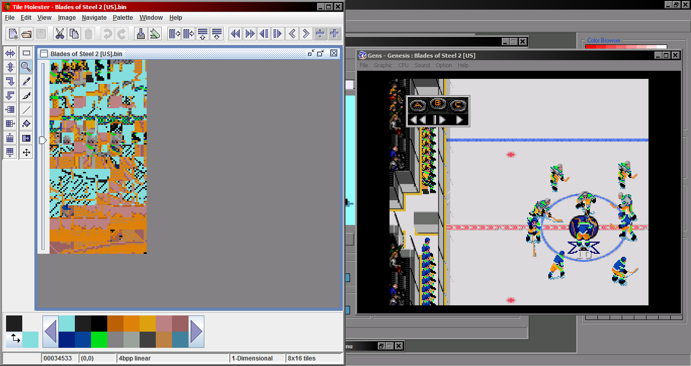
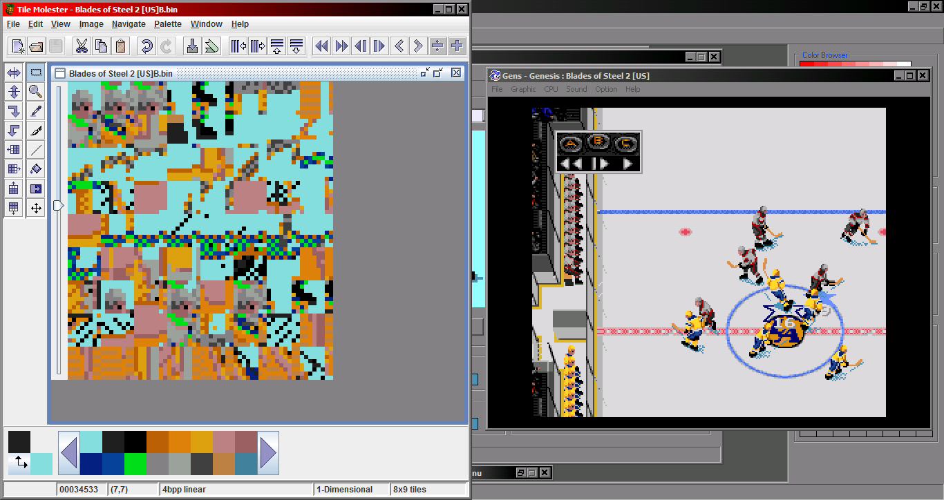
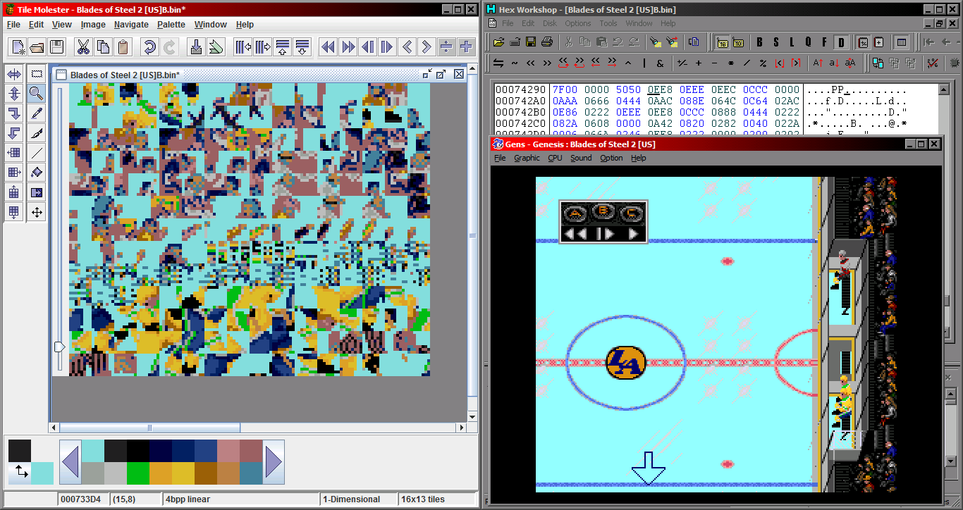
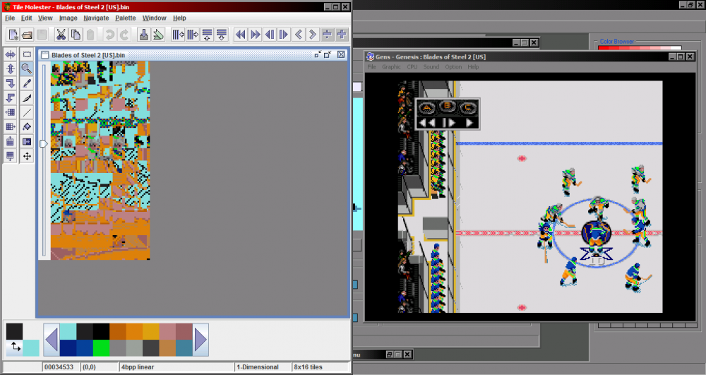
Actually, figured it out. Seems that unlike the later games, the home and and away teams are using different sets of sprites. Seems redundant. And also prone to mistakes. As self illustrated here. It would seem that simply copying the lower [home] set of sprites over the upper [away] set should fix the issue. Haven't found out for sure either way yet, but I'm wondering if this is also the culprit behind the penalty box sox. Looks like I'm going to have to update a few games... Edit: Confirmed The penalty box guys are grouped in with the animated crowd sprites though, and there is only one set of them. This likely means that the socks are listed in the overlays code somewhere, but I wasn't having any luck. Aside from that, I changed up the socks on the bench and sin bin sprites so they match the on-ice sprites a bit better. Definitely going to have to update a few ROMs now.

-
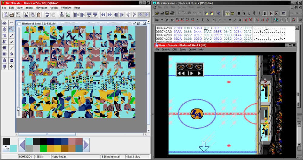
NHL Hockey [92] has another issue with the players on the bench on the other side too. But again only the away team. Not sure what they have going on there, with colours seeming half a set off.
-
How-to: Edit the Rink, Sideboards, & More (NHL '94)
von Ozbourne replied to AdamCatalyst's topic in How-To & Reference
We talking like.... Or maybe if Mike Milbury whacking some guy in the face with his own shoe is too much, maybe just that old guy in the blue sweater getting tired of that kid that keeps banging on the glass so he pelts him in the back if the head with a beer can.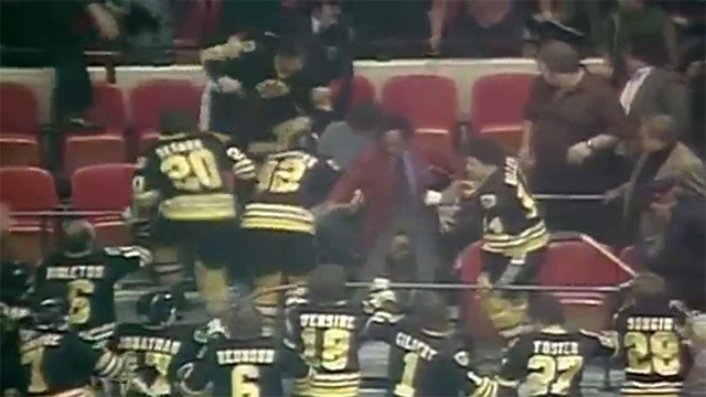
-
How-to: Edit the Rink, Sideboards, & More (NHL '94)
von Ozbourne replied to AdamCatalyst's topic in How-To & Reference
Alright. Couldn't help myself, quickly mocked up an idea and it looks like maybe a third of the original animated tiles would still move, while combining the classic and modern sensibilities. Assuming this is enough to not overload the memory, this might open up some interesting possibilities...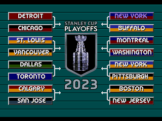
-
How-to: Edit the Rink, Sideboards, & More (NHL '94)
von Ozbourne replied to AdamCatalyst's topic in How-To & Reference
Hold on.... So does that mean that if say, to "reduce" the size of the image, one could theoretically trade the spinning cup out for a version of maybe half the size and have transparent/static image for the rest of the sprites and that might still work? -
How-to: Edit the Rink, Sideboards, & More (NHL '94)
von Ozbourne replied to AdamCatalyst's topic in How-To & Reference
Oh no... What have I done!?! -
NHL 2024 ['94] by JKline3 and von Ozbourne
von Ozbourne replied to von Ozbourne's topic in Genesis Roms
Well, I suppose constructive feedback is always welcome. Actually I've always been of the mind that it's good top be original and have a unique vision, but on the other hand, you don't want to use an inferior idea solely on the basis of being different. -
How-to: Edit the Rink, Sideboards, & More (NHL '94)
von Ozbourne replied to AdamCatalyst's topic in How-To & Reference
Whoa whoa whoa! Just for the record, I was not trying to incorporate betting ads into my games. Actually... if you were just trying to disable some of the animations, you could always go the low tech method. I needed to disable some animation for a project that needed the arena to be smaller, a la community centre, plus while exploring options for the obligatory outdoor rink. Found the section where the sprites for overlaying the animated portions of the crowd sit here. Plus what might[?] be part of the code that controls animation as it directly follows the sprites and the games seem to follow that convention. What I ended up doing was just make the animation sprites that overlay the sections in question, into transparent blocks and called it good enough.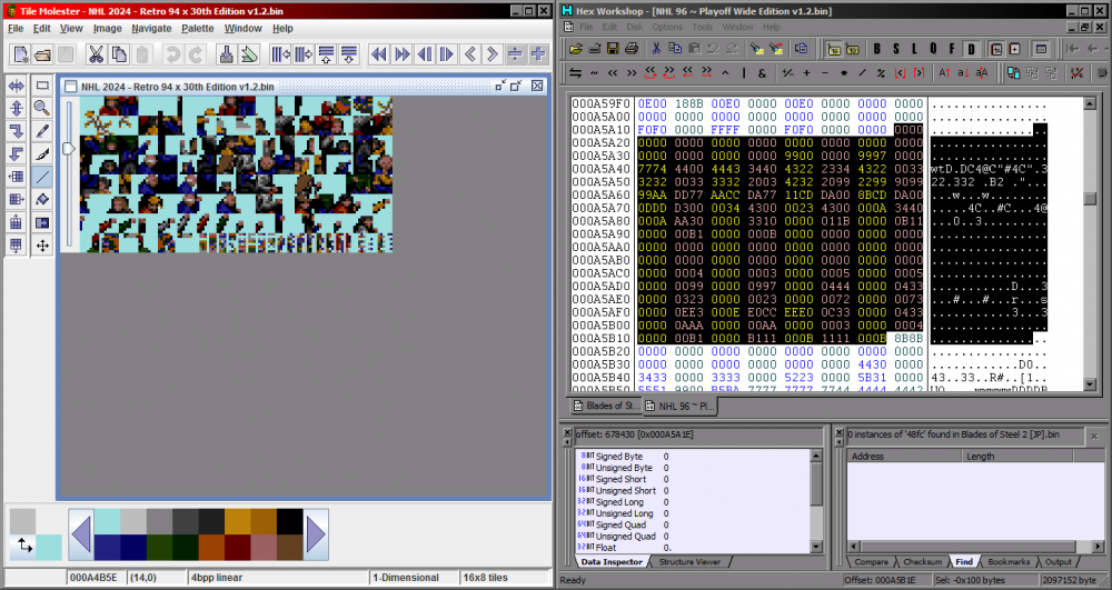
-
How-to: Edit the Rink, Sideboards, & More (NHL '94)
von Ozbourne replied to AdamCatalyst's topic in How-To & Reference
Actually in all seriousness, I think this one might[?] be plausible, as there is some code after the animated sprite tiles that looks like[?] something similar to the animated Stanley Cup in '95 on the Playoff Bracket screen, but unfortunately any kind of messing around I tried with that just crashed the game. That being said, I didn't try that hard, so there is a good chance I was just missing some key thing. Or there is always that chance that it is compressed like the ref animations and off limits for the time being. -
How-to: Edit the Rink, Sideboards, & More (NHL '94)
von Ozbourne replied to AdamCatalyst's topic in How-To & Reference
Hmm... You aren't per chance trying to implement a certain animation change are you? -
NHL 2024 ['94] by JKline3 and von Ozbourne
von Ozbourne replied to von Ozbourne's topic in Genesis Roms
GM's try to blame it on salary cap management, but we all know that they see a ROM update and call up their buddies to have a chuckle at our expense. -
NHL 2024 ['94] by JKline3 and von Ozbourne
von Ozbourne replied to von Ozbourne's topic in Genesis Roms
Huh, guess I missed that one. Didn't touch the penalties, so that would have been an artifact of whichever ROM I ended up borrowing as the base when I switched from 30 to 32 teams. Changed that and updated. Player names are a debate. Spell them properly and run into overflow or reduce them to the ten character limit and hope they don't look silly. Suppose we could open that debate again. -
NHL 2024 ['94] by JKline3 and von Ozbourne
von Ozbourne replied to von Ozbourne's topic in Genesis Roms
With a few major roster changes occurring recently, we've put together a minor update to hold us over until the new year. There have been a small handful of roster moves since Version 1.0, but the most notable changes include: Kane is in, Perry is out. Goaltenders reevaluated and changed up in cases where the original projected #1 or 1A has been relegated to 1B or backup status. Cleaned up a small number of player photos. This new ref animation isn't new. but I'm just going to bring attention to it as a distraction. Added to original post as well. NHL 2024 - Retro 94 x 30th Edition v1.2.bin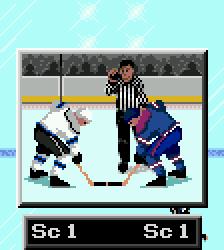
-
Okay. I really like that new Shootout window layout, but I have to say it. 15 seconds is not long enough! I feel like I'm at the start of a Mario Bros. level and that "hurry up" jingle is playing before I even get to move! Then I'm rushing and setting myself up for failure! I only won 2-0! Totally bogus! 7/10.
-
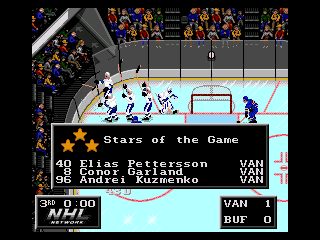
Alright, I get that we're supposed to be smack talking each other, but you did some pretty interesting things here and I literally did a double take when I saw the rearranged 3-Star text. I may need to see how you did that.
-
HOW TO: 0-15 player attribute rating scale
von Ozbourne replied to smozoma's topic in How-To & Reference
I finally had some time to examine this closer and I think that you caught it already. Looking at the 0-6 rating here. Judging by that, as you said, the 0-15 seems to just add more increments to the pre-established scale. I guess it just threw me off because perhaps in the 0-6 scale, 6 is considered "super human" and used sparingly, but they still wanted those 3s and 4s to seem respectable rather than have the median be actually 50%. Maybe it's just a me thing, but I would figure that to make better use of the added increments, the numbers could be something like 0=20 and each increment could increase that number by a flat value of 6. This would result in E=104 and F= a "superhuman" 110. Obviously this is just a preference based on a compulsion for equal numbers, but without the ability to do it myself, I can't really flex any authority on the matter. It just seemed like a missed opportunity to me to not take advantage of the extra nuance afforded by the new scale, but again as you say, one is still beholden to the limits of the code in which the game was built.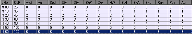
-
HOW TO: 0-15 player attribute rating scale
von Ozbourne replied to smozoma's topic in How-To & Reference
@AdamCatalyst I sent you a message with my distillation of editing weights as displayed in the game as explained to me by Smozoma earlier [if that is what you were referring to specifically] and if it isn't, it is really interesting nonetheless. @smozoma As an aside perhaps to the Overall player rating in a 0-15 scale as interpreted by the ROM, I had made a test game where all of the player attributes were set to the same value [all 1s, 2s, 3s, etc...] and I was noticing that I was getting an overall of 99 with all D's, E's and F's and all B's and C's were already over 90. [I'll send some screen shots later to explain better, but I'm supposed to be finishing my breakfast and getting ready for work, not doing research for a game] I suppose that this is an extreme case and not how the player attributes are supposed to be used in a "real" game, but it just seemed like something was off, if the top third of available rating options all gave you a score in the top 10%. -
NHL 2024 ['94] by JKline3 and von Ozbourne
von Ozbourne replied to von Ozbourne's topic in Genesis Roms
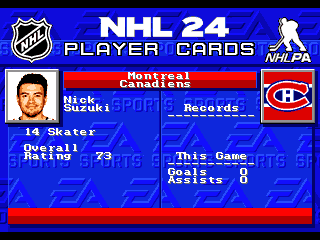
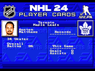
Yeah I'm curious about the process... What kind of image adjustments you make before putting them in... Saturation and contrast boosts? Then dither with a predefined palette in photoshop? To start, Many thanks. To be honest, I was actually messing around with the idea of colour photos last year, but the team photographers were so inconsistent with the lighting and colour adjustments that it was just not worth the effort. This year however, they did a much better job of being at least in the same vicinity tonally, even if some teams would have a different fill light here or there or end up with a less vibrant set of images. But, it was all close enough that it seemed worth revisiting. Still wasn't sure though until I actually made that Dave Reid image. I'd gotten it ready for index colouring by setting a custom palette with all eight of the default grey tones and limiting the image to 16 colours and found that it was able to give me that image using only five skin tones. Emboldened with this knowledge, I tried an assortment of player photos using those same five tones and white, black and mid grey and it actually looked nice. As for what I had to do to the photos, given that they were so close to start, I was able to set up some photoshop actions to bump the vibrancy and contrast and brightness just a little bit before converting to eight colour index. I actually find that vibrancy works better for me than saturation and combined with a subtle brightening with probably a maxed out contrast and after going through the cropping and resizing, probably about 2/3 of them were good enough already. For some of the duller, darker, washed out players, I did go back and add some preset vibrancy, brightness/contrast adjustments, and that took care of a good chunk more so I think maybe only 10% of the total pictures actually required some manual attention. And even in these cases It was a lot of just going back to those vibrancy and contrast settings. In the more extreme cases, I would use dodge and burn to darken some forehead glare if the flash was too hot or darken the mid tones around areas like the nose or jaw to increase the contrast in just those areas. In some cases I ended up using layers, where I would overlay a copy of the image but with the layer properties changed to "soft light" or "overlay", occasionally in tandem with masking off areas so only certain features were adjusted. And then usually the top layer was a copy of the original but the layer property set to "colour" in order to preserve the original tones. This mind you is only in the extreme cases luckily so I didn't need to do this too many times. And luckily I didn't have to worry about too many bubble players who missed picture day this time, so trying to match a kid's junior photo to everyone else, wasn't an big issue. Anyway, armed with these tools, while constantly switching to the index colours I settled on after each adjustment, allowed me to see what was going to work in game. I did however restart about a third of the way through due to a change in direction with the dithering. [interesting you both touch on that in a way] I originally settled on a 30% dithering effect since it was subtle enough with the small images, but then I realized that I still didn't so much like it when it was up-scaled as it looked too "retro computery" rather than staying true to what old-school console game art looked like. To me anyway. So I bumped it down to 10% and that's what you see there. Sorry if this is getting long winded, but I guess the takeaway is that luckily the source images were very consistent this year, otherwise I probably would have just settled on black and white again. But since setting up a few automated batch actions was able accomplish what I needed for the majority of the pictures, I didn't feel like I was wasting my time on a foolish idea this year. Hopefully the team photographers do me a favour and keep this up next year. -
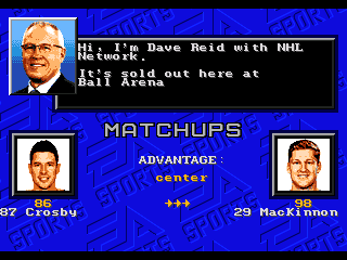
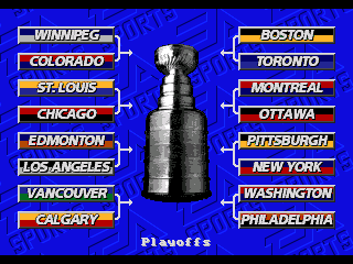
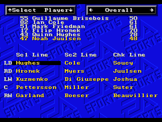
Alright. First off, sorry this one is a bit late, but in our defence, sometimes life happens at the most inopportune times. Cutting to the chase, it's time @Jkline3 and I submit: NHL 2024 - '94 Edition To start, while I haven't seen any mention of this being the 30th anniversary of this all-time classic in any of the modern releases, [if you're into that sort of thing] it seemed wrong not to address it in some manner. Also, NHL Network continues their "sponsorship" in this edition. The main menu background didn't change, but some other things have. Since Ray Ferraro left NHL Network, the search was on for another former player turned host that we can call on for riveting in-depth pre-game analysis, and Dave Reid was classy enough to return our call. With the new season, the playoff format is restored so anyone could win it all! Some minor tweaks to the game menu graphics, where one can view their lines with the updated player rosters and custom player ratings. Zamboni guy improved his posture and changed his sweater. As well as the new player cards. Yes, I may just be trying show off the new photos at this point. With the discontinuation of the Reverse Retro program, this year's edition sticks to the regular home and away kits. As well, this version incorporates a new 3-Star calculator thanks to the amazing tutorial work by @AdamCatalyst [It's hard to justify giving the goalie credit for the shutout when he only faced two shots all game] Obligatory under the hood and minor graphical stuff: Original custom player attribute stats based on NHL24 updates. Original JKline player sprite mod based on helmet patch for more accurate and varied uniforms. Tighter puck collision on boards and net making for pucks that hit closer to the boards sprites and a slighter smaller scoring area on the nets. Pucks that also feature original customized sprites that change with team colours. The nets that those pucks can go in have also had their sprites redrawn. Weight bug fix is applied. SmozROM Ratings consistency fix - player ratings will match hot/cold overall. Freeze Bug applied so no player stats and player name on second line. User Records set to "ON" can still cause crashes with Vegas, Washington and Winnipeg so caution is advised. Expanded goalie roaming area. Go out to the edge of the trapezoid or out to the face off dots to cut down the angle. Goalie can also carry the puck out to the blue line before the automatic whistle. [if play isn't blown for holding the puck too long] Yes we know that the goalie can technically go to the red line, but that would mean having to figure out how to assess delay of game penalties and that's not likely to happen. Goalie Y-button control hack applied. Edit Lines hack for any player to play at any position. Great for 4-1 Power plays. Benches have been edited so the coach mod has been removed. EA Sports watermarks have been updated to modern logo. NHL 2024 - Retro 94 x 30th Edition v1.0.bin NHL 2024 - Retro 94 x 30th Edition v1.2.bin NHL 2024 - Retro 94 x 30th Edition v2.1.bin


- 89 replies
-
- 13
-

-

-

-

-
Interesting question. My first thought though would be how after a whistle, there is basically an invisible wall put up in front of the net that prevents the puck from going in, even if the goal shouldn't count anyway. One would think that a similar thing would occur in either scenario, where the whistle blows as soon as a player bleeds, thus walling off the net, or the play is dead after a goal, thus disabling the code that makes a player bleed after a forceful enough hit. I am curious about post whistle fighting though. I know that after an egregious enough beat down, the loser can acquire a gushing head wound, but I've only ever seen that in a fight that stopped the play, rather than post whistle shenanigans. And if that still counts.
-
Oh no.. While part of me wants to "Yes and" this string, I feel like we've possibly gone too far already. Yes. it was an joke and No there will be no charge... up front... [stop it!] I do feel that I should probably note that we are going to miss our goal by a few days, so no game today. Sorry. As to why, well, I'm not going to say that my esteemed rival, Adam, had anything to do with it. And I'm not going to say that he might have affiliations with Russian hackers. And that he may have allegedly employed their services to slow us down, thus ensuring his monopoly on game mods. For the record, I did not say any of that. I will say that it was not aliens.
-
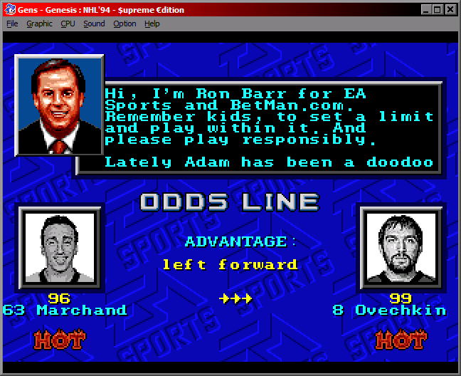
I feel slightly slighted, so I have been forced to retaliate the only way I know how. 'Bargo Bustin' a leaked Beta Build of Adam's Bogus Betting filled game! Is THIS what you want?! Show these sports gambling shills how you really feel by cancelling your pre-order and for only half the cost of a subscription to his game, you can support real indie development by subscribing to my patreon. Get the preferred early bird discount by signing up in the next 48 hours with the promo code YOUBETIWONT and receive a "FREE" pin!* *Supplies limited. Must be 18+ and have a parent or guardian's permission. Not available in the Province of Quebec for whatever reason.
-
Damn, that's a fat wad of Canadian Tire money. It's gotta be worth tens of dollars.