von Ozbourne
-
Posts
439 -
Joined
-
Last visited
-
Days Won
113
Content Type
Profiles
Forums
Events
Everything posted by von Ozbourne
-

Genesis NHL 94/95/96/97/98 wide mode (256x224 to 320x224)
von Ozbourne replied to elfor's topic in Genesis Roms
Well how about that. I was playing around with EA Hockey trying to see if I can figure out an unrelated thing when I noticed that I just did this. That blue highlight used to be 08F8, but when I changed the value to 6002, it did this. Although with the empty space when I skate too close to the right, it seems to be more a case of disabling the horizontal framing rather than setting the resolution to something different. Does make me wonder if there might not be a key in here somewhere.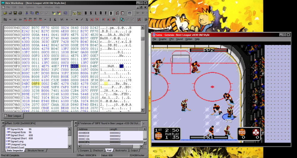
-
NCAA Hockey: Road to Tampa Bay (NHL 94) - 2023 NCAA ROMs - Final Update
von Ozbourne replied to Sean's topic in Genesis Roms
Okay. That sounds awesome. You're also making me think I need to step up my game. I have a project in the works that is just screaming for new music, but have not yet gotten serious about doing that. Extra special kudos for the Chicago Bulls shout out. -
My biggest gripe is that I live in an area of the country where "free market rules" are prevalent and people who... pretty much do the equivalent of scalping, insert themselves as a middle entity and collect profit without adding any actual value. Anyway, they just make life more expensive for no reason and I don't like them. But yeah. As someone who has taken the route of trying to make games that look like a real release of the era, I've mostly avoided those types of obvious markers. At least I haven't seen any of my ROMs being used in this manner, [don't know it I should be relieved or offended] but it does kind of make me wonder if a more prominent logo/credit/splash screen should be incorporated. Hmm... now I'm thinking I may design one of the splash screens to say something like "NHL94.com Free Review Edition. Not for resale." That sounds realistic enough eh?
-
I kind of like [and really hate] the "Due to the popularity of this product, all orders will take approx 3-7 days to be shipped." As in "we make them to order". At least they acknowledge how "Very Rare" your game is. Kind of wonder if you reported them to ebay if they would give a damn.
-
HOW TO: Adding a graphic to the Main Menu background
von Ozbourne replied to Drezz's topic in How-To & Reference
Curious what you did. I gave it a shot and it worked great in the 30-team. Seemed to work fin in the 32-team as well.... until I started a game and got as far as one frame after the face off when... I realized that I did something dumb and had accidentally moved the image over some important code. Never mind. This is why you always keep backups folks. -
How many still play EA Hockey, NHL Hockey, and NHLPA 93?
von Ozbourne replied to a topic in General NHL'94 Discussion
NHL Hockey is okay, but EA Hockey on the NTSC setting is the best because the physics are on steroids. -
HOW TO: Give every player back their photos in 32-team ROM
von Ozbourne replied to von Ozbourne's topic in How-To & Reference
You know, I figured that must have been the case, but I found it odd that literally everyone was using the version where all but the starting six had their pointers deleted and were stuck with default lefty/righty as their photos. And I usually download every different ROM I can find on here, if even just to see what others are doing, but I couldn't find one that had all the photos intact. Obviously I just never came across the right thread, [and since I wasn't the only one, if you want to link it here I can reference it too] but in that case this can just be for restoring those missing cards on the games all you folks have already completed while using the inferior version. -
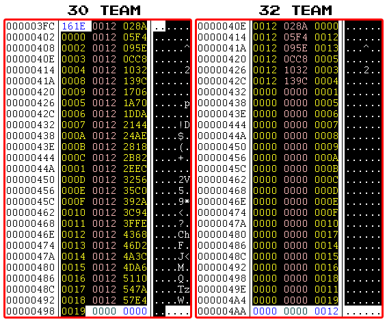
I've always preferred working in the 30-team ROM since it meant that every player got to have a photo, but there are obviously other reasons one would prefer the 32-team ROM. Unfortunately the main 32-Team version floating around seemed to be missing the photos for all but the starting lineup. Why was this? ...was the question. Turns out they were just erased. Yeah, all those 0's is bad. For those interested in what the columns mean. In the case of the first row: 0012 & 0284 - The pointer for the player photo. 0000 - The hex number coinciding with each player's position in the roster. There are some 0's and stuff after the 26th player, so the columns get offset a bit with each new team. Want the player photos back? Follow these steps. Step 1. Starting on a new game? Excellent! Just download Slapshot67's original ROM below and you are done. No need to proceed to Step 2. Although, check out Bonus Step 5 if you like. Step 2. Still here? Okay, I guess that you are looking to reattach the photos in a ROM that you have already put some time into. Well, luckily the quick fix is to open your hex editor and select the code between offsets 040E & 6154. Step 3. Replace it with this: 0012028A0000001205F400010012095E000200120CC800030012103200040012139C000500121706000600121A70000700121DDA0008001221440009001224AE000A00122818000B00122B82000C00122EEC000D00123256000E001235C0000F0012392A001000123C94001100123FFE0012001243680013001246D2001400124A3C001500124DA600160012511000170012547A0018001257E400190000000000125B4E000000125EB800010012622200020012658C0003001268F6000400126C60000500126FCA00060012733400070012769E000800127A08000900127D72000A001280DC000B00128446000C001287B0000D00128B1A000E00128E84000F001291EE0010001295580011001298C2001200129C2C001300129F9600140012A30000150012A66A00160012A9D400170012AD3E00180012B0A80019000000000012B41200000012B77C00010012BAE600020012BE5000030012C1BA00040012C52400050012C88E00060012CBF800070012CF6200080012D2CC00090012D636000A0012D9A0000B0012DD0A000C0012E074000D0012E3DE000E0012E748000F0012EAB200100012EE1C00110012F18600120012F4F000130012F85A00140012FBC400150012FF2E00160013029800170013060200180013096C00190000000000130CD60000001310400001001313AA000200131714000300131A7E000400131DE80005001321520006001324BC000700132826000800132B90000900132EFA000A00133264000B001335CE000C00133938000D00133CA2000E0013400C000F001343760010001346E0001100134A4A001200134DB400130013511E0014001354880015001357F2001600135B5C001700135EC60018001362300019000000000013659A000000136904000100136C6E000200136FD80003001373420004001376AC000500137A16000600137D800007001380EA0008001384540009001387BE000A00138B28000B00138E92000C001391FC000D00139566000E001398D0000F00139C3A001000139FA400110013A30E00120013A67800130013A9E200140013AD4C00150013B0B600160013B42000170013B78A00180013BAF40019000000000013BE5E00000013C1C800010013C53200020013C89C00030013CC0600040013CF7000050013D2DA00060013D64400070013D9AE00080013DD1800090013E082000A0013E3EC000B0013E756000C0013EAC0000D0013EE2A000E0013F194000F0013F4FE00100013F86800110013FBD200120013FF3C0013001402A600140014061000150014097A001600140CE400170014104E0018001413B800190000000000141722000000141A8C000100141DF60002001421600003001424CA000400142834000500142B9E000600142F080007001432720008001435DC000900143946000A00143CB0000B0014401A000C00144384000D001446EE000E00144A58000F00144DC200100014512C001100145496001200145800001300145B6A001400145ED400150014623E0016001465A8001700146912001800146C7C00190000000000146FE60000001473500001001476BA000200147A24000300147D8E0004001480F80005001484620006001487CC000700148B36000800148EA000090014920A000A00149574000B001498DE000C00149C48000D00149FB2000E0014A31C000F0014A68600100014A9F000110014AD5A00120014B0C400130014B42E00140014B79800150014BB0200160014BE6C00170014C1D600180014C5400019000000000014C8AA00000014CC1400010014CF7E00020014D2E800030014D65200040014D9BC00050014DD2600060014E09000070014E3FA00080014E76400090014EACE000A0014EE38000B0014F1A2000C0014F50C000D0014F876000E0014FBE0000F0014FF4A0010001502B400110015061E001200150988001300150CF200140015105C0015001513C6001600151730001700151A9A001800151E040019000000000015216E0000001524D8000100152842000200152BAC000300152F160004001532800005001535EA000600153954000700153CBE000800154028000900154392000A001546FC000B00154A66000C00154DD0000D0015513A000E001554A4000F0015580E001000155B78001100155EE200120015624C0013001565B6001400156920001500156C8A001600156FF400170015735E0018001576C800190000000000157A32000000157D9C0001001581060002001584700003001587DA000400158B44000500158EAE0006001592180007001595820008001598EC000900159C56000A00159FC0000B0015A32A000C0015A694000D0015A9FE000E0015AD68000F0015B0D200100015B43C00110015B7A600120015BB1000130015BE7A00140015C1E400150015C54E00160015C8B800170015CC2200180015CF8C0019000000000015D2F600000015D66000010015D9CA00020015DD3400030015E09E00040015E40800050015E77200060015EADC00070015EE4600080015F1B000090015F51A000A0015F884000B0015FBEE000C0015FF58000D001602C2000E0016062C000F00160996001000160D0000110016106A0012001613D400130016173E001400161AA8001500161E1200160016217C0017001624E600180016285000190000000000162BBA000000162F2400010016328E0002001635F8000300163962000400163CCC0005001640360006001643A000070016470A000800164A74000900164DDE000A00165148000B001654B2000C0016581C000D00165B86000E00165EF0000F0016625A0010001665C400110016692E001200166C9800130016700200140016736C0015001676D6001600167A40001700167DAA0018001681140019000000000016847E0000001687E8000100168B52000200168EBC0003001692260004001695900005001698FA000600169C64000700169FCE00080016A33800090016A6A2000A0016AA0C000B0016AD76000C0016B0E0000D0016B44A000E0016B7B4000F0016BB1E00100016BE8800110016C1F200120016C55C00130016C8C600140016CC3000150016CF9A00160016D30400170016D66E00180016D9D80019000000000016DD4200000016E0AC00010016E41600020016E78000030016EAEA00040016EE5400050016F1BE00060016F52800070016F89200080016FBFC00090016FF66000A001702D0000B0017063A000C001709A4000D00170D0E000E00171078000F001713E200100017174C001100171AB6001200171E2000130017218A0014001724F400150017285E001600172BC8001700172F3200180017329C00190000000000173606000000173970000100173CDA0002001740440003001743AE000400174718000500174A82000600174DEC0007001751560008001754C000090017582A000A00175B94000B00175EFE000C00176268000D001765D2000E0017693C000F00176CA600100017701000110017737A0012001776E4001300177A4E001400177DB800150017812200160017848C0017001787F6001800178B6000190000000000178ECA00000017923400010017959E000200179908000300179C72000400179FDC00050017A34600060017A6B000070017AA1A00080017AD8400090017B0EE000A0017B458000B0017B7C2000C0017BB2C000D0017BE96000E0017C200000F0017C56A00100017C8D400110017CC3E00120017CFA800130017D31200140017D67C00150017D9E600160017DD5000170017E0BA00180017E4240019000000000017E78E00000017EAF800010017EE6200020017F1CC00030017F53600040017F8A000050017FC0A00060017FF740007001802DE0008001806480009001809B2000A00180D1C000B00181086000C001813F0000D0018175A000E00181AC4000F00181E2E00100018219800110018250200120018286C001300182BD6001400182F400015001832AA00160018361400170018397E001800183CE8001900000000001840520000001843BC000100184726000200184A90000300184DFA0004001851640005001854CE000600185838000700185BA2000800185F0C000900186276000A001865E0000B0018694A000C00186CB4000D0018701E000E00187388000F001876F2001000187A5C001100187DC600120018813000130018849A001400188804001500188B6E001600188ED80017001892420018001895AC00190000000000189916000000189C80000100189FEA00020018A35400030018A6BE00040018AA2800050018AD9200060018B0FC00070018B46600080018B7D000090018BB3A000A0018BEA4000B0018C20E000C0018C578000D0018C8E2000E0018CC4C000F0018CFB600100018D32000110018D68A00120018D9F400130018DD5E00140018E0C800150018E43200160018E79C00170018EB0600180018EE700019000000000018F1DA00000018F54400010018F8AE00020018FC1800030018FF820004001902EC0005001906560006001909C0000700190D2A0008001910940009001913FE000A00191768000B00191AD2000C00191E3C000D001921A6000E00192510000F0019287A001000192BE4001100192F4E0012001932B800130019362200140019398C001500193CF60016001940600017001943CA00180019473400190000000000194A9E000000194E080001001951720002001954DC000300195846000400195BB0000500195F1A0006001962840007001965EE000800196958000900196CC2000A0019702C000B00197396000C00197700000D00197A6A000E00197DD4000F0019813E0010001984A8001100198812001200198B7C001300198EE60014001992500015001995BA001600199924001700199C8E001800199FF80019000000000019A36200000019A6CC00010019AA3600020019ADA000030019B10A00040019B47400050019B7DE00060019BB4800070019BEB200080019C21C00090019C586000A0019C8F0000B0019CC5A000C0019CFC4000D0019D32E000E0019D698000F0019DA0200100019DD6C00110019E0D600120019E44000130019E7AA00140019EB1400150019EE7E00160019F1E800170019F55200180019F8BC0019000000000019FC2600000019FF900001001A02FA0002001A06640003001A09CE0004001A0D380005001A10A20006001A140C0007001A17760008001A1AE00009001A1E4A000A001A21B4000B001A251E000C001A2888000D001A2BF2000E001A2F5C000F001A32C60010001A36300011001A399A0012001A3D040013001A406E0014001A43D80015001A47420016001A4AAC0017001A4E160018001A5180001900000000001A54EA0000001A58540001001A5BBE0002001A5F280003001A62920004001A65FC0005001A69660006001A6CD00007001A703A0008001A73A40009001A770E000A001A7A78000B001A7DE2000C001A814C000D001A84B6000E001A8820000F001A8B8A0010001A8EF40011001A925E0012001A95C80013001A99320014001A9C9C0015001AA0060016001AA3700017001AA6DA0018001AAA44001900000000001AADAE0000001AB1180001001AB4820002001AB7EC0003001ABB560004001ABEC00005001AC22A0006001AC5940007001AC8FE0008001ACC680009001ACFD2000A001AD33C000B001AD6A6000C001ADA10000D001ADD7A000E001AE0E4000F001AE44E0010001AE7B80011001AEB220012001AEE8C0013001AF1F60014001AF5600015001AF8CA0016001AFC340017001AFF9E0018001B0308001900000000001B06720000001B09DC0001001B0D460002001B10B00003001B141A0004001B17840005001B1AEE0006001B1E580007001B21C20008001B252C0009001B2896000A001B2C00000B001B2F6A000C001B32D4000D001B363E000E001B39A8000F001B3D120010001B407C0011001B43E60012001B47500013001B4ABA0014001B4E240015001B518E0016001B54F80017001B58620018001B5BCC001900000000001B5F360000001B62A00001001B660A0002001B69740003001B6CDE0004001B70480005001B73B20006001B771C0007001B7A860008001B7DF00009001B815A000A001B84C4000B001B882E000C001B8B98000D001B8F02000E001B926C000F001B95D60010001B99400011001B9CAA0012001BA0140013001BA37E0014001BA6E80015001BAA520016001BADBC0017001BB1260018001BB490001900000000001BB7FA0000001BBB640001001BBECE0002001BC2380003001BC5A20004001BC90C0005001BCC760006001BCFE00007001BD34A0008001BD6B40009001BDA1E000A001BDD88000B001BE0F2000C001BE45C000D001BE7C6000E001BEB30000F001BEE9A0010001BF2040011001BF56E0012001BF8D80013001BFC420014001BFFAC0015001C03160016001C06800017001C09EA0018001C0D54001900000000001C10BE0000001C14280001001C17920002001C1AFC0003001C1E660004001C21D00005001C253A0006001C28A40007001C2C0E0008001C2F780009001C32E2000A001C364C000B001C39B6000C001C3D20000D001C408A000E001C43F4000F001C475E0010001C4AC80011001C4E320012001C519C0013001C55060014001C58700015001C5BDA0016001C5F440017001C62AE0018001C6618001900000000001C69820000001C6CEC0001001C70560002001C73C00003001C772A0004001C7A940005001C7DFE0006001C81680007001C84D20008001C883C0009001C8BA6000A001C8F10000B001C927A000C001C95E4000D001C994E000E001C9CB8000F001CA0220010001CA38C0011001CA6F60012001CAA600013001CADCA0014001CB1340015001CB49E0016001CB8080017001CBB720018001CBEDC001900000000001CC2460000001CC5B00001001CC91A0002001CCC840003001CCFEE0004001CD3580005001CD6C20006001CDA2C0007001CDD960008001CE1000009001CE46A000A001CE7D4000B001CEB3E000C001CEEA8000D001CF212000E001CF57C000F001CF8E60010001CFC500011001CFFBA0012001D03240013001D068E0014001D09F80015001D0D620016001D10CC0017001D14360018001D17A00019 Step 4. Aaaand technically you're done. Now go make your game! The photos for all 26 possible players on all 32 teams were already there in the ROM. Just that now you can actually use them again! Bonus Step 5. The other thing to note is that this particular text block will arrange the players in the order that they appear in NOSE from the starting goalie [0000] to the last D-man [0019] If you want to have the starting lineup appear first followed by the other peons, you will need to figure out where the players appear in the order in NOSE and set the first six players to: 0000 [the Starting goalie always goes first, and appears last in the player scrolling] Follow up with the five skaters in your starting lineup, counting where they are in the order and using the corresponding hex number to their roster spot. [1st is 0000, 15th is 000E, 20th is 0013, etc] Be sure that your player photos are imported in the same order that you are placing them in the hex code. Finish the team up with the remaining players until everyone from 0000 to 0019 has made it into the roster somewhere. Pair this up with the hack to set how many players you display on the main menu and the Ron Barr pre-game screen, as well as the Winnipeg freeze bug fix, shake well and enjoy.
-
Hack help. No. Don't help.
von Ozbourne replied to von Ozbourne's topic in General Questions & Discussion
Oh? I'll have to look him up. Although I'm not so sure we would get on since he sounds pretty self absorbed. I mean, he does have "Me" right in his name there. -
Hack help. No. Don't help.
von Ozbourne replied to von Ozbourne's topic in General Questions & Discussion
Hmm, guess I'm "lucky" in that I was a Jets fan who happened to move to an area of the country where they don't feel the need to broadcast Jets games for some dumb reason. Also, as it ends up, the bad joke is that Bettman being from New York, must not be a Yankees fan, otherwise he'd know that 3 Strikes [lockouts] and YER' OUT! Instead, much like the lost season gave rise to the broadcasting of Texas Hold'em tournaments to fill space, the third shut down [sadly occurring in just the second year we got the Jets back] forced me to find something else to do with my time. Things that I basically just kept doing even after the NHL came crawling back. @AdamCatalyst So, you're only slightly worse than most hockey analysts. @seamor There is actually a recent push to watch AHL/CHL games for just that reason. Less money involved so they kind of have to rely on the pure "love of hockey" experience. That and you don't have to take out a second mortgage to buy season's tickets. -
Hack help. No. Don't help.
von Ozbourne replied to von Ozbourne's topic in General Questions & Discussion
I'll have to say that I agree with him, although I may have taken it a step further by no longer tuning in to watch anymore. I find the drama in international competitions to be much more interesting than anything the club leagues can muster up on any given day anyway. And I've followed the sport long enough to know that the talking heads don't really add anything to my viewing experience, so if they are taking time away from talk about lineups and point streaks to tell me why so-and-so is at minus three and a half to score tonight... well they aren't talking to me. I am disappointed that TSN lost the pairing of Dreger and Ferraro though. [Especially since they keep bringing back Button. Tell ya, last World Championships, I watched the game on mute and listened to a podcast, it was a pretty good experience.] Funny you mention Marek. Coincidentally I mentioned to someone else recently that while I appreciate that he does appreciate the history and stories around the game, it's a shame that he doesn't use his powers for good enough. [I've long disliked his stance that "'Tradition' is just giving in to peer pressure from dead people"] -
Hack help. No. Don't help.
von Ozbourne replied to von Ozbourne's topic in General Questions & Discussion
Nah. All good man. I just couldn't resist the obvious science based jab. Although speaking of scientific minded thinking, sometimes there is some comedy in that line of thinking of Question, Exploration, Conclusion when you suddenly realize that the conclusion is ABORT MISSION! Just need to keep in mind not fall for the sunken cost fallacy and accept that my time was not wasted because I still have new knowledge that I can add to the pile for later. -
Hack help. No. Don't help.
von Ozbourne replied to von Ozbourne's topic in General Questions & Discussion
While changing a user name for this reason could be useful [it might help me fix the accidental typo in my name], I also see it being a problem when revisiting the community after some time away and not seeing a name you recognized anymore and used to passively follow. On the other hand, if a forum would allow for a second @ name for this nicknaming process, that could be fun. Shame the php forum coder folks never thought of that. If that were the case, I'd cast a vote to start calling you Nickel. You know, because as a metal, it's A damn good Catalyst... and totally has nothing to do with the value of your opinion of calling me Gary. <this would be the part where I would storm off in righteous indignation, before turning around and mentioning that I was sorry and was only kidding. shame there isn't really an emoji thing that can convey that kind of nuance.> -
Hack help. No. Don't help.
von Ozbourne replied to von Ozbourne's topic in General Questions & Discussion
No obligation but this guy did a pretty good job of explaining the problems I've had with the smarmy New York lawyer and the league director's decision making in general for years now. -
I think I remember seeing this show back in the day on English CBC. Was this the one where the team had Nordiques uniforms but the logo was changed from an "n" to an "m"? Didn't see too many episodes at the time, but thought it was pretty cool that it was a show about a hockey team. Especially since it was the last show I'd seen until Power Play got a couple seasons in the late '90s. Didn't know they made movies.
-
Hockey Stars 2 ['95 by way of SNK Prototype]
von Ozbourne replied to von Ozbourne's topic in Genesis Roms
Thanks for the heads up. Admittedly I didn't really play test the last minute change in puck collision that that much, but instead was going on my assumptions of NHL'94. I did tone it down a bit and won with the Bisons 5-2, using 10 minute periods, with their pair coming late in the third. [Although I had to rely on a couple breakaways to get the score that high as I too had a problem with my one-timers, in that they were being blocked half the time] You have given me another reason to put out another update though, as I just now realized that I made an error in the player select screen. Only recently figured out how to use 4-player mode in Gens and only now configured it to be on. Long story short, all four player numbers should have looked like number 3 does here. Posted 1.2 in the OP.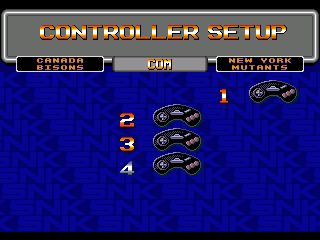
-
Playing around with rink and crowd tiles, it occurred to me that it might be possible to relocate the crowd animation to make some different animated sections. Then I wondered at what possibilities this could open up. Then I realized exactly where this is going and decided to try a mock up to see what it would look like. I must stress at this point. DO NOT. I repeat, DO NOT explore this idea any further. It is not worthy of your time. It's a non-issue.
-
Hockey Stars 2 ['95 by way of SNK Prototype]
von Ozbourne replied to von Ozbourne's topic in Genesis Roms
This one had been so long in the works that I forgot that I changed both. But yes, the main reason for the initials was because during the end-of-season-mode awards ceremony, the ambiguity of single names became a problem. Didn't want to break tradition and invent last names, and rather than worry about which combination of C&B was attributed to which C.B., I figured might as well find an alternative for both. -
Hockey Stars 2 ['95 by way of SNK Prototype]
von Ozbourne replied to von Ozbourne's topic in Genesis Roms
This was based on '95. As far as I know, that engine doesn't have the weight issue. -
NHL 2023 [94] by Jkline3 and von Ozbourne
von Ozbourne replied to von Ozbourne's topic in Genesis Roms
Now that I do know I have the info for. I should have PM'd you the results. I'll have to put together something that can be copied and pasted into the default ROM at some point. -
NHL 2023 [94] by Jkline3 and von Ozbourne
von Ozbourne replied to von Ozbourne's topic in Genesis Roms
I think since we decided we weren't fans of the coach, eliminating him gave us a few extra tiles. I think the three stars logo has a 6 wide, 4 high configuration. It uses a vertical mirroring with that middle star offset up one row. I'll see if I can find my references tomorrow when I have more time and put something together. -
What a difference a day makes. Version 1.1 of the widescreen patch means Version 1.1 of the Widescreen Edition. IIHF 99 - [Widescreen Edition 1.1].bin
-
Genesis NHL 94/95/96/97/98 wide mode (256x224 to 320x224)
von Ozbourne replied to elfor's topic in Genesis Roms
Oh man, that was fast. Can confirm that it has been fixed and is awesome. Now I have some work to do. Now I can't help but wonder why '92 isn't getting any love... -
Alright. Just resurrecting this thread to note that in light of the widescreen patch, I decided to make an IIHF 99 Widescreen Edition. It's pretty nice and does help the game play look like an upgrade to match all of the graphical changes I tried to do in this version. I will mention that one drawback is in the drawing of player sprites. I noticed that the players seemed to blink out when they get too close to the edge of the screen. I think it has to do with the way the patch works in that the background displays at the wider resolution, but the player sprites are unloaded from memory when they reach edge of the original display area. Given the trade off, I kept both versions. Version 1.1 has fixed this. And it looks great. There is another change to this version however, with the addition of the puck collision data for the full series of Genesis games, this widescreen edition also features a closer tolerance to the board and net sprites. Not too drastic, just going from a 0005 to a 0002. Not that the '98 engine needs any help in making it more difficult to score, but I like the slightly closer bounce off the boards. Also copied to the main post.

-
Genesis NHL 94/95/96/97/98 wide mode (256x224 to 320x224)
von Ozbourne replied to elfor's topic in Genesis Roms
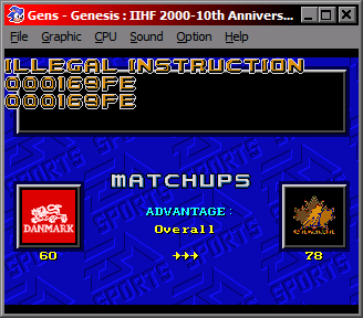
Sadly the 94 patch doesn't work on the PS2 '94 Anniversary port either. Got this when I tried to start a game. Can't really screen shot this, but another heads up, I noticed, for 98 at least, that players tend to disappear when they get too close to the edge of the screen. My guess is that while the background is displaying at the wider resolution, the area in which the player sprites load and unload remain the same as the default version. Haven't decided if that is too jarring yet, but I think I'm going to use it anyway...