von Ozbourne
-
Posts
439 -
Joined
-
Last visited
-
Days Won
113
Content Type
Profiles
Forums
Events
Everything posted by von Ozbourne
-
Sorry, had one of those "Oh! Yeah!" moments when i read this. We encountered this before and figured it out on Ultramagnus' thread a while back. There are in fact two different sets of team ratings. [it gets even messier if you were using the 34-team version.] Funny things is, I usually default to line changes on, so I had the opposite problem before coming across this. Never caught that line changes on/off was what determined which set got used. Oh yeah, have to ask. Who's Sedge?
-
California is indeed South and West of Manitoba, but I wouldn't really consider Seattle very South. And Houston is actually East of Winnipeg longitudinally... Piss taking aside, you might be alright with Pacific, I mean if the NHL can put the expansion Vancouver Canucks into the Eastern Conference their first couple of seasons, Texas is close enough. Blame that giant dead zone that west of the 100th meridian [where the great plains begin] for the poor options of population dense hubs. Although to be honest, I was always partial to the divisions being named after prominent figures, despite the vanity of it.
-
Took me a bit to remember what you were talking about. You mean flags/banners eh? Yeah there are a lot of repeated tiles on those screens in the name of saving bytes, so in that case I think I just imported a full mockup into another window and then copied the matching tiles over whatever they were replacing. The good news is that the hex code, that sets the arrangement of the tiles for main menu background and overlay and all of the menu screens, is usually found after each of the graphical assets. Can take a fare chunk of time going through and reconfiguring that, but it does open up the options.
-
Aah. I was wondering where you got those. Curious though, have you conducted any experiments with 95 music too? I've been seeing how far I can go with changing every asset in the game, but haven't figured anything out with the sound yet. Figure that should be something to try too.
-
I'd noticed that wboy's tutorial mentioned that the colours are also referenced for elements on the main menu screen [and I think the pre-game perhaps?] but in testing it turned out that as long as you don't change the default white and black, the remaining six grey scale values can be any colour you want and you won't mess up anything else. I've done this with other things, kind of jealous that I didn't think to try with realistic player photos myself. @DeterminedApathy Just a heads up in case you haven't tested it yet, but as for NHL 95, turns out that the photo palette behaves the exact same way. Just a shame that EA ditched the player cards that year and you can only have your awesome photos for the starting lineup.
-
Not being familiar with IceHL, my first thought was if this related to the IHL [1945-2001] [quickly clear it was not] Have to say, the colour photos are impressive. I was a bit curious where the rosters came from until I saw an Alaska Husky player name Calvin Broadus. ....hmm, wait a minute.
-

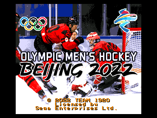
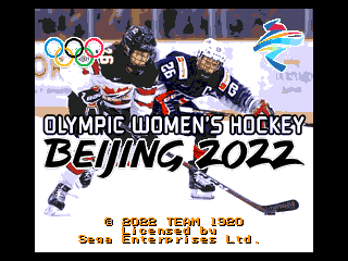
Olympic Hockey: Beijing 2022 [The Series]
von Ozbourne replied to von Ozbourne's topic in Genesis Roms
When you are playing around in NOSE and realize this must be a good omen. Anyway, just giving this a bump to highlight the completion of the series. Because now it is a series. Olympic Hockey - 2022 Beijing-N.bin Olympic Hockey - 2022 Beijing-M.bin Olympic Hockey - 2022 Beijing-W.bin Updated descriptions and download in the original post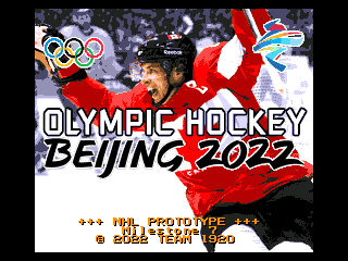
-
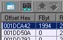
Don't know is this will help, but I have noticed something similar to this occur when I was copying or importing sprites within some games. My problem seemed to be related to what colours were being displayed when the copy/pasting occurred. Importing is just a matter of making sure that the colours are different enough so there is no misinterpretation on tile molester's part when it chooses what colours to use. Copy/pasting is weird because you would think that it would just directly swap the #4 colour in one game for the #4 colour in the other game, but I came across an issue when the colour palette had a dark grey [R096/G096/B096] and a dark green [R096/G128/B096]. For some reason, both the grey and the green were being interpreted as grey, and it was messing things up. I've also encountered this when the transparency colour is either the same, or too similar to one of the visible colours. The NHL games have this problem a lot since the transparency colour is typically ice blue, so if a sprite uses a colour that is close to that shade, it ends up disappearing when you paste it. This happens a lot in the case where the first/transparency colour is black and there is another instance of black in the palette, everything you paste just ends up as that first instance of black. This is why I usually use bright magenta, or sometimes its inverse of bright green, as my transparent since it should not come up in a regular sprite. In some cases, I've even gone as far as to change the current colour palettes to this, just to make sure that there is no chance of misinterpretation. Sorry for the long reply, hope this helps.

-
Update complete. No more "Bruins" outlier. New ROM in the main post.

-
Sunuva.... You know, I'd forgotten all about that. And that's the kind of thing that really bugs me too. ... V1.1 will probably be incoming sometime tomorrow.
-
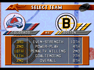
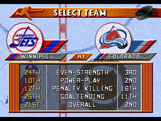
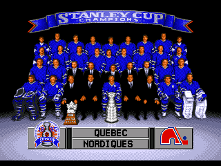
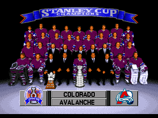
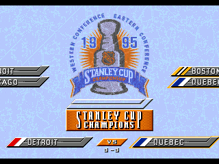
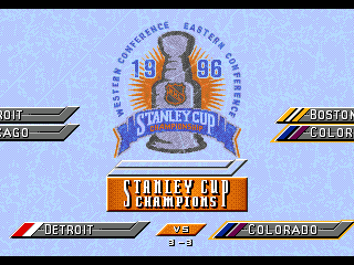
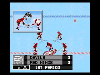
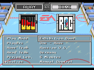
After spending a lengthy amount of slow progress on some bigger projects, [plus you know, that whole "being a responsible adult" thing] it was nice to take a break and bang out an Adam Savage style "One Day Build" [in that it actually took two days]. Figured now that it's done, I might as well share it. Thanks to @Deckard for the suggestion on this one, been a while since I did anything with NHL96 and it was fun to revisit it. The premise: Take NHL96 and give it an NHL97 roster update. Effectively making it closer to season end rosters. Fix art as applicable. Which makes this, Not a lot of changes, but the most obvious is, out goes Quebec, in goes Colorado. [sorry to see you go, but it is more historically accurate this way] All the other logos were mainly borrowed from '97 for consistency, although there are a few other fixes that, in theory, shouldn't haven't needed fixing... It's a little thing. Not so little on the other hand... Now, two caveats: 1. Due to how the team positions are hard coded, to avoid a giant compounding mess, Colorado simply adopts Quebec's old place in the North East Division. 2. Due to NHL97 having more memory space allocated to rosters than NHL96, I've had to cut one or two players per team to get in under the free bytes limit. Luckily there is no pre-game preamble anymore [something I would not say under any other circumstance], so I could delete the arena names and free up some extra bytes to avoid having to cut even more players. Thanks to @Deckard again for making the tough choices. UPDATE: Switching to Version 1.1 to eliminate the odd "Bruins" inconsistency. NHL 96 ~ Playoff Edition V1.1.bin NHL 96 ~ Playoff Wide Edition v1.2.bin
-
Ah. Yeah that's fine, we all start somewhere. To be fair, I find that the 96-98 games are a lot more complicated than the 92-95 ones anyway, so you don't want to start learning there. Unfortunately we don't have any A-level hackers around here who find cracking open 96-98 - like others have done with 93-95 - to be as worthwhile, but at least an art swap like that is attainable.
-
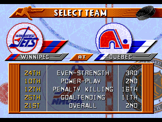
Curious. You just want the rosters copied over? That's relatively easy to do in NOSE, but what about the artwork? Also 96 still has Quebec and Winnipeg in it, while 97 has them in Colorado/Phoenix. [although I prefer the former anyway] 96 also would be lacking the All-Star teams, but the menu presentation is a lot cleaner and nicer to look at. [Which is mostly why I typically I just skip it an go from 96 to 98]
-
Olympic Hockey: Beijing 2022 [The Series]
von Ozbourne replied to von Ozbourne's topic in Genesis Roms
Yeah, I had started multiple versions, it was just that between some of the actual rosters not getting announced until very late [or getting announced and then changing last minute] and the age-old "free time" issue, I just haven't had the chance to complete the set as it were. Figured at this point I'll just throw this one out and wait until the Olympics are finished so I can use the complete stats as my base for player ratings. -
Well that's annoying. I do recall coming across this once while I was in the middle of making changes, and it stumped me to the point where I just went back to a previous version where that issue dis not arise and went on from there. But it seems that when I select South Africa, I'm now getting about a 50/50 chance that it glitches. Weird that I didn't notice this when I was testing, guess it must have snuck back in there along the way. I still can't figure it out, but I'm curious if it has something to do with the fact that I used the hex code edit that changes the default from the East & West All-Stars to the EA & THQ teams. [they had more sprites to work with as far as art] South Africa happens to be the first of all the unranked teams. [EA] Did the same thing for 98, but the glitch hasn't come up yet. Only using Gens myself.
-
Olympic Hockey: Beijing 2022 [The Series]
von Ozbourne replied to von Ozbourne's topic in Genesis Roms
Hah. Guess that means the teams were nicely balanced. Glad to see you like it! -
Olympic Hockey: Beijing 2022 [The Series]
von Ozbourne replied to von Ozbourne's topic in Genesis Roms
Oooooooooh... I... think so? I'll be honest, withe the recent talk around the 3-star formulas, I was trying to also use Smoz's hack applicator for the modified base weight numbers and 1-15 scale along with the new three-star calculator, but even with the NOSE file edit, something was preventing me from opening it after all of those things were applied. However, I am pretty sure that I did the weight bug and base weight before I ran into issues [although the base weights probably didn't change anyway], but I reserve the right to be wrong. -
Olympic Hockey: Beijing 2022 [The Series]
von Ozbourne replied to von Ozbourne's topic in Genesis Roms
Okay, if I didn't know that it would make the names a mess to read, I'd be tempted to use those. It's also kind of weird to try to figure out how some of those conversions were devised. Like (Ethan) Wei Ruike lost his first name? The women's team has some weird ones too. Actually not much of a story. I just liked the idea of using a pretend development company rather than a solo artist name. Also, that way if any collaborative work is used in my stuff, I can just say they were contracted to be part of the "Team". As for why that name, it's kind of a combination of influences like Team 17, and the original "Team Canada", aka my home town Winnipeg Falcons, who won gold representing Canada at the 1920 Olympics. Can't really explain why it amuses me to build up a lore around a bunch of modded games, just weird that way I guess. -
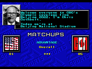
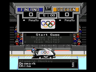
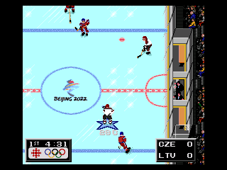
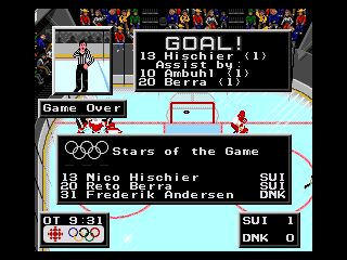
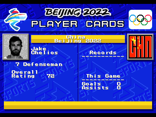
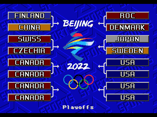
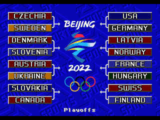
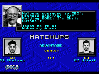
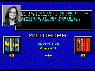
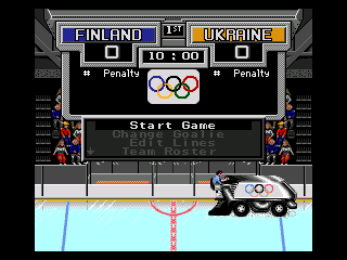
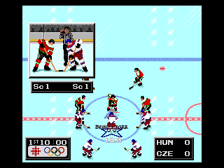
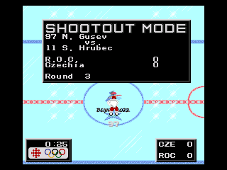
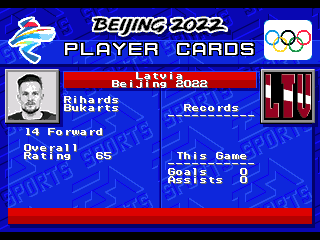
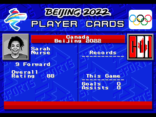
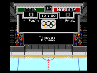
Well, I had originally started this a while back ans set a goal for myself to see if I could complete a set of games before the Olympics started. Then stuff happened, bla bla bla... You know what they say about best laid plans... So since the actual rosters version of this idea is in a bit of development hell, [The fact that some countries waited until very late to announce their rosters didn't help matters either] I figured I might as well pull a AAA move of releasing what I have now, and just patch it later. </caveat> With the development Orpheus-ian journey finally over, I figure the best option is to just post the complete series in one place. Updates to be spliced in, like for starters, the complete array of title screens. Hey, games take a while to make, the idea for this one started back when NHL players were still supposed to be going, in spite of you-know-who's smarmiest efforts. Wait... three game? Yeah, why not. So there are differences. Like these: Splash screen is even more a bit cluttered with all of the groups that were needed to sign off on this. Default to last Olympic finalists, Non-Russia gets a new logo which fits in well enough with the ISO-3 Code/flag team selection icons. Small changes here. Most notable is the inclusion of new Qualification Round countries as playable teams. Replay the final qualifying round and re-write history. Speaking of history, figure I would mention that in light of contemporary world events, despite being someone whose great-grandparents emigrated from Ukraine to Canada, I do prefer historical accuracy over revisionism. I did however change the reference to the ROC team as only ROC. I did decide that Qualification round team Belarus was expendable, so I dropped the Group D team in favour of Group H Ukraine because screw it, I can. The women's side didn't enter a team, but being currently ranked 40th means that they wouldn't have fared very well or really be playable anyway. In lieu of being able to figure out how to hide some sections of the playoff bracket, bye-round teams get the double-up effect. Luckily, having enough spots for playable and non-playable versions of the same teams means that there are no first round mirror games. Playoff mode is expanded to allow for regular 12 team [men's] or 10 team [women's] bye-round infused format, or take one of the lower ranked teams straight from the Qualifying Round to the Medal Round and win it all. Like in PyeongChang, the three major sports networks in Canada are sharing a small team of presenters and announcers comprised of members of CBC, TSN and Sportsnet. Former CBC and TSN, now with Sportsnet, commentator Chris Cuthbert was selected to be the play-by-play guy. Not much change on the men's side [other than lower overall ratings] but to make things equal, Olympic pre-game presenter Kate Bierness is present as the Olympic pre-game presenter. You will likely notice the crowd. I had originally intended on an empty area look, but was unable to come up with an empty seat sprite that I was happy with for the sides of the area. So, since this is just a prototype, we'll just say that the dev team figured that we'd be able to have people in the stands by now. I'll just figure out something else for the real-rosters version. Still couldn't do much with the crowd that I was happy with, so we'll just ignore that. It was nice that the default arena palette worked so well with the Beijing 2022 logo. And in spite of the gobs of money the inferior Sportsnet was attempting to throw around, broadcast branding went to the classier CBC Sports. You even get to have a game end in a stupid shootout like the IIHF if you like. ....and go back to the main menu screen. Another in lieu of, being able to figure out a formula to select the single best player of the game from each team, we have five rings for the three stars. Nothing really different to point out with this screen, so I'll just mention that teams now have an as-accurate-as-possible-to-Nike's-craptacular-unfit-for-hockey-uniforms-design-aesthetic sprite colouring. Sadly, some of the player sprites don't look that great, but then neither did the real life players! Similar to how in my 1920 Olympic game, when I inadvertently predicted the official name change of Czecho-slovakia/Republic to Czechia, [I just used the traditional shortened name for the sake of fitting less letters] the prototype China team was based on the KHL's HC Kunlun Red Star roster. Including a Chinese guy named Jake? [who yes, is a relation] It does kind of show the mockery of the IOC's "passport=nationality" rulings as well as highlight how the IIHF had to make concessions to avoid embarrassing a hockey program that is about 20 ranks and three and a half divisions out of their element. Oh well, play as these guys [or one of the Qualification Round teams] for "extra challenge mode". One benefit to the "official releases" is that unlike the prototype, IIHF.com had 99% of the player photos right there. Automated image editing for the win. And for the teams that didn't qualify, I just used the default man/woman graphic like they did. While the Women's side was actually quite straight forward, I feel that ratings may be contentious in the men's side. This is mainly due the the difficulty in comparing player stats with either tiny sample sizes, or from vastly different quality of teams and leagues. I'm happy with the disparity though, so maybe I'll just call it the "Dark Souls" of Hockey games. Olympic Hockey - 2022 Beijing-N.bin Olympic Hockey - 2022 Beijing-M.bin Olympic Hockey - 2022 Beijing-W.bin

-
I like it. Always cool to dig into some of the lesser hyped leagues.
-
I suppose that does leave the door open for a Denis Godla-like 2015 World Junior like performance. Getting the fan chanted unanimous first star nod in a 39 save, 5-1 loss.
-
I guess this is more of a "Well here's one for ya" kind of thing, but I tend to test the playoffs as well, so I use 10 second periods, with two players, and pull the goalies because of that infinite overtime thing. Usually end the game by winning the face off straight back into the net. The weird part about that is it ends up giving the three stars to: 1st. The guy that lost the face off, but was given credit for the resulting own-goal. 2nd. The winning goaltender with a 0-save shutout. 3rd. The winning team's backup goaltender, who I suppose did just as much as the rest of the team.
-
Hockey Stars Prototype [NHL 94, by way of SNK style-swap]
von Ozbourne replied to von Ozbourne's topic in Genesis Roms
Hey thanks man. Although I have to admit that I only had one original female player photo to work with after I captured them all from Baseball Stars Professional. And it only seemed logical that Venus would be it. Only added the second female [and filling out the Baseball Stars 2 teams] by playing up the mix-n-match nature of the various facial features. I was going to say that the title screen was meant to play up the NES version. Yes it seems a bit odd to have the right to left orientation, but I guessed that it was to have a right-handed pitcher. And you know, It was developed in a country that reads right to left, so they may not of thought much of it. Although given that the downloads of your picture exactly matches the downloads of my game, I wonder if the masses have spoken...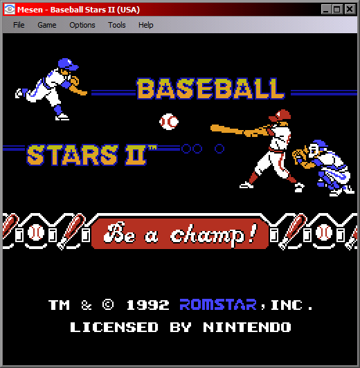
-
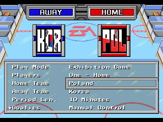
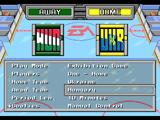
In light of the variation of the 32-team glitch fix posted by @AdamCatalyst , I figured it was a good fit for the presentation in my IIHF rom. So now the only drawback is that Ukraine and USA won't crash the game. Updated in the original post list. IIHF 94 CE F2.bin
-
Yeah for my purpose it was testing to see if I can align the team overall ratings while maintaining an alphabetized order. But it seems that that information is tied to the selection order and doesn't care in the slightest what team is in a given slot. And since I would be changing all of the art assets anyway, reordering them would comically end up being extra work. Like you said, it just comes down to the results you are looking for.