

von Ozbourne
-
Posts
446 -
Joined
-
Last visited
-
Days Won
113
Content Type
Profiles
Forums
Events
Everything posted by von Ozbourne
-
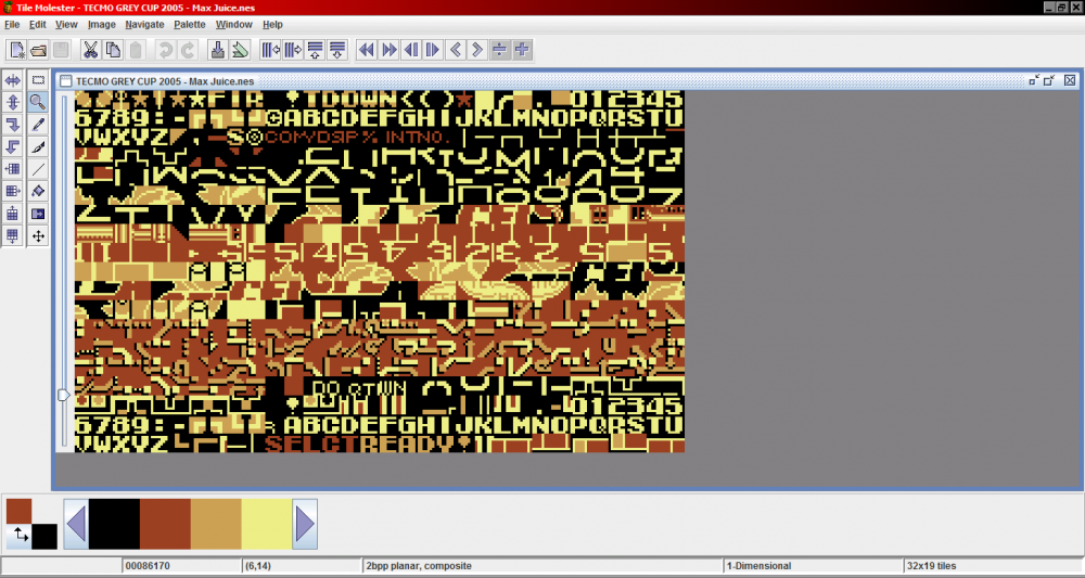
Most of the NES games that I've played around with have had a stack of sprites in a grouping near the end of the ROM data. Being very much a non-expert, this is the only method I know, but it worked fairly similarly if using TLP or TM. This is a screen shot of a CFL mod, but it should still be fine to illustrate the location of the fonts. Actually I might as well mention that I had a moment of uncertainty that this would work, but it turned out that I accidentally had a mod for TSB3 for the SNES mixed in with my NES folder. So this will probably work as long as you are talking about the original Tecmo Super Bowl. </disclaimer>
-
Sadly, while this would be a nice change in game presentation, the most recent patch is still incompatible with the expanded versions of '94.
-
Oh no! Wait! That was... Those was... There were "Quote" thingies! I didn't want the added pressure of knowing that we will inevitably be run over by a runaway hype train!
-
I guess since no one else has spoken up yet, I'll alleviate any concerns by saying that we are in the middle of something. Still a fair bit of stuff to do before it's ready, but suppose I can share this for the "hype". PRE-ORDER NOW! For Spectacular Bonuses! All 32 officially unlicensed NHL teams! A complete set of 16 bit graphics! All 16 of them! Zero Thousand N/A Chel points! FREE Membership to NHL94.com forums!* *sign up required. not affiliated with Electronic Arts, Sega Enterprises or the idiot making this post.
- 19 replies
-
- 10
-

-

-

-
 Sorry man, hmm ...not sure if that is an indictment on how the coders build the game or my explanation of my testing.... To be honest, I was just testing this with the colours that I already had in the #9 and #10 spots. I was planning on doing something with gradients and/or striping if this worked, but Florida just turned out to be a Bob Ross moment.
 -
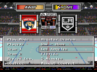
Just realized that while I was looking into something else, I seem to have stumbled onto something tangentially related, if possibly no more helpful. I was playing around with transparent team banners on the Game Setup screen with a net result of trying to get more colours into the banners. Then I noticed this happening. For context, what we're looking at here is a screen that is using four colour palettes. #1 [0xxx] is the default rink colours and the one used by the overlaying bits. [Also the background in the default game, but in this example I'm using the @Drezz background hack] #2 [2xxx] is The Home Team colours. Which is the most interesting, so more on that later. #3 [4000] is the Away Team colours and basically consists of the nine colours, plus black and white, used by the Away team logo. The remaining first five are basically unused. And #4 [6000] is an extra palette not used in the original game, but I use it with the background image to allow for the greatest option of colours that don't conflict with any other assets. Now, in the above image, I made the middle portion of the Home/Away banners fully transparent and put a gradient banner directly on to the background image that will peak through allowing for essentially four colour gradient banners not including the anti-aliased text. By changing the background hex code for those areas to 4000 [away] and 2000] [home] this allows me to borrow from the team logos' colours to create this effect. I tried this with the Banners themselves, but I recall this not working out so well. Turns out, it doesn't completely work this way either. [unless you disable player photos... hmm...] Anyway, finally getting around to testing it, I had to check all of the colours and I noticed that the 2000 palette on this screen it a real hodge podge of colours. Of the 16 colours used in that palette, #1 is the default background, #2&3 are taken from the Home Team banner colours, [the tutorial for such is included in wboy's original modding reference] #4&5 are what the Away team's banner uses, despite being a separate palette [in the same tutorial] #9-16 are taken from the Home Team's logo, but only when the logo is on the screen. Turns out that when the player photos are being displayed on this screen, those final eleven colours are replaced by the eight player photo colours and the blank black spaces that follow it. I haven't tried setting those extra black shades to something brighter, but seeing as they would be universal to every team, it doesn't really address the thing I was attempting to do anyway. Going to abandon the banners at this stage, but it did make me think about how the colours may be available to the player photos [once the 3 vs 4 bpp issue is taken care of and they can access those extra colours]
-
Hack help. No. Don't help.
von Ozbourne replied to von Ozbourne's topic in General Questions & Discussion
While pretty gross, I have to admit that I am neither as saddened or disgusted by this practice as I should be. Probably just numbness from seeing how things progressed to this point or due to the fact that, as someone who basically doesn't engage in online play anymore, it doesn't actually affect me beyond having some dumb thing cluttering up my menu screens. And as someone who is admittedly "behind the times" on these yearly instalment games anyway, I can just skip one if it looks like the publishers had more input than the developers, if you catch my meaning. -
Hack help. No. Don't help.
von Ozbourne replied to von Ozbourne's topic in General Questions & Discussion
The first step is admitting your shame. The NHL board of governors is ready to return your "Valuable Fan" card once you have proven that you can rectify your oversight. Ew... now my cynical brain is imagining a meeting somewhere where a bunch of suits are complaining that the developers should totally be able to code a live score feed into the game and use the credit card attached to your Xbox Live account to allows you to buy a "Loot Box" that will unlock an "Ovi Celly" if the Bruins can beat the Red Wings by 3 or more. -
Hack help. No. Don't help.
von Ozbourne replied to von Ozbourne's topic in General Questions & Discussion
Figured I'd see what EA was doing for 2024 and saw this. While I accept no responsibility for any influence taken from this post, I would just like to go on record that while I executed the idea first, I also executed the idea. -
I could probably hook you up with something that should be easy to follow at some point this weekend. I'll have to reinterpret my notes away from my particular brand of shorthand, but should have something in the step-by-step style that shouldn't be too hard to follow [as long as the program is working well enough to open correctly I suppose] I guess the other question is: What type of sprite style are you looking for? I have a couple of different stripe styles and helmet patches that I use depending on the look, but if you prefer to have something that just looks like the original game sprites, but with tape, I just checked and it looks like I have a version of that too.
-
I suppose that would depend on what your intention is for the ROM. There is a patch for it, [don't know offhand, but it's in the forum] but the caveat is that it also updates the ice surface to modern standards. All well and good, but doesn't exactly fit a game that is meant to look like it is from the 1994 era. Another option [and the one that I mainly use for period accurate ROMs] is to open your ROM in your sprite editor of choice and import a copy of the taped sticks from another ROM or from a set of image files. I can hook you up with a set of images if you are interested in going that route.
-
Have to second what Sean said. Especially interesting when it's about a league that I don't know anything about, So I get to learn about it from someone who obviously has enough passion to have put together a game about it.
- 2 replies
-
- 1
-

-
- ice hockey
- latam cup
- (and 1 more)
-
Hold up, if this were to work, is it possible that the 6000 palette might help out here? I'm wondering if even if the photos still reference the different palettes in the three different locations, could that just not be changed to the same colours? The menu doesn't have a third palette, so it's referencing a blank one. Might just be a matter of checking which instance of the "default rink colours" that the screen uses. i should really search that out later... But on the pre-game screen, it's just a matter of making your Ron Barr or replacement announcer image use the same colours as the players. As for the Player Cards screen, since the logos use that 3rd palette, and since the first palette has grey shades anyway, they can just share the first or second one with the rest of the background. Just need to remember which one dictates what parts change colours with the switch in teams. Have that in notes somewhere... This is all based on the premise that the photos can be converted to 4bpp of course, but if RAM limitations does pose an issue, wonder if commandeering the 3rd [or possibly even 4th] palette might be a possible workaround.
-
This could still be interesting actually. Quick math would indicate that even if there is no additional space allocated for player photos, once converting from 3bpp to 4bpp, that would still leave enough space for 17.3333 photos per team as opposed to the full 26. But that just happens to be exactly the same number as the starting lineup when counting the three full strength lines and starting goaltender with one spare for a logo or "generic shadow" to represent the rest of the team. Based on the assumption that this is also not going to be a problem.
-
Well fine, I suppose if I wanted to get pedantic about it, I could say that I am in fact capable of making a series of statements on the many aspects about the game that profess its superiority. What I would not be capable of however, is credibly refuting these assertions.
-
Ah yes. I should have clarified that since (6x6)-2 is obviously 34 and not 22, but it either slipped my mind or I've spent so much time counting in base-16 that it's second nature. I'll just edit that in. This was also a concern given that the player photos would end up taking up a lot more space. [guessing rather than a "4 is 25% more than 3" thing its a "2³ vs 2⁴" thing] My initial thought was that instead of increasing the bit depth of each photo to use 16 colours, [which would admittedly make things look a lot nicer and be a lot cooler once all the potential heavy lifting is out of the way] but perhaps relocating only the used palette to another location so as to free up the mandatory white and and black used by the other menu assets or allow for the use of multiple palettes. Which in light of the Doug Weight thing, would be pretty inefficient and take a lot of time and extra effort to set up and work with, which is why I wasn't married to the idea beyond general curiosity... I think I'm talking myself out of pursuing this matter any further.
-
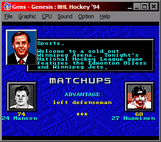
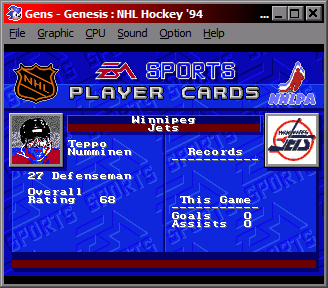
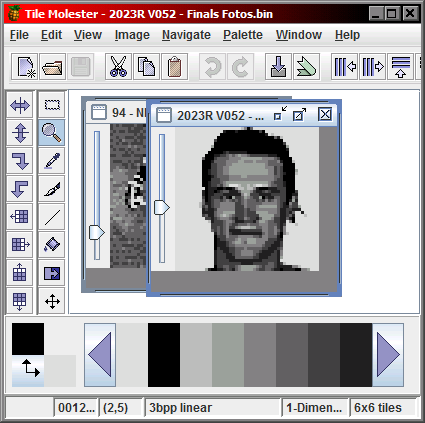
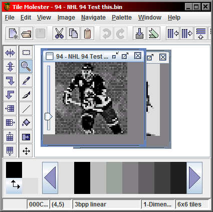
Okay. After spending some time on this, I appear to be at the end of my capabilities. I don't know if this is even an question that can be answered in the affirmative, but I figured I would purge my notes and see if this might prove helpful to others or just be an interesting story about how to listen to the clues that you may be wasting your time. The quest? Can player photos be adapted in some way to use more than the per-requisite 8 colours. It's already been established that as long as the first white and black photo palette colours aren't changed, the remaining six colours can be changed to anything you want in order to introduce colour to the photos. First player card photo offset is at: 30 & 32 Team = 120294 OG game = C6402 [default unused guy] or = C6838 [default players] or = C75E0 [first starting lineup player photo] Colour palette offset = 120294 [decimal] Uses same #1 white and #2 black as menu screen assets and #3 to #8 are grey-scale colours by default, but can be changed to any colours as they are independent of any other asset. This is part of a larger colour palette that starts at offset C6762 Space is allotted for standard arrangement of 4 x 16 colour palettes Photos actually use colours #6 to #14 of palette #2. If using 120294 [decimal] on 3bpp linear as a basis, Palette #1 is the default colours, #2 is blank, #3 is a copy of #1, #4 is blank, #5 is a copy of #1 & #3. Using these settings, there is actually space for two preceding palettes, starting at colour #6 on palette #1, but it is not known if these can be incorporated. Every player photo, in both the default and 30 team version, is preceded by the hex code: 0000 0000 0000 0000 0024 Not sure why the four groups of 0s are required, but best guess on the "0024" is that each player photo is 6x6=36 tiles in decimal, aka 24 tiles in hex This appears confirmed by the fact that the first default player photo to reuse tiles was Doug Weight [offset CE9F4] whose photo leader code is: 0000 033A 0000 03BA 0022 Not sure about the "0000 033A 0000 03BA" yet, but clearly the "0022" points to the fact that Weight's image only uses 22 hex [34 dec] tiles instead of the normal 24 hex [36 dec]. I am guessing that "033A" and "03BA" are overrides for the new colour palette and tile ordering offsets respectively because... Following Weight's image tiles it appears that the "saved" space is just used threefold by additional colour and tile arrangement data anyway. [wonder why they bothered...] At offset CED24: 0EE6 0EE6 0EE6 0EE6 0EE6 0EE6 0EE6 0EE6 0EE6 0EE6 0EE6 0EE6 0EE6 0EE6 0EE6 0EE6 0EE6 0EE6 0EE6 0EE6 0EE6 0EEE 0000 0CCC 0AAA 0888 0666 0444 0222 0EE6 0EE6 0EE6 0EE6 0EE6 0EE6 0EE6 0EE6 0EE6 0EE6 0EE6 0EE6 0EE6 0EE6 0EE6 0EE6 0EE6 0EE6 0EE6 0EE6 0EE6 0EE6 0EE6 0EE6 0EE6 0EE6 0EE6 0EE6 0EE6 0EE6 0EE6 0EE6 0EE6 0EE6 0EE6 Colour data follows previous pattern of using latter half of 2nd palette, although 3rd and 4th are left blank Immediately followed by: 0006 0006 Photos are six across by six down Immediately followed by: 2000 2001 2002 2003 2004 2005 2006 2007 2008 2009 200A 200B 200C 200D 200E 200F 2010 2011 2012 2013 2014 2015 2016 2017 2018 2019 201A 201B 201C 201D 201E 201E 201F 2020 2021 201E Normal image tile numbered ordering with colour instruction [2000 meaning 2nd palette as noted above] [Unfortunately my copy of the original unedited game doesn't load up when I make edits, probably something to do with checksum info or something... whatever] Used SmozROM tool to make a new "OG - checksum" version. That was the problem. Yay. Changed top half of Weight's image to use "4000" colour option and it came up with the top half using different colours. It appears that palettes might stick to the 8-colour model though so rather than jump to #6 to #14 of #3 palette, possibly they use the colours directly after the adapted "#2" palette and uses colours #1 to #8 of #3 palette. Although now I think they are referencing a palette in a completely different location. It is possible that "0000" colour will be #14 of palette #1 to #5 of palette #2. Or, in testing Winnipeg's Teppo Numminen, who uses 23 instead of 24 tiles, changing the tiles from colour "2000" to colours "4000" and "6000" appear to shift the colours in the image to instead use the colour palettes attached to the background on which the image is viewed [main menu, pre-game screen, player card screen] Top third is "2000", middle is "4000" bottom is "6000". From previous notes, I know that the main menu has no 3rd [6000] palette, for the Pre-Game screen, its 3rd palette is used for Ron Barr's colour photo and the Player Card screen, has a 3rd palette for the NHL and NHLPA logos Final image, default, Winnipeg's Alexei Zhamnov, offset E62D2 image is followed by hex code: 0000 2B0A 0000 2B8A The fact that the difference between the two offsets being "0080", matching that of the Weight example is not a coincidence On further investigation, jumping ahead an offset of 2B0A from this point arrives at the colour palette and tile arrangement data for the Player Cards screen background. Makes sense. 30 Team not as helpful as immediately after the final player image [offset 1C6622] [32 Team = 1D17AA] is the colour palette data for the main menu team banners Tried changing the "0000 0000" on the last couple players to "0000 033A" but it seems that whatever control override for colours was allowed in the original, is not accommodated when the additional teams and photos were programmed in. Soooo.... that's what I got. [sorry for the junk loads of bold, it just helped as I would skim along] Absolutely no idea if there is even anywhere to go with this idea, but I figured why not put it here and see. And if anything, even a failed experiment can be informative, because that's just science.
-
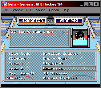
Noticed that the version of 94 I was using still had this inverted head to ass relationship issue. Using this '93 code and the sock colour offsets @Jkline3 posted, I found that pattern still held true to '94. Figured I'd post here for anyone still needing this and so it's all together in the one post. Here's the "head up asses" fix for NHL 94: OFFSET A74E0: Change "0132" to "011e" OFFSET A74E8: Change "0142" to "012e" OFFSET A7500: Change "011e" to "0132" OFFSET A7508: Change "012e" to "0142"
-
Blades, of Steel, II *shink* [EA Hockey 91]
von Ozbourne replied to von Ozbourne's topic in Genesis Roms
Probably not to this one since it was based on fictional teams and those cities didn't have teams in the 1980's anyway. Not to say I haven't thought about revisiting this franchise for a Part 3 at some point. Just might be a ways off on that though. -
Hah. Thanks man. Although I have to admit that my typical artistic direction is to try to pretend that it is a real, period correct, official released port and stay in character and see where that goes.
-
NHL 2023 [94] by Jkline3 and von Ozbourne
von Ozbourne replied to von Ozbourne's topic in Genesis Roms
Thanks eh. It was certainly an interesting project to make. Will have to see how the next few months unfold, but it's a possibility. -
Thanks eh. But come on, can't do half measures right? Oh, and... Why yes, you are. Or the other way around. IIHF still lists the white uniforms as the home kit.
-
This is actually why I doubled back and specified the alpha-3 codes, which differ slightly from the 3166-1 codes, 'cause if there's one thing I know about standardization, people love when things are standardized. Just as long as it's standardized to the way they like it. However, you have brought to my attention that I for some inexplicable reason started using outdated information. https://en.wikipedia.org/wiki/ISO_3166-1_alpha-3#Indeterminate_reservations I also seem to have combined Latvia [LVA] and Lithuania [LTU]. Maybe I was thinking of Lathuvania. II. Simon's Quest. Guess I'll just stealthily update that...
-
Oh, yeah. I've actually done it like this for a while now, it derives from the ISO Aplha-3 country codes. [Canada:CDN, Germany:DEU, Latvia:LVA] The only one where I deviate is usually Switzerland, using SUI [for the French Suisse] rather than CHE [for the Latin Confoederatio Helvetica, because seriously, Latin?]
-
Okay, breaking kayfabe for a minute since this one is built on such a high number of community contributions, I figure the "you know who they are" level of thanks isn't good enough in this case. So in no particular order, shout outs to @wboy, @slapshot67 and @smozoma for their great work with ROM cracking and tools. @AdamCatalyst for his more recent breakthroughs like three-star code and seeing the distracted ref. @Drezz for his breakthrough on the menu and watermark backgrounds. @Jkline3 for his masochism in redrawing all of the player sprite striping patterns so I didn't have to. Guys like @Sean & @Sedge for putting out some interesting games to draw inspiration and perspective from. And anyone else I may have forgotten to mention, no slight intended.
