von Ozbourne
-
Posts
439 -
Joined
-
Last visited
-
Days Won
113
Content Type
Profiles
Forums
Events
Everything posted by von Ozbourne
-

3-Button Genesis Controllers - Different Models
von Ozbourne replied to Scribe99's topic in Hardware
This is the kind of interesting thing that you don't think about as a kid. Design iteration? Supply chain changes? Why wouldn't they just make them all the same? Seems I have a model 2 [grey and SEGA branded cord], which sounds like the better model? but admittedly I don't use it much as I prefer my 6-button. -
NCAA Hockey: Road to Tampa Bay (NHL 94) - 2023 NCAA ROMs - Final Update
von Ozbourne replied to Sean's topic in Genesis Roms
Looks like Jkline beat me by 5 minutes. If you're interested, I have tinkered with it for my IIHF Roms, sadly I have not found how to change the colour palette so you're kind of stuck with silver But the only thing I can add is that save states and two player head-to-head are your friends. Unless of course you want to play four games in a row every time you make a tweak... -
Photoshop & Tile Molester for SMD / Genesis Sprites
von Ozbourne replied to AdamCatalyst's topic in How-To & Reference
If I may offer some more info I've acquired on the refs, I was chatting with Jkline3 about them and how every ref/linesman image other than the faceoff popup seems to have some really crazy compression going on there. To the point where the animation, arrangement and image data even looks like it's all smashed into a single tile. Even simple recolouring [him, dasherboards; me, zebra suit] seems to be verboten and guarantees a glitch. Luckily I got to do some of that giant-shoulder standing thing and didn't waste as much time on it as I could have. Definitely more big-brain stuff than I can pull off, but if one of the real big-brains around here is able to dissect those guys, that would be awesome. I just suspect that it was not a big enough priority to look into thus far. Annoyingly, this seems to also be the reason why there doesn't appear to be any graphics tiles for the EA Sports "watermarks" in the background of all of the stats/pregame screens. As someone who likes to rebrand the games, necessitating a different watermark, it would be nice to, likely, redirect these backgrounds to a different section of the rom where one could put any watermark one pleases. So far the only solution I've found is just setting all of the background colours to the same shade. -
Or, you know... multiple backups. Admittedly, I've accidentally glitched something and, because I was editing/testing for something else, it went unnoticed for a while and required going back a few versions to find out what the clean working code looked like. At least that way you can just copy/paste over the offending part and start over fresh.
-
Photoshop & Tile Molester for SMD / Genesis Sprites
von Ozbourne replied to AdamCatalyst's topic in How-To & Reference
You know, I was still using v0.15a for just this reason. Downloaded v0.16, but for some reason, never got around to switching my shortcut and promptly forgot about it. The real kicker is that the "Press F5 to Go To Again" function doesn't function in 15a, if you are using it to navigate Relative that is. It just defaults back to Absolute mode and that's not helpful when you are say, putting in logos. I see that 16 fixed that... kind of annoyed at myself on that one. Although speaking of forgetting, when I was starting out, I originally would just use game screen captures to mock up certain assets and only ever used the Import function. I've since graduated to working on individual assets, [although sometimes seeing everything all together helps with design choices] but for 90% of the cases, I already have base photoshop files that I just make a copy of for say, splash and title screens or the tile overlay or team banners. Definitely going to have to try exporting for that other 10%. To be honest, that's why I use the scrap file. I've done stuff like set up Actions for arranging player photos and a few other things, but for anything that isn't a straightforward import image and move on, I always return to the scrap file. Especially when I'm changing the trophy. Being that it's arranged in 1x4 chunks, I find it easier to just make my working file one tile wide and then paste over the sections. I haven't either, but I will note that for a couple of projects where I've found myself getting very particular with the look of logos, I've Indexed them using a Local palette and then gone into the colour table to change the RGB values to something in the Genesis "Everything is in multiples of 32" range. Very time consuming this way, but I found it was the only way that I get the amount of control I want, especially when I want to fudge some anti-aliasing or make something resembling a gradient. And since old-school consoles didn't rely on dithering the way computers did, I find it the best way to get that look and the separation, when say the source is a gradient of blue between 0-0-180 and 0-0-200, I'll just expand it to 0-0-160 and 0-0-224, and dither the middle just a little bit so that 0-0-192 band in between isn't so sharp. Like I said, time consuming and slightly obsessive. Can not recommend. -
Photoshop & Tile Molester for SMD / Genesis Sprites
von Ozbourne replied to AdamCatalyst's topic in How-To & Reference
My workflow is very similar [especially the full screen mock ups] but I have a couple questions and/or I suppose a suggestion regarding this. First the question: When you say "export" what do you mean by that? Only ask because my version of "export" is just to set magnification at 100% and then print screen and paste it into photoshop, cropping out what I don't need. While quick and dirty, the gamut handling between TM->PC->PS always seems a bit off. Especially when I index an image to 16 colours for the purpose of having better control over how it looks when I import them. As long as I change the colour table to match the RGB values available in the Genesis palette, it works just fine, but if there is a more 1:1 information transferring method, that would probably be worth adopting. My question/suggestion re: tile reordering: Do you do that in Photoshop as well? I actually did that for one project until the tedium got to me. Now I just import the full image into a scrap file, [usually just a previous version of the game I'm making, sometimes just a blank file] make sure my active colour palettes match, then either rearrange the tiles in the scrap file, or just go straight to cut/pasting into the file I'm working on. [Much better than my original method of using a hidden layer with a grid of 8x8 pixel squares and alternating between wand tool, layer select and cutting and pasting. -
Making the Game More Difficult?
von Ozbourne replied to RetroGameplayer's topic in General Discussion
Ah ha found it. I had some notes copied on this, but even better than that, this is the thread regarding puck collision. This edit more noticeably affects how close the puck gets to the boards, but a few replies later, Brodeur30 goes into how it also changes the puck's collision with the net. Heh, come to think of it, make it even harder by expanding the goalie free movement area. Makes it really easy to get way out of position if you like to turn on manual goalie control. -
Making the Game More Difficult?
von Ozbourne replied to RetroGameplayer's topic in General Discussion
There's a hex code edit that can adjust the hit box of the nets as well. This can be used to make them effectively smaller, [even though the sprites will look the same] forcing you to take more precise shots. As for the cut in front move, I've found that using smozoma's suggestion of decreased speed boost and lower endurance, in addition to increased opponent Defensive Awareness can result in the AI defencemen clogging up those easy lanes and your forwards not having the ability to overcome them. Overdone, this can turn your games into a slogfest, so use with caution. -
Hey, thanks eh!
-
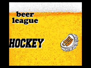
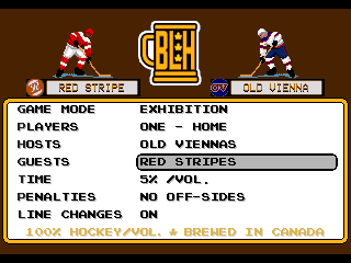
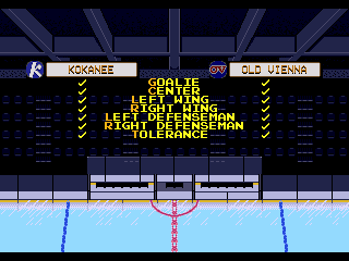
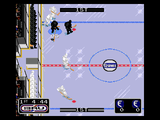
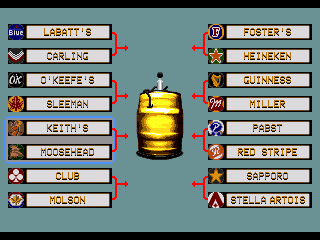
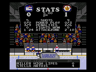
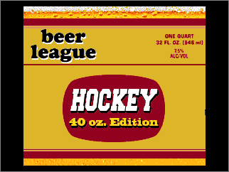
This was a dumb idea. But as it is my habit for doing weird and/or esoteric stuff, the question started off innocently enough. "What if there was a game where you play in a beer league, that is sponsored by actual beer companies? I mean... Breweries used to have teams back in the day... granted then so did factories, offices and banks." "Except instead of real company teams, you make it play like a typical beer league." "Yeah this is already sounding silly." "No, it's sounding funny and awesome and you have to do it." "I *have* to eh? Ah what the hell..." So with that mindset, we dive into: The backstory on this one was that, while developing IIHF Hockey [1991] for the Genesis, a small section of Team 1920 was unwinding with a few brews after hours and thought it would be funny to use the game engine to make a beer league game. This breakaway group called themselves the "Twist Cap Division" and did the work in their free time, which they had some of since crunching wasn't as prevalent back in those days. They took 22 of their favourite beers and named teams after them, subbing them in for the international teams. Bottle caps made for great logo references and a Beer League Hockey logo displaced the EA Hockey League logo because never mind them. The idea was that these guys would never play in a big arena, so the smaller community centre look was used for the pre-game team preview screen. Playoffs were divided up and Easter eggs were thrown around willy-nilly. Just assume that everything is an Easter egg. Such as the black and white Elsinore brewery teams. If you've seen Strange Brew, you know exactly how well these guys play hockey. The kids today might be tempted to call this team the "Dark Souls of Hockey", but they aren't *that* bad. Broadcast sponsorship was "provided" by local channel C-BRU - Channel 13. Fittingly, the beer leaguers are playing for glory and a golden trophy. Based on a real trophy, which is just a regular keg painted glorious metallic yellow. The actual golden trophy was the stuff inside it. This was a dumb idea. Please enjoy responsibly. UPDATE: Version 1.1 features corrected the bench players, so they wear the same uniforms as the guys on the ice. Beer League Hockey 91[1.3].bin Beer League Hockey - 40oz Edition[1.3].bin Disclaimer: This game was based on the PAL port of EA Hockey [1991] as I am apparently obsessed with the extra speed and arcadey physics that it provides. For best results, set your device to 60hz NTSC.
-
Ooooh.... uh. He was slumping? Actually thanks for pointing that out. [It always bothered me when I see the wiki page that says WHL legend, Guyle Fielder is the " fourth-leading scorer in professional ice hockey history, behind only Gretzky, Jagr and Howe". Completely ignoring that Hand outscored and the citation is just North American biased] As the Olympic pre-qualifying teams were basically 90% the same as their World Championships rosters, I might have just borrowed the stats I already made. But as my IIHF '94 mod was intended to be in line with the default NHL '94 ratings, [where tournament leader Paul Kariya was only rated a 70 overall] this ended up meaning that most players were average to weak by comparison. [Something I departed from in subsequent years] I decided to give the field a speed/agility bump to make the game more fun, but.... kind of forgot to do that with the four non-qualifiers. Patched version added to the original post.
-
...grumble. Even if we win, shootouts are a dumb way to end a hockey game. I know why the IIHF did it. Same reason they used to switch ends halfway through the 3rd period. Ice and environmental conditions on outdoor rinks meant that they needed to be fair and the ice wouldn't be able to hold up to endless overtimes. But hey, indoor rinks and artificial ice meant we don't have to worry about that! And other than needing to make sure that the game ends on time so the area can be clear for the next game that was already scheduled for later that day... Well that's not exactly going to be a problem in the Final now is it? ah...Sorry. </rant> Oh cool! Need to see if I can find one of those old magazine articles!
-
Thanks eh! Actually the "ambitious project" is supposed to be NHL '95 based thing, but I've been running into a lot of glitches and instability linked to the nature of the 34-team mod. The annoying thing is that I could probably just drop the eight additional teams and go with the original 26-team version, but my head canon has already determined that I must have 34 teams. [even if eight are unavailable to use in season mode] I'm curious about the medium goal. I.... think [?] I used the mod were the puck-to-boards collision is closer, [I usually use a 2 instead of a 5 setting] but to be honest I used one of my default "a bunch of mods already applied to this one" ROMs and I kind of forget if that one was in there. If i recall correctly, the puck-to-boards collision distance also affects the puck-to-net collision, so I guess I'm wondering if that's what you are referring to, or is there a way to reduce the net size, while not having the pucks bounce off an invisible wall a foot off the boards.
-
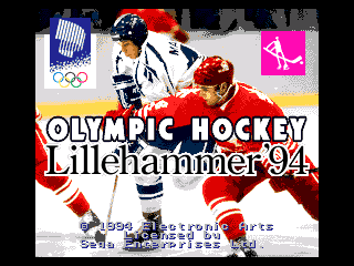
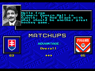
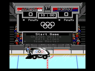
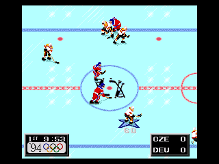
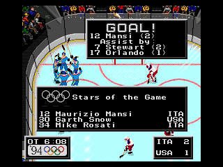
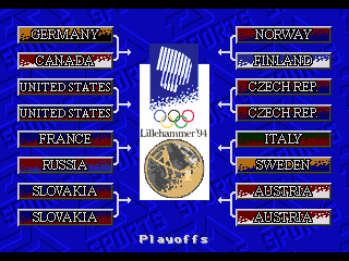
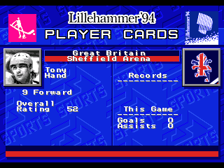
Been too long since completing something, so I figured I'd put the more ambitious projects on the back burner and bang this one out. After getting the most and least recent [as of 2022] versions of the Olympic hockey tournaments, figure there is no harm in bouncing around a bit. So, for the next retro review... Presenting: Released in late January 1994, and with the Olympics no longer doubling as the World Championships, this was one of two international tournament ports for the '94 season, and third game overall in this incarnation of the game engine including the original NHL game. 3rd party developer Team 1920 is continuing to partner with the IIHF and featured 1994 Olympic mascots Kristin and Håkon on the splash screen. Prior to the banning of official National Team iconography by the IOC, team logos are allowed to be featured. The IOC did make sure however that there was no shortage of ensuring that you know that this is an Olympic game by making sure their Rings emblem got in there too. The official broadcast sponsor for this year's games was CTV in Canada, with lead presenter Rod Black getting the nod to present the games here as well. While the Lillehammer logo's "snow drift" was copied over to the team banners, the Olympic Rings logo got copied over to everywhere else. Just in case you might have forgotten what game you were playing. All teams play out of the same two arenas in Lillehammer and Gjovik, and the 1994 Olmpics "hockey player" logo that was featured at center ice is adapted well here. More Rings for the Stars. Obviously a tournament mode for the Gold Medal is featured in the game. With only 12 teams taking part, some teams are given a bye in the first round. A cleaner look with blank bye rounds would have been nicer for this, but it is clear that the limitations of the game engine influenced the presentation. Each team gets full player cards, plus a bonus. In addition to the twelve teams that competed at the Olympics, teams from Great Britain, Japan, Latvia and Poland, [that competed against eventual winner and final qualifier Slovakia in the pre-qualification tournament in Sheffield] are available for exhibition and a "Re-write the Road to the Championship" style mode. While not originally featured in Playoff mode in the demo copy sent for evaluation, it seems the sneaky devs went ahead and unlocked them for the the final release. Final score: 3/5 Rings - A bit of a lazy art asset swap, but still has the same solid game play of a main EA release of those days. Olympic Hockey - 1994 Lillehammer.bin EDIT: Upgraded the non-qualifier's attributes to match the more "arcadey" [faster] feel intended for this game. Olympic Hockey - 1994 Lillehammer 1.1.bin
-
Heh. Same here. As someone who ran a GM-mode pool a while back, [draft teams and play a season on demo mode] the 50-80 shots, 200-250 pass attempts and 60-100 face offs made for some bizarro stat collecting. Plus it was a bit predictable in the end. The last finals was a modest team, with Patrick Roy in net, winning 4-2 over a slightly less modest team with Dominick Hasek in net. The President's Trophy winner was swept in the second round due to only having Mike Richter between the pipes.
-
Not off hand, although the banners and logos are all listed together. I suppose the follow up would be if you have knowledge of a drawing program and sprite editing tool.
- 1 reply
-
- 1
-

-
Mutant League Hockey - ROM Hack Project
von Ozbourne replied to kingraph's topic in Mutant League Hockey
You don't say eh. I'm a bit too busy at the moment, but this game is definitely on my radar. Going to have to stick a pin in this one for later and se what's possible. -
Shoot. Yes. Sorry, it was late and i was getting wires crossed. I edited to sort of fix the incorrect info. hopefully. it is late again.
-
Ah I haven't played in years, but I still have a fully customized version of Wayne Gretzky's Overtime Hockey sitting in a box in my brother's attic. Even painted up about half a dozen of the teams we had with accurate gear, before I started trying to buy the rest online and got lazy. [the model paint would tent to flake off after extended use anyway] Although I only printed out the numbers, names and patches on full uncut sticker sheets that i can cut out, I totally would make my teams look like that custom Vasilevskiy you have there. [Although our rosters featured guys like Winnipeg's Selanne and Essensa; Pittsburgh's Lemieux and Jagr; Boston's Neely and Oates; and Montreal's Damphousse and Roy.]
-
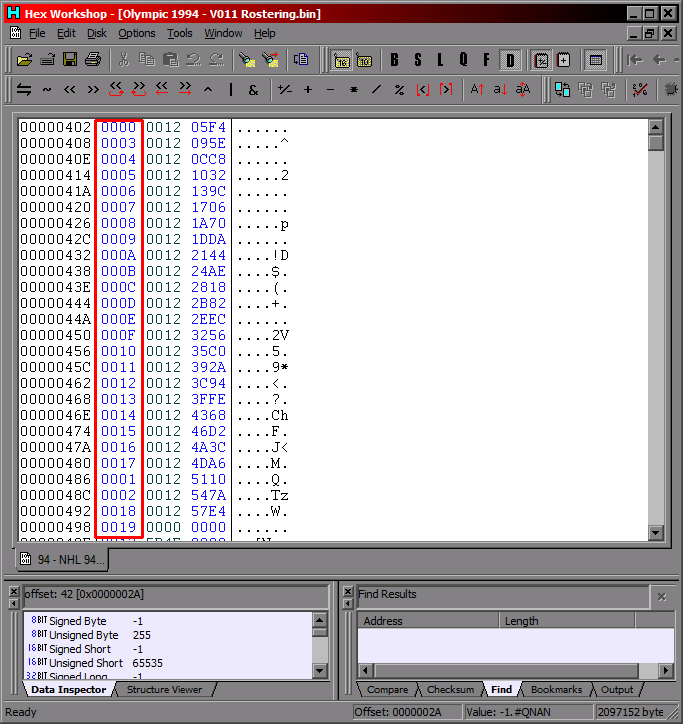
Actually that is kind of the thing, there really isn't any specific order for the teams when you use this tool. [full disclosure, I do the photos last now, so I don't really use this method much anymore] The way this method works is that when you copy a player's photo into your ROM using the sprite editor, you copy that player's name into the spot that corresponds with the offset. [circled in the first image] <EDIT> I keep NOSE open to make sure that I am putting the photos in the same order as I have the players listed in the roster section. But the actual order that the photos and players are related can also be checked in the hex code. Player 0000 denotes the staring goalie and doesn't like being changed. It always glitches out on me whenever I try to put him in a different order. He ends up as the last guy in the rotation regardless. In this example I had 20 skaters and 3 goalies and the net minders were the first images i pasted in, but the last three player photos/cards shown where the backups and the starter. But in any case, the red circled offsets in the original post pictures is where the offsets and player names get aligned. To be honest, I messed with them in a couple cases and the player photos don't even need to be in any particular order, just as long as the offset number listed next to a particular player's name matches the offset of the desired photo of the player who owns that name. Or in some cases, multiple people who share a name, so you will have to make sure if you want that or not. </EDIT> The main use for the spreadsheet I find is to change things around after your players have already been set up. For example: A pre-season vs a trade-deadline version of the same ROM. Rather than moving photos around, you can just click to re-point a picture to a player that was traded to another team.
-
You sparked a memory and I literally got the "I've seen things" expression from this one. Power and will cannot be underestimated, I've done this. Once graduating from pencil and graph paper, I made six seasons worth of spreadsheets for a table hockey league between my brother and me. Had a dozen different teams for that game, printed out stickers of individual names and numbers on their backs. By the last season I'd gotten sophisticated enough to link different sheets, automatically adding up individual game points into a season total and then copying that data over to a full team totals, team player lists and overall stats leader list. Now the question is, does that old backup drive still work...
-
I did this with Blades of Steel back in the day. In hindsight, I'm glad that game doesn't have individual player stats. Well perhaps, but to compile the game stats and link game sheet data to team calendars and player leader boards and team stats and rankings... Would would almost take longer to do that than it would to play the games.
-
That's awesome. Hmm, might have to see how this one works if I can borrow the base for a project. Problem I'm running into with the 34-team one is that there are a number of other instability and glitch issues I've encountered as well, and things such as the player trades not working with the non-original-26 teams.
-
Curious. Do you mean expand the number of teams in a season? Only asking because in experimenting with the 34-team mod, I was able to set the schedule for any team in season mode, change the divisional alignment as far as season standings and change which playoff bracket they belong to when the playoffs start [because weirdly that is a separate bit]. The problems I'm running into however is when I try to include any of the additional eight teams. And while I can change the number of teams in each division, there is no room for the code to exceed 26 and I can't seem to find where to set the number of teams that make the playoffs in each conference. And worst of all, while I can pick whatever teams I want to show up in each division, as soon as you select to start the playoffs, the game freezes. Annoyingly, simply changing the playoff brackets to not include any of the additional eight teams seems to eliminate the freezing issue. Beyond the starting lineup player photos for those additional teams being located in a separate section of the ROM, can't seem to place what is confusing the game so much.
-
Ah. Clever and the portmanteau something I can get behind. Although as for the plant, I've never heard of them before, but to me the etymology of the word makes me think of the way Brits shorten words via either dropping or just not bothering to pronounce letters. Like it started out as "Whut's that growin' by ya fence theyah? Et looks like ah grasSy 'EDGE mate." And of course, far be it from me to discourage the use of a developer alias...