

von Ozbourne
-
Posts
439 -
Joined
-
Last visited
-
Days Won
113
Content Type
Profiles
Forums
Events
Everything posted by von Ozbourne
-
Just figured I'd give the heads up to anyone looking into this. I was curious as to what this actually reordered and was disappointed to find that, as far as NHL98 goes [and given the similarities, I might guess '96 and '97], it seems that in addition to the team graphics, it also doesn't reorder the team ratings, divisional alignment, default matchup, or well, anything that isn't the roster data basically. I was hoping this would do something similar to how Carolina's data is still in the Hartford spot, but given that that change also applies to the logos and stuff, there is clearly something else at work here and more digging would be required. Unfortunately for my purposes, this edit doesn't do anything different than simply copy/pasting the player data in NOSE. Oh well.
-

Hockey Stars Prototype [NHL 94, by way of SNK style-swap]
von Ozbourne replied to von Ozbourne's topic in Genesis Roms
This was something I thought about, and it is why I removed the eyes, [to better match the SNK plain face style] But the downside is that EA only made the one player model, unlike the different batting stances, or gender options, you can find in the SNK games. And going by how much time and effort the guys that have done the helmet colour mods put in, and how the sprites are arranged already, it seems like it would be a lot of work for what quite possibly would only be a slight change in the art style. -
Hockey Stars Prototype [NHL 94, by way of SNK style-swap]
von Ozbourne replied to von Ozbourne's topic in Genesis Roms
Sorry guys. Ringing in the New Year playing video games, as one should, it was brought to my attention that I seemed to have gaffed in not saving the few final stat fixes I had made before posting this mod. Had to fix it right away. And with that out of the way, we finished our playoff in peace. But I figure I might as well share the fixed version here too. Mostly the team rating numbers were way off and not representative of each team's actual abilities. Simple error of accidentally undoing my changes before I saved. Additionally, I had Dah Bears as a team of all Lefties except for the backup goalie. I've spread a few more Correct Handed players in there. Lastly, and apparently most important, the Canadian Dreams team, while technically just the old American Dreams team with the names changed from old baseball hall-of-famers to old hockey hall-of-famers, had a couple of number overlaps. These were resolved, but apparently I chose the wrong player to be Number 9. Originally I gave "Gordon" number 9, while "Robert" had 16 and "Maurice" had 15. I was reminded that despite the longevity, "Gordon" was not as concerned about the number on his back and would have said "Aw shucks, he should keep it". So I gave "Gordon" his rookie number of 17, while the elder "9" got keep the number that reminded him of his first child's birth weight. [Side note if anyone is interested. The American Dreams are still present, although they were included as one of the "created" teams which uses the name "Blasters"] -
I've always wondered that myself. I just figured it must have something to do with online play [errors/not wanting to deal with conflicts from one player wanting to use them and the other not/whatever] I just edit it to read "User Records" again and don't worry about it.
-
Hockey Stars Prototype [NHL 94, by way of SNK style-swap]
von Ozbourne replied to von Ozbourne's topic in Genesis Roms
Ironically following up with the bit of art that started this whole project: I recently bought myself a drawing tablet and decided that to try it out I would attempt to turn the iconic Baseball Stars NES cover into a Hockey Stars Genesis cover. Tried to stay as true to the original as I could while also making it distinctly hockey. Liked the goalie too much to just have that tiny little guy in net though, so figured I could do without a "Video Game Team" logo.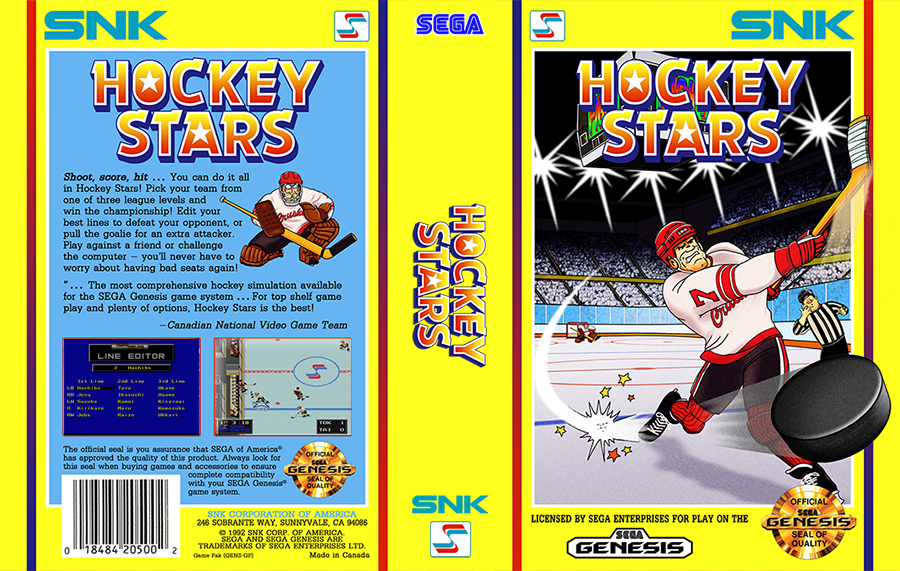
-
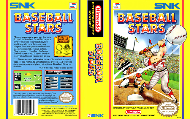
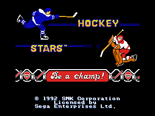
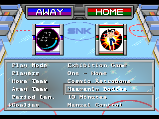
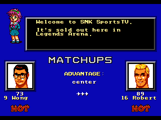
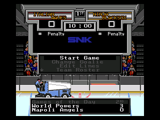
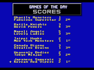
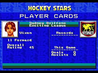
Leaving this one up for the aversion to George Lucas-ing the thing, but if you happen to come across this one, please note that there is a better one out there. Back to the past... But first, since tis the season. Twas the night after Christmas, and all through the house, No more creatures were stirring, not even the mouse-r. The stockings were empty, the tree, it lay bare, In memory of loot that used to be there; The children were finally snug in their beds, No more talking of whatever popped in their heads; And mamma was snoring and I on my laptop, Thinking "just one more thing, then I will nap... pop" Recalling the games played throughout the day's chatter, Defeating the bosses like it was no matter. Now the finishing touch should be done in a flash, I pick the controller whose buttons we'll mash. Just a quick test of the new-finished show, Fire up the game by the monitor's glow, Then, what to my critical eyes should appear, But a miniature ref, and ten tiny players, With a flick of the thumb, so lively and quick, I knew in a moment I'd have a hat trick. More rapid than... something else fast, goals they came, And he whistled, that ref, and displayed their name; "Now, center now, wingers now, defence and goalie! Go, Shoot it! go, stupid! go, save it you... goalie! To them hit with a check! now into the wall! Now bash away! crash away! dash away all!" In the overtime frame, off a shot like a missile, The game it was over, and the ref gave a whistle, We'll play it tomorrow, the kids and I might, HAPPY GAMING TO ALL, AND TO ALL A GOOD-NIGHT! Pardon the indulgence. Now for another with the retro game review. Back in 1988 SNK released arguably the best baseball game ever made for the Nintendo Entertainment System. You may remember it as: With the shift to licensed league based games, it has been mostly forgotten aside from retro-re-releases, but at the time it did spawn a series of games with both Baseball Stars and Baseball Stars 2, Legends of the Diamond and Little League Baseball: Championship Series all being released for the NES while being based on the same engine. Another Baseball Stars 2 was released for arcades via the NEO•GEO MVS, which wasn't a sequel to the NES game as much as it was of Baseball Stars Professsional , a launch title/pack in for the NEO•GEO MVS and AES systems. Two more ports were released for the NEO•GEO Pocket/Colour. That's a lot of bla bla bla about baseball, but wasn't this supposed to be about hockey? Yes. So what about that hockey game? Released in 1992 by Romstar [SNK's North American distribution arm in the late '80s/early '90s] on the Sega Genesis, the first Hockey Stars features many recognizable teams and player names from it's baseball contemporaries. Including the trademark stark white splash screen and "Be a Champ" words of encouragement. Teams are still divided up by league; You will find mention of the "Exciting", "Fighting", "Professional" and "Legends" leagues in the team intros. These are not exclusive in Versus play as in the NEO•GEO releases, but will determine what division you play in during the Playoff mode. Although not as sharp as you will find on AES hardware, full colour cartoony depictions of player photos are still present and take their art style from the previous "Professional" game. And just as in most other SNK games, the pre-match presenter has another SNK character making a cameo in Athena from Psycho Soldier. You will not have any trouble identifying the developer of this game. Team names are also on brand. Each player has an individual photo and stats you can look up. It can be considered lucky that this is the only screen that features this intense of a watermark treatment. In another similarity to the Baseball games, player stats seem to be directly imported as they are wildly different. Meaning that play-style can vary quite drastically even among line mates. Some may wish to play with line changes off and create a "super line" of each team's best players, but if you are looking for the added challenge of having to adapt to each player's varying abilities, you may want to keep line changes on. The Playoff Cup from Professional makes a return, only this time it is put on a pedestal as hockey deserves. The colour coding now makes sense as each "League" is contained to a divisional playoff format. You can play a traditional Best-of-7 or Single Elimination tournament. There's more of that branding... Finally the gameplay, it was described to me as simultaneously "perfect" and "clunky" so make of that as you will. It seems to be both reminiscent of the vintage hockey games of the era, while also adding that layer of challenge due to the wildly different character attributes typical to the SNK titles. At least the 3-stars icon isn't another SNK logo. I don't like to give number reviews, but I will rate this one as "Recommended" during this World Juniors season. Hockey Stars v1.1.bin

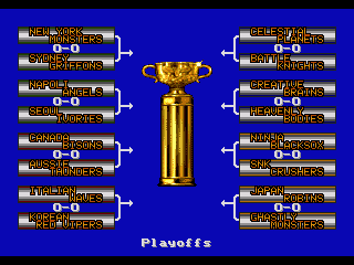
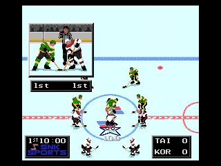
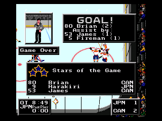
-
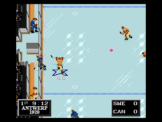
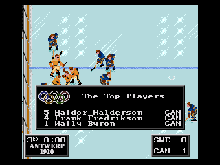
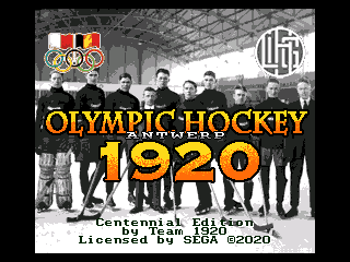
The weather outside is frightful, but the games are so delightful. And the hockey's great in retro, Score a goal. Score a goal. Score a goal. I'd been going back to this one off and on and figured I might as well post an update. Technically this one is build 1.8, but I'm renaming the ROM Olympic Hockey - 1920 Antwerp. Among a bunch of minor tweaks [most of which I don't even remember what they are anymore] the major and most noticeable differences will be: Slight rebranding of the title screen. With an assist from the indispensable @Jkline3, an updated helmet[less] patch for that authentic 1920's look. Goaltenders get some love with a set of heavy leather pads. ....wait. Hockey was a rough sport back in those days. Not sure how I forgot to use this patch until now, but we managed get the 3-stars sponsor back in there. Link will be placed in the main post as well, Barring any further developments, such as figuring out how to get the rover in there, this is probably the final form. Please enjoy responsibly. Olympic Hockey - 1920 Antwerp.bin
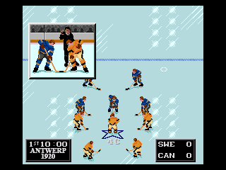

-
Been a bit out of the loop as of late, so I can't say I'm qualified to answer most of these, but on a personal level I would throw in for: 1. Bud of the year, @EagleXIII and @Jkline3 for the invaluable research and resources that helped me improve quite a few projects. 3. Best ROMs, Said by many others, but my reason for mentioning @UltraMagnus is for his extensive work with NHL95 and the many non-hockey related sports games.
-
NHL All-Star Hockey '95
von Ozbourne replied to Sedge's topic in Post '98 Titles & Other Hockey Titles
Haven't played this one much as I missed it when it was new, but that Jets one kind of stings. [For some reason the only "debacle" I can think of from that season was the off-ice stuff] -
Hah. I noticed that. [Although from my end it looked like you were the winner] Good to know we have each other's backs in a pinch anyway.
-
Downloaded these a couple years ago. Guess it would make sense to post them here if the links are indeed dead. Hope the file all still work. NHL'93classic.bin NHL'93classic_modano.bin NHL'94classic.bin NHLclassic+6.bin NHLclassic+69-73.bin NHLclassic+75-78.bin NHLclassic+81-85.bin NHLclassic+86-91.bin NHLclassic+usa.bin 2v2'Slapshot.bin
-
I'm kind of sad because I know I had tried compiling a list like this myself, but now I can't find it. Would have been interesting to compare notes. Also know that it would have taken a while to make so, yay... lost effort... If it helps with some of those question marks, I think the issue is that the rosters were compiled during the off season and many of the player numbers represent the rosters at the end of 1990-91 season more so than the beginning of the 1991-92 season. Case in point: Pittsburgh #9, when Francis had transitioned back to #10 by this season. Or Quebec having a #37 on D [probably Shawn Anderson who actually spent 1991-92 in Germany] since F Martin Rucinsky at the trade deadline wouldn't make any sense. This is also what I think San Jose's issue is. Most of the players were drafted but likely are still using the numbers from their old teams. And similar to '94, where Anaheim and Florida were added late so you get Guy Hebert as the Ducks' starter and the Blues' backup or the Panthers' Beezer and Fitzpatrick splitting time on the New York teams, I think all of the numbers represents a player that is still on both teams as well. [I noticed you went that route with San Jose's goalies as well] I also seem to recall figuring #19 on the Rangers as well as the Sharks be Brian Mullen [although the stats don't match], making #12 on the Rangers become Kris King, making Tim Kerr still #12 on Philly [he's on the "4th" line ie: PP/PK.] The weird thing with the first NHL Hockey's rosters is that you can't edit the lines unless you actually go into NOSE and switch them up. Otherwise if you play with line changes, you're just stuck with whatever the programmer decided to give you.
-
Oh! Yes that is a good question. Are you playing a regular game and seeing this roster issue or just looking at season mode? For context, I had made a custom NHL95 ROM <for reasons> and copy/pasted all the players onto different teams. [was easier than manually trading everyone] BUT, when I went into a season, the rosters were a right mess. Eventually realized that as I had started a season already, they players were considered "traded" to their teams, despite the edits in NOSE. Turns out that not saving as a copy was the problem. When I closed the game, GENS saves the game settings data to an .srm file in the same folder as gens.exe. So despite my changes, every time I opened the game, it was referencing that .srm file. Saving as a copy, or deleting the .srm file that has the same filename as the ROM you are using will give you a clean slate and might resolve your roster problem.
-
First, Hey welcome. Second, figured since I have made some mods in '98 I might have some helpful info. While taking the wonderful expanded teams mods for '93, '94 and '95 into consideration, it theoretically *could* be possible to add another team to '98, it's easier said than done. I know there was a '97 based mod that tried to add the All-Star teams to the playoff format, but using them was a bit glitchy. That said, including the All-Star/National Teams, you would have 31 total teams to work with already in the game, [yes 33 if you count the EA and THQ teams, but they just end up taking the place of the East/West teams] just that the last five would not be included in season or playoff mode. The other thing that you may have noted is that on the team selection screens, the team names are entirely sprite based, meaning that in addition to changing the text in NOSE, you would also need to edit the team name sprites along with the logos in Tile Molester. The unfortunate side effect of that is that some of the teams [like Team USA] have a limited number of sprites to work with so fitting the new names in there sometimes takes some creative hex editing as well. Not sure if international hockey is your thing, but here's a thread with a pair of mods I made using '98 if it helps in dissecting the game. Also have some notes, not sure how easy it is to follow [I got rather lazy in making them], but I can lend some of those as well. https://forum.nhl94.com/index.php?/topic/20403-the-world-championships-series/
-
Well, I don't know about him, but if I had one of those, I wouldn't let you know until I've collected on the rather large wager I'd have placed on the Finals.
-
NHLPA 93 Editing.
von Ozbourne replied to Rising Phoenix Gaming57's topic in General Questions & Discussion
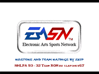
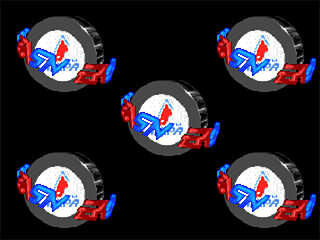
Guess you liked that documentary eh? Actually I have a question, as the banners are all sprite based and the information is located in different places and the process would be a bit different depending on which version of NHLPA 93 you might be trying to mod. Are you using wboy's 30-Team mod as your base? [with this splash screen] This is probably the easiest to work with if you are just starting. Or Slapshot's 32-Team mod? [with this splash screen] This is good to work with too, but will require some extra steps. or hopefully not trying something silly like using the original NHLPA'93 ROM. [with this splash screen] [I tried doing stuff with this one before and man, it's a lot of extra work]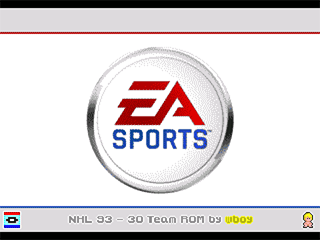
-
Maybe he means Cardiff?
-
Don't know if the player types are possible. I hear that music might be possible. [but really really hard to execute] Otherwise this is something I was already interested in taking a stab at although I didn't really want to make a competing version. On the note of artistic vision, I did make a TRON hockey game from the older PAL EA Hockey [1991] ROM. Curious about how much influence this could have on perhaps a TRON 2.0 sequel in the '94 engine.
-
HOW TO: Altering The Net Tiles And Palette
von Ozbourne replied to clockwise's topic in How-To & Reference
Here? Damn. I never knew about this. Don't be sorry. Now I want to try out that puck thing. [edit after looks again] Oh, you mean in the offset for the palette swap eh. That is something that I do not have, but would like to as well.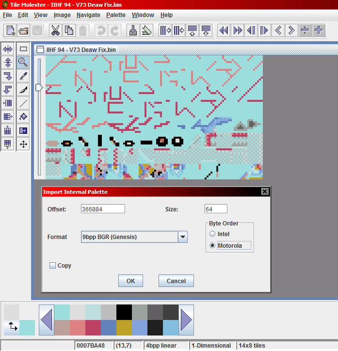
-
This was the best I could come up with too, but you would think that after the Leafs' <insert mocking adjective here> first round exit, EA wouldn't figure it beneficial to hitch their wagon on him again so soon. Not to mention that there are six other regions that very much dislike Toronto and the Leafs [although they will admittedly be buying the game anyway so it doesn't matter] Although to be fair, if EA wants to pump up their PS5 numbers, I'd say that they would probably be better served by getting Sony to pump up their PS5 numbers.
-
Heh. Yeah, I figured if I wasn't going to completely redraw the entire crowd to be wearing Edwardian 3-piece suits and ankle length skirts, then they should at least be less vibrant.
-
Not to take away from kingraph's guide, but it if helps, I tested my EARE list generator on my 1920 ROM and all of the rosters had between 7 and 12 players. And I actually had two versions of each team, [one that the player can select, one they can't - for purposes of playoff configuration] and just linked them to the same set of photos. I even changed the order that the teams were listed in NOSE and set the cards again without changing any of the sprites. The thing with EARE is that as long as the player's name and card offset on the list, match with the player whose picture is located at that offset, the program doesn't care. It also by default uses the NLC Line as the main menu featured cards. You can change the NLC line after the fact and it will modify the lineup for Ron Barr's pre-game screen, but will leave the main menu alone. Used along with the hex code change to set how many players are featured on the main screen and you can effectively feature your top players regardless of position, [and the #1 goalie] just so long as you initially set the top two D-men as two of your desired featured players. After that, it seems to just run down the list starting after the top three forwards. The only real issue with this method I find is that you just need to make sure that you haven't made any spelling or copy/pasting errors along the way and that everything is exactly the way you want it before you click that "Set" button. Otherwise you might be going back and setting it again. And like kingraph's, any name in NOSE that doesn't have a corresponding entry in the card list, will just end up linking to the default Lefty/Righty Player/Goalie pics after you click that button.
-
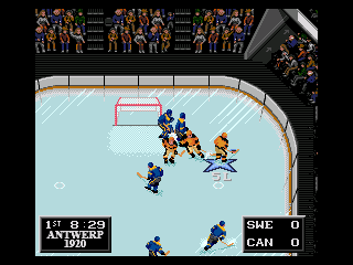
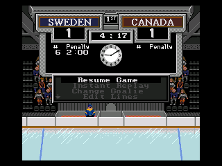
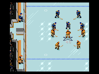
So, it is with thanks to @Jkline3, that I was able to get that cleared bench I was looking for. And I figured while I was at it, I might as well go with a few more period accurate touches. Rover is thinking "I should be out there." I like the more scattered snow look in this goal area better. The seats appear really far away without the glass, but it's not out of the ordinary in European rinks. Not much keeping the fans separated from the action, or the penalized player, but at least he won't have to share a bench with an adversary from the other team like in some old rinks. Decided against the old tongue-and-groove slats look for the rink boards as that was just way too busy, but behind the bench works. Updated the main post as well, but I'll keep the original in there to in case anyone wants to use it for reference. Olympic Hockey 1920 V1.1.bin
-
Sunuva... That was the one I was looking for! Although admittedly I was kind of tired of the Ref by that point. Basically: Hmm, try the white pixels in this section... <broken> Hmm, try the striped pixels in this tile... <broken> Hmm, try these two pixels here... <broken> Hmm, try never minding this bollocks... <never minded> It just looked to me that the sprites were based on the on-ice players, so I figured they probably just pointed to some of them to save memory. The good news is that It doesn't seem to affect anything else. This does mean that the benched Rover player doesn't move at all, but it's an okay trade off. However, now you got me looking at one other thing I was debating doing... Going to conduct some tests. V1.1 update should be ready by tomorrow.
-
Heh. Have to admit, that is some pretty impressive spreadsheeting. Although I also have to admit that sometimes I stick with novice level techniques a bit longer than I should as it gives me time to iterate in my mind many times over before I physically complete any one task. That starting lineup is a pretty cool feature though. I remember as I was just learning I was stuck either searching the hex location and manually entering the roster spot or just being lazy and putting the players I wanted into the roster position that was pre-selected to be featured on the main menu. Don't have another '94 based game on the to-do list for a while, but I'll have to see how this one works for me when I do.